Introduction
Your dashboard is the moment of truth. Every day, a user opens it and decides, in about three seconds, whether your product is working for them. Most dashboards flunk that little test. Not because they’re ugly; plenty of ugly dashboards do fine, but because they’re trying to say everything at once, so they end up saying nothing.
And the cost of flunking it is brutal. In 2024, Userpilot benchmarked 62 B2B SaaS products and found only 37.5% of new users ever reach activation, the point where they actually get the thing they came for (Userpilot User Activation Benchmark Report, 2024). The rest poke around, get confused, and leave. The dashboard is usually the room where that decision gets made.
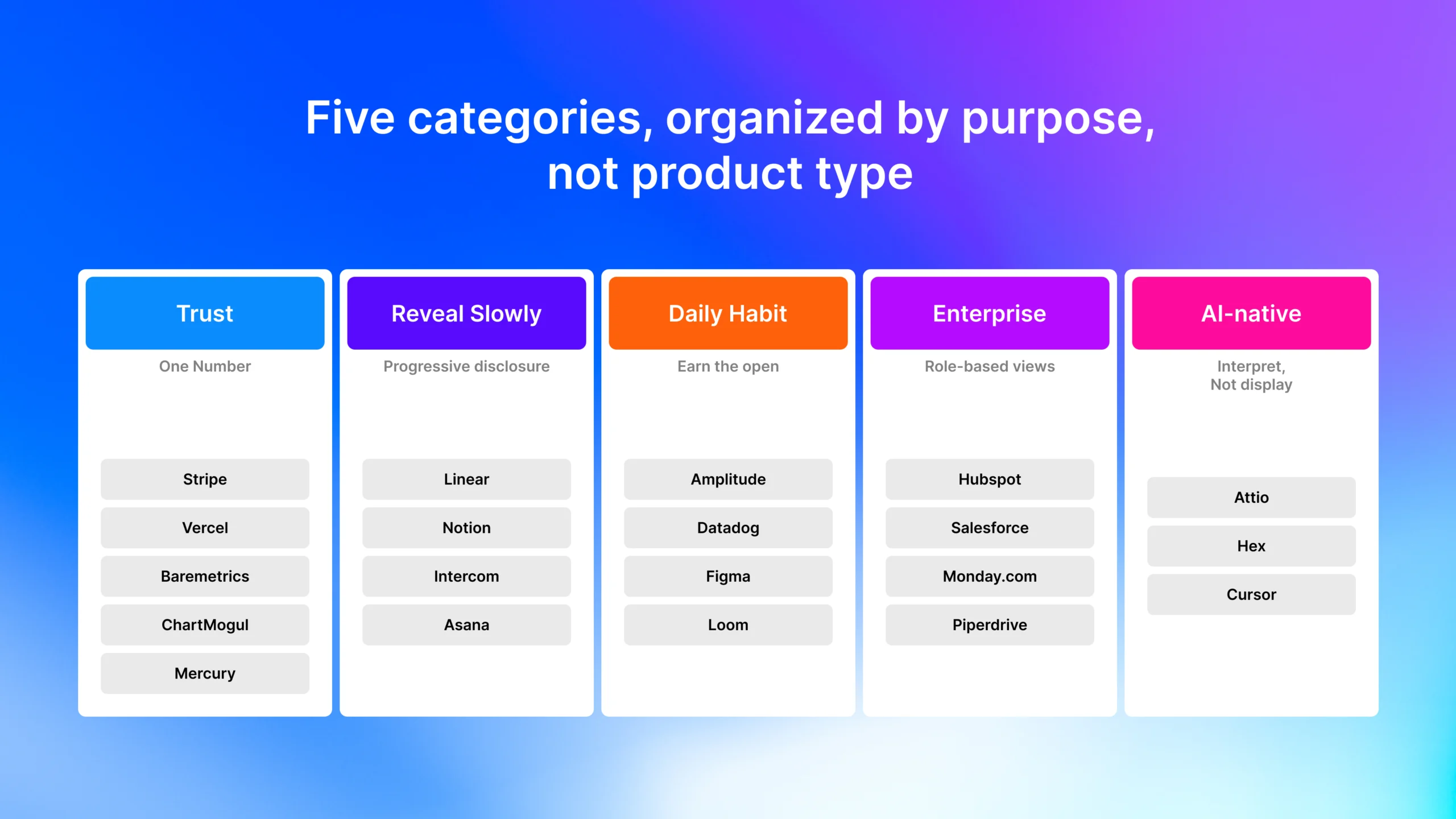
So here’s what I want to do. Instead of handing you yet another gallery of pretty screenshots, I grouped twenty saas dashboard design examples by the one thing that actually matters: what each dashboard is designed to do. Build trust. Reveal complexity slowly. Earn the daily open. Survive the enterprise buyer. Let AI do the thinking. Once you see the job, the design choices stop looking like taste and start looking like decisions.
One word keeps coming up when you study the good ones: calm. The teams behind tools like Linear talk about calm design, a screen that’s quiet on the surface and deep underneath, so it never shouts at you. Hold that idea. It’s the thread running through almost every example below, and it’s the opposite of what most dashboards do.
Key takeaways
- Only 37.5% of new SaaS users ever activate, and over 98% churn within two weeks if they never hit value (Userpilot, 2024; Amplitude, 2025). Your dashboard is where most of that is won or lost.
- A dashboard that answers one question fast beats one that answers twenty questions slowly.
- Progressive disclosure, showing less and revealing on demand, is the single most useful pattern of 2026.
- AI-native dashboards (Attio, Hex, Cursor) are quietly redrawing what a dashboard even is.
What actually makes a SaaS dashboard work?
A dashboard works when a person can look at it and instantly know whether things are okay. That’s the whole job. With average activation stuck at 37.5% (Userpilot, 2024), the products that win aren’t the ones with more charts. They’re the ones that make the answer obvious before you’ve finished your coffee.
Before we get to the examples, four principles run underneath all of them. Every one of the twenty best SaaS dashboards below follows these, whether the team that built it would say so or not.
1. One north star, front and center
There’s one number that tells the user whether they’re winning. It goes top-left, large, and it never leaves. Everything else is a supporting actor. If you can’t name that number for your product, that’s not a design problem. It’s a product problem wearing a design problem’s coat.
2. Action over information
A good dashboard doesn’t just tell you sales are down 12%. It shows you the next move. This is the line between a report and a product dashboard design that earns its place on the screen. Reports get read. Dashboards get scanned, and then someone does something.
3. Progressive disclosure
Show people less on day one and more on day thirty. New users get a calm, simple view. Power users unlock depth as they go. Among the dashboard design patterns worth stealing, this is the one I’d steal first.
4. Color is status, not decoration
Red means at risk. Green means on track. If you color things because they look a bit plain, you’ve thrown away your most powerful signal. Good dashboard UX design spends color like it’s expensive.
One more thing before the list. This article isn’t about admin templates you drop into a codebase. It’s about design decisions inside real, shipping products. If you came for code, this is the wrong page; if you came to figure out what to put on the screen and why, stay.
Dashboards built on a single number (trust)
Financial and infrastructure products carry one constraint above all others: trust. People open these when something might be wrong, so the design job is to communicate health instantly and to do it in a way that feels calm and authoritative instead of anxious. The pattern across all five is the same: one number, given the best seat in the house.
Trust in a financial dashboard is built by subtraction, not addition. The fewer things competing for attention, the more reliable the product feels. That’s why the strongest SaaS dashboard design in this category looks almost empty next to its competitors and why that emptiness is the point, not an oversight.
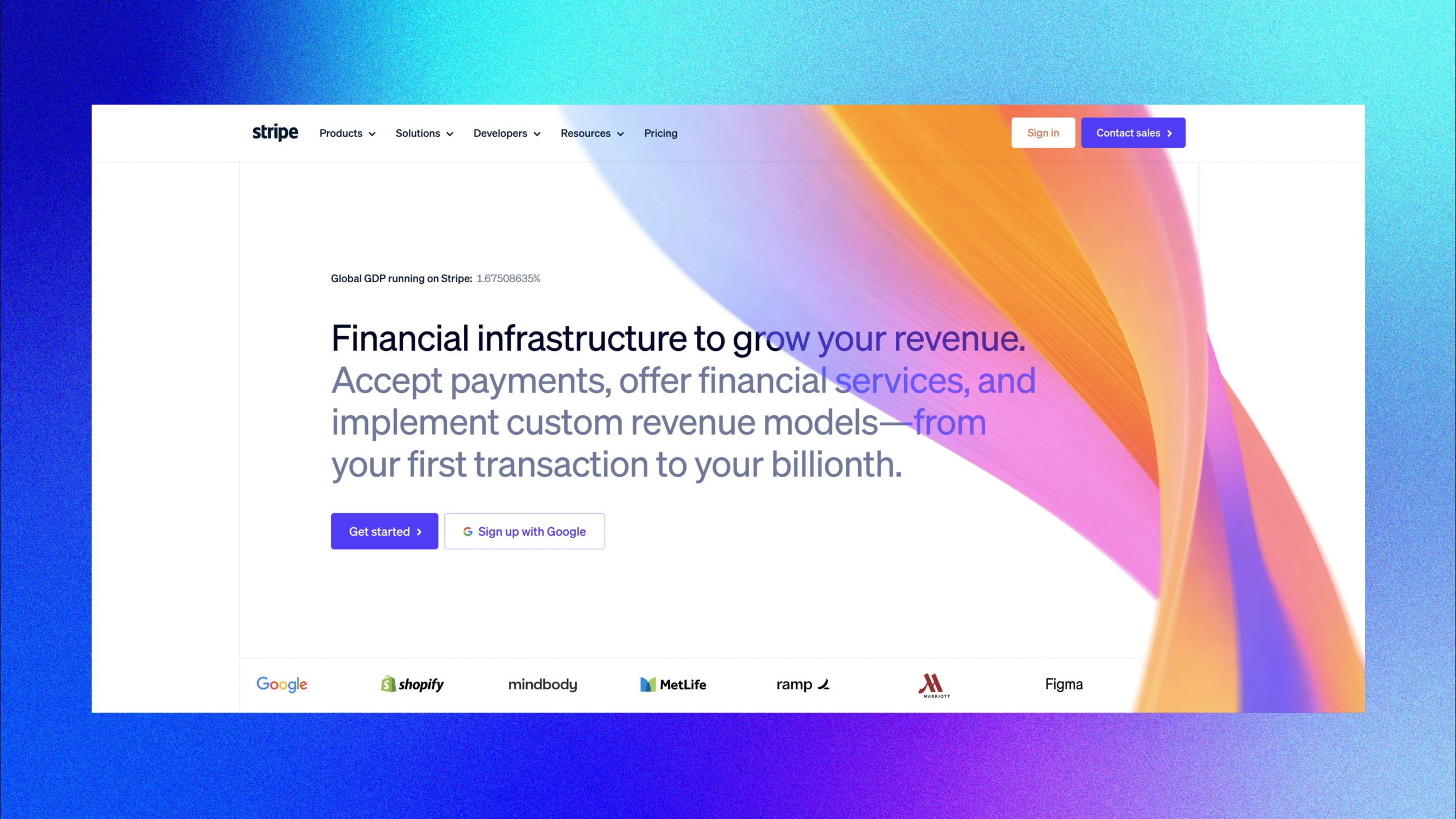
1. Stripe — revenue gets the best seat
Stripe opens on the number every founder actually checks: revenue. It’s the first thing your eye hits, and it stays reachable as you move into payments, customers, or settings the metric follows you around instead of hiding behind a menu. That persistence does something quiet but real: it tells you the product knows what you came for. You never have to hunt, and hunting is where trust leaks out. Call it the “ambient north star.”
What to borrow:
- Give your single most important metric a permanent home, not a tab you have to go find.
- Keep it reachable from deep inside the product, not just the landing screen.
- Pick the one number a founder would glance at on their phone, that’s your north star.
2. Vercel — one question, one answer
Every deploy raises exactly one question: did it work? Vercel answers it before you’ve read a word: green, red, or building, so you read a state, not a statistic. The whole screen bends around that status, and the detail (logs, timings, history) waits politely underneath. It’s fast because it respects that, in the moment, you don’t want data. You want relief. Pattern: “state at a glance.”
What to borrow:
- If users come for a yes/no answer, design the yes/no first.
- Use color as the primary signal, so status reads without reading.
- Push detail one layer down; reveal it after the reassurance lands.
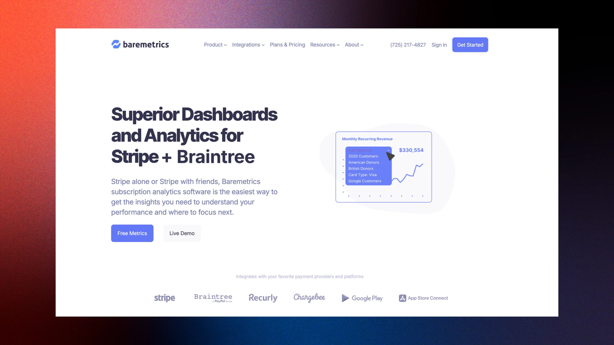
3. Baremetrics — size is hierarchy
Baremetrics prints MRR bigger than anything else on the screen, with its trend arrow riding right alongside it. You never search for your number, and you never see it naked — the direction is always attached. That pairing matters: a big number with no trend is a snapshot; a big number with a trend is a story. The eye goes to the largest thing first, so the largest thing had better be the thing that counts. Pattern: “momentum display.”
What to borrow:
- Scale your headline metric physically larger than its neighbors.
- Always show the trend beside the value, never the value alone.
- Let size do the prioritizing so users don’t have to.
4. ChartMogul — answer the follow-up before it’s asked
The second you watch MRR move, your brain fires the next question: why? ChartMogul puts the breakdown — new, expansion, churned — right inside the main view instead of a click away. It answers the follow-up before you’ve finished asking it, which is the gap between a dashboard that informs and one that anticipates. Fewer clicks, fewer dead ends, no “wait, where do I see that?” Pattern: “answer the next question.”
What to borrow:
- Spot the one follow-up users always ask, and build the answer into the primary view.
- Show the components of a number, not just the total.
- Cut the click between “what happened” and “why.”
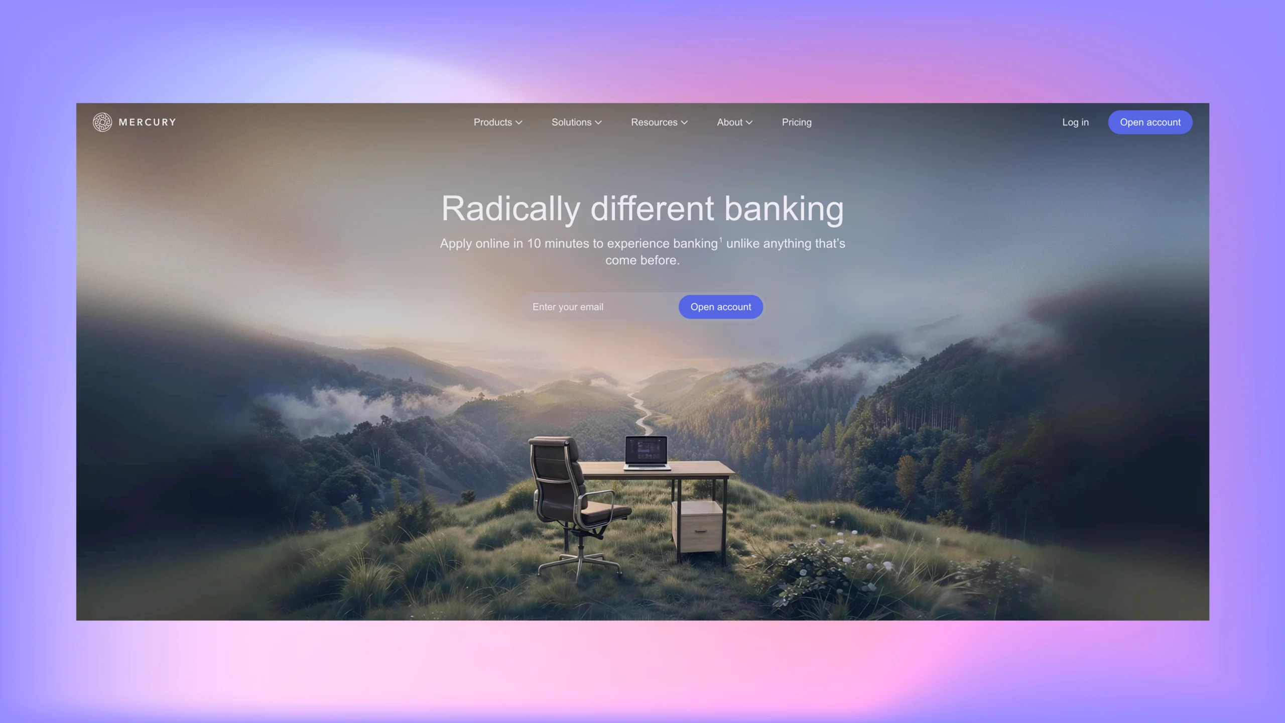
5. Mercury — confidence first, detail second
Mercury shows one balance, cleanly, with almost nothing else competing for attention. For a product holding your money, that restraint isn’t minimalism for looks, it’s how trust gets built. A busy banking screen reads as risky; a calm one reads as safe, even when the code underneath is identical. The first feeling a money product gives you can’t be confusion. It has to be “I’m okay.” Pattern: “trust through restraint.”
What to borrow:
- In anything touching money, lead with the number that answers “am I okay?”.
- Cut visual noise; perceived reliability rises as clutter falls.
- Let detail wait; confidence comes first.
Dashboards that reveal complexity slowly
These products serve power users who need depth and newcomers who need air. The trick isn’t showing less for its own sake; it’s sequencing what people see based on how far along they are. Get this right and the same screen feels simple on day one and bottomless on day ninety. This is what designers in 2026 mean by calm design: not sparse, not stripped, but sequenced.
Progressive disclosure is the most reliable retention pattern in 2026 because it refuses to make the new user pay for the power user’s complexity. The dashboard starts quiet and then earns the right to show more as the person demonstrates they’re ready for it. Simple by default; deep on request.
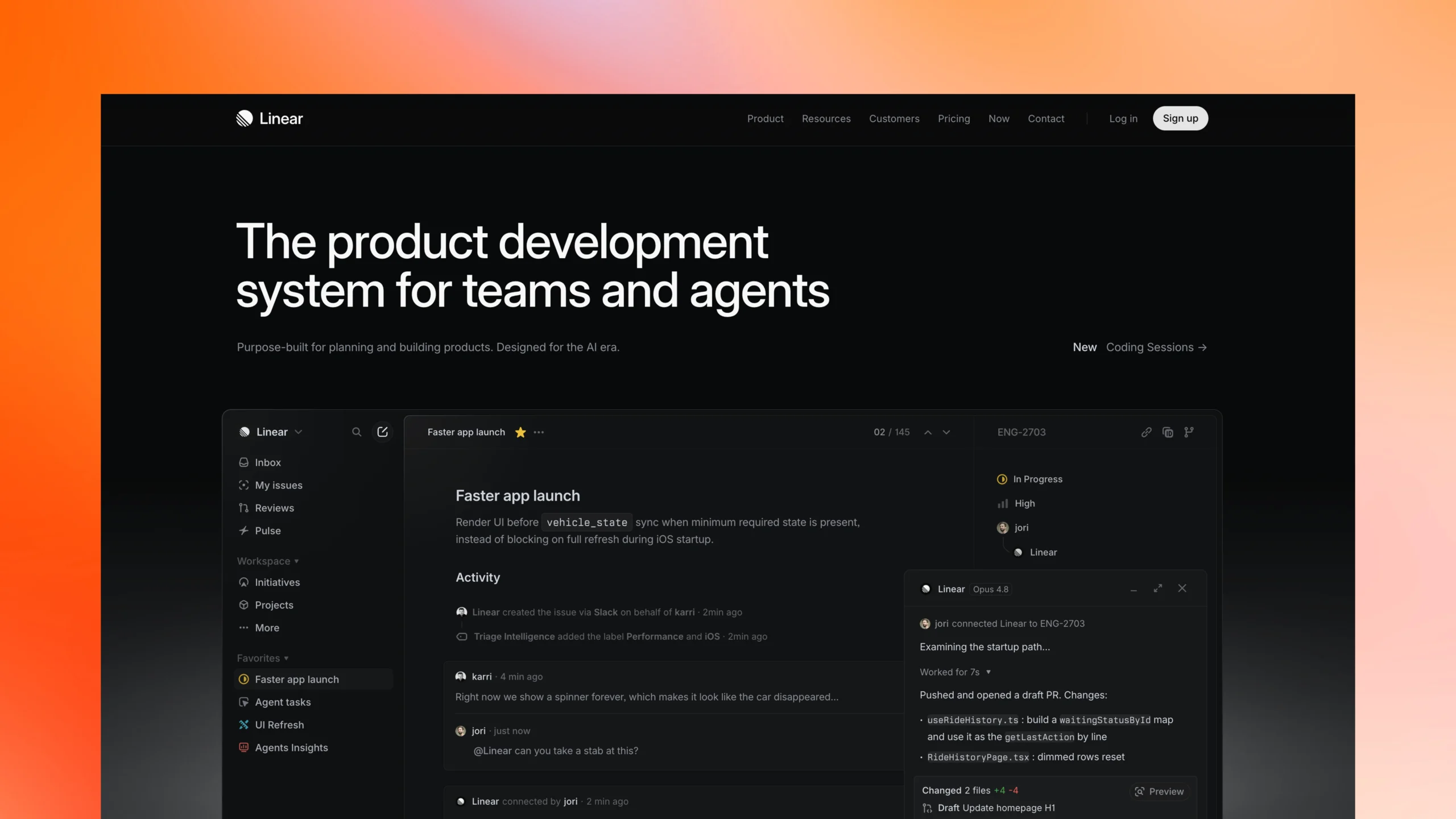
6. Linear — separate “doing” from “analyzing”
Linear’s default view is a clean list of what’s active — no charts, no clutter, just the work. Analytics and burndowns live one click away under Insights, so daily execution and weekly reflection never fight for the same screen. New users see something they instantly understand; power users know depth is a keystroke away. It feels simple not because it’s shallow, but because it’s sequenced. Pattern: “calm default.”
What to borrow:
- Build a “work” view and a separate “insights” view.
- Keep the default screen about doing, not analyzing.
- Hide depth behind one obvious click, not a wall of options.
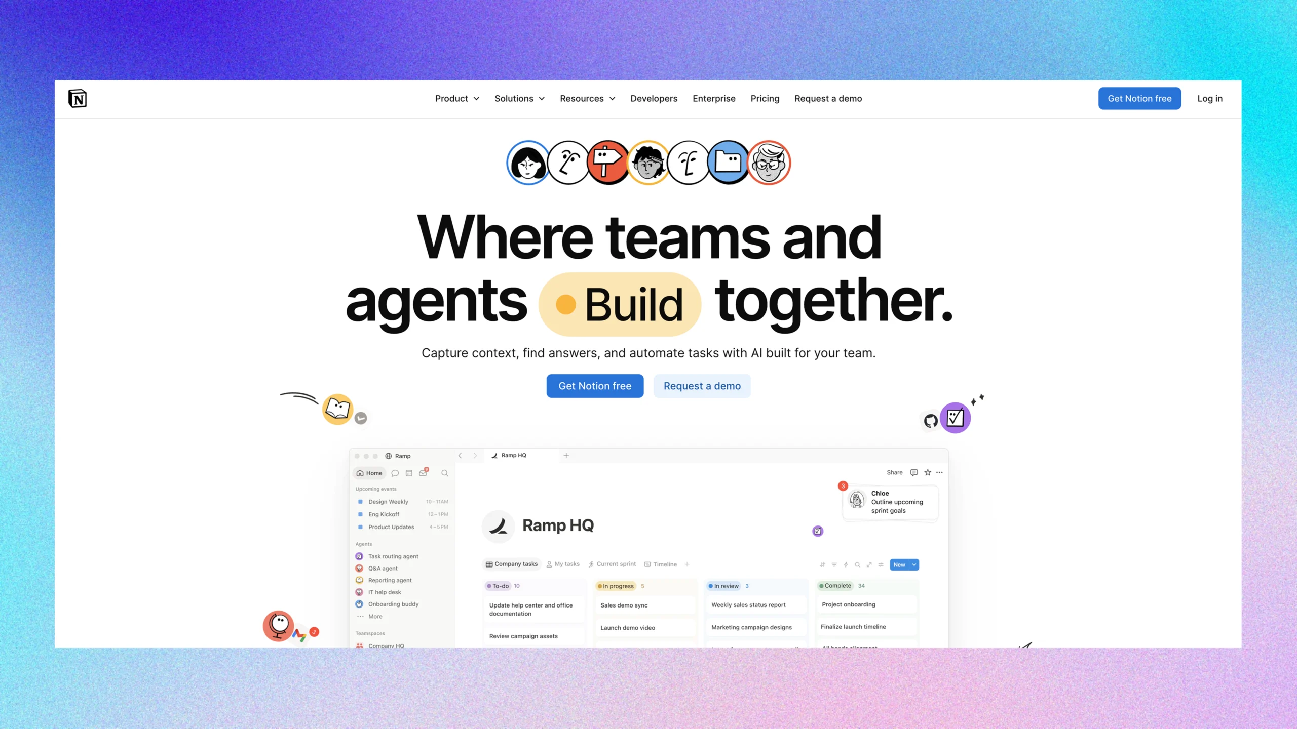
7. Notion — modular, personal, yours
Notion hands you components instead of a fixed layout, because a marketing team and an engineering team don’t track the same things. You assemble the dashboard you actually need, and the product gets stickier the moment you’ve built something that’s yours. Its AI lives inside the editor rather than behind a badge, there when you want it, invisible when you don’t. Configuration itself becomes a reason to stay. Pattern: “build-your-own.”
What to borrow:
- For varied personas, give modular blocks instead of one rigid layout.
- Let users assemble their own view, ownership drives retention.
- Fold AI into the workflow instead of announcing it.
8. Intercom — a smart summary first
Every conversation in Intercom carries an AI-written summary, so you can triage a full inbox without opening a single thread you don’t need to. You read the gist, decide, and move, expanding only when something actually requires you. That’s the whole trick: summary up front, detail one tap away. It turns a wall of tickets into a scannable list of decisions. Pattern: “summary-first.”
What to borrow:
- When items have detail behind them, show a smart summary up front.
- Let users expand on demand instead of forcing every detail open.
- Design the list to be triaged, not just read
9. Asana — personal before organizational, with a little joy
Asana defaults to your work before the team’s, you care about your plate before the org chart, and when you finish a project, a small creature flutters across the screen. It’s a B2B product, and someone still decided a moment of joy was worth shipping. That’s not fluff: tying a tiny celebration to a real win gives people a reason to come back and finish the next thing. In 2026, the line between “serious tool” and “tool people enjoy” is thin. Pattern: “delight as retention.”
What to borrow:
- Default to a personal, action-oriented view; opt users into the broader one.
- Find the moment your user “wins” and celebrate it, even in B2B.
- Treat delight as a retention tactic, not decoration.
Dashboards designed to become a daily habit
Some products live or die on whether you open them every single day. Their dashboards are built to pull you back in a good way. The goal isn’t “show data.” It’s “be the first tab you open with your coffee.” In its 2025 Product Benchmark Report, Amplitude found over 98% of users churn within two weeks if they never find value (Amplitude, 2025 Product Benchmark Report), so the daily open isn’t a vanity metric. It’s survival.
Habit-forming dashboards share one move: they’re built for the returning user, not the first-timer. They lead with what changed since you were last here, because “what did I miss?” is a far stronger pull than “here is your current state.” Design for the second visit and the hundredth, not the screenshot in your pitch deck.
10. Amplitude — show what changed
Amplitude filters by use case, not by data type, so you land on the metrics tied to what you’re doing right now instead of a wall of everything. The strongest move is designing for the returning user: lead with what moved since last time, because “what did I miss?” pulls harder than “here’s your current state.” A dashboard built for the second visit and the hundredth beats one built for the screenshot. Pattern: “delta-first.”
What to borrow:
- Design for the returning user, not the first-timer.
- Lead with what changed since the last visit.
- Filter by the job at hand, not by every data type you have
11. Datadog — let power users build their own signal
Datadog’s drag-and-drop widgets let each engineer turn the dashboard into their own mental model of their systems. That sounds like a power-user nicety, but it’s an engagement hook — people who build their own view stick around longer than people handed a default. The act of arranging it is a small investment, and small investments create attachment. Give control, get retention. Pattern: “modular dashboard.”
What to borrow:
- For analytics-heavy tools, let power users configure their own view.
- Treat customization as an engagement hook, not just a setting.
- Ship sane defaults, but make rearranging effortless.
12. Figma — match the user’s mental model
Figma’s home screen is a grid of file thumbnails, because designers recognize their work by sight faster than by name. A list of filenames would make them read; a wall of pictures lets them just point. The lesson isn’t “use thumbnails” it’s “match the format to how your users already think.” Designers think in images, so the dashboard shows images. Pattern: “speak their language.”
What to borrow:
- Match the dashboard format to how users mentally sort their work.
- Favor recognition (visuals) over recall (names) where you can.
- Ask what your users “think in,” then show them that.
13. Loom — answer “did it work?”
Loom surfaces watch rates and engagement, not just a raw view count, so you learn whether your video actually landed not merely whether someone clicked. And because new views trickle in unpredictably, checking back becomes a small, addictive habit: the variable reward that keeps pulling you in. It answers the question you really have, then gives you a reason to look again tomorrow. Pattern: “variable reward.”
What to borrow:
- Show the metric that answers “did it work?”, not “did they click?”
- Lean on unpredictable, trickling updates to earn the recheck.
- Make the number that matters the one that keeps changing.
Dashboards built for enterprise buyers
Enterprise SaaS gets used by a sales rep, a VP, and a RevOps analyst who all need different things from the same tool. The good b2b saas dashboard design examples solve this with role-based views, ruthless hierarchy, and output a manager can drop into a board deck without a paragraph of explanation. Same product, completely different first screen depending on who you are.
The defining feature of enterprise dashboards is that they’re built to be shared upward. Every enterprise buyer answers to someone, so the dashboard has to make that person look prepared. Design at least one view whose entire job is to be screenshotted and sent to a boss clean, large, and self-explanatory.
14. HubSpot — the default view fits the role
Open HubSpot as a sales rep and you get pipeline; as a marketer, campaigns; as an exec, revenue. Same product, completely different first screen. Nobody wades through someone else’s complexity to reach their own job. The design question shifts from “what does this show?” to “who’s opening this, and what do they need first?” Get that right and every persona feels like the product was built for them. Pattern: “adaptive default.”
What to borrow:
- Set role-based defaults so each persona lands on their own job.
- Ask “who opens this?” in every design review.
- Hide the other roles’ complexity instead of stacking it on everyone.
15. Salesforce — report-first, executive-ready
Salesforce leans into big, clean charts a manager can forward straight up the chain without exporting or explaining anything. Some views exist specifically to be screenshotted into a board deck: large type, minimal chrome, self-contained. Enterprise buyers always answer to someone, so making them look prepared is a feature, not a nicety. The dashboard that helps a VP report upward is the dashboard that survives the renewal. Pattern: “share-upward.”
What to borrow:
- Make reporting a first-class feature upward.
- Design at least one screenshot-ready executive view per area.
- Use large type and minimal chrome so a view explains itself.
16. Monday.com — color as a shared language
Monday’s red/yellow/green status reads across an entire board in a split second, and teams adopt the color system as their own shorthand: “we’re green on that” becomes something people say out loud. Status carries enough visual weight that nobody has to read it; the color is the message. When a whole team speaks the same color vocabulary, alignment stops needing a meeting. Pattern: “status vocabulary.”
What to borrow:
- Give status enough visual weight to read without reading.
- Use a consistent color system so it becomes team shorthand.
- Reserve red for real risk; don’t spend it on decoration.
17. Pipedrive — put the most-used action on the home screen
In Pipedrive, the deal pipeline is the default view, because that’s where reps actually live. No navigating to your most-used feature; it’s the home screen. The pipeline metaphor even shapes the whole information architecture: work flows left to right, the way salespeople already picture it. Whatever your primary user does most, that’s what should greet them. Pattern: “most-used is home.”
What to borrow:
- Put your primary user’s most-frequent action on the dashboard by default.
- Let the central metaphor drive the whole layout.
- Cut the navigation between “open the app” and “do the main thing.”
AI-native dashboards (the 2026 shift)
This last group was built for a world where AI is plumbing, not a feature. Their dashboards are architecturally different: instead of just displaying data, they interpret it and suggest the next move. The new design problem is trust. How do you make an AI output feel reliable and let people overrule it without quietly undermining confidence in the whole product? That tension is what makes AI dashboard design the most interesting frontier of the year.
The tell of a 2026-era AI product is that the AI badge has disappeared while the intelligence hasn’t. Products that slap an “AI” label on every feature already look dated. The strongest SaaS dashboard examples 2026 fold intelligence into the workflow so smoothly that users stop noticing it’s there; they just notice the work got easier.
18. Attio — records that prioritize themselves
Attio ranks and surfaces what you should act on next instead of showing every record with equal weight. Enrichment happens quietly in the background, so data appears without you filling in fields; the CRM feels like it already knows. A flat list makes the user do the sorting; a ranked one does the sorting for them. In 2026, the win isn’t more data on screen; it’s the right row floated to the top. Pattern: “ranked attention.”
What to borrow:
- Let the dashboard rank attention instead of showing a flat list.
- Enrich data in the background so users provide less.
- Surface the next action, not just the full record.
19. Hex — AI writes the query, you read the insight
Hex lets non-technical users get answers without learning SQL: AI handles the query, and the view leads with the plain-language result instead of the raw table. Lead with interpretation, confirm with data, headline first, evidence beneath. For a data-heavy product, that inversion is the whole point; most people want the answer, not the spreadsheet. The numbers are still there for anyone who wants to check the work. Pattern: “insight-first.”
What to borrow:
- If users need data but not complexity, let AI handle the mechanics.
- Lead with the plain-language answer; put the raw data underneath.
- Make the interpretation the headline, not a footnote.
20. Cursor — a command-first interface
Cursor puts a command bar at the center; summon it with a keystroke, type what you want, skip the navigation entirely. It’s the defining pattern of 2026’s power tools (Linear, Raycast, and Notion all share it), and it works because a palette lets you say what you want instead of remembering where it lives. The one catch is discoverability: a palette only helps if people know it’s there, so the best ones hint at the shortcut right on the empty screen. Pattern: “command-first.”
The command palette that little box you summon with a keystroke and use to do anything is one of the defining dashboard design patterns of 2026. Cursor, Linear, Raycast, Notion, and a dozen others all share it now. The reason it works is simple: navigation makes you remember where things live, while a command palette lets you just say what you want. For a power user on their thousandth visit, that’s the gap between “fast” and “death by clicking.” The catch is discoverability — a palette only helps if people know it’s there, so the best ones hint at the shortcut right on the empty dashboard.
What to borrow:
- Add a command palette for frequent, repetitive actions.
- Surface the shortcut where new users will actually see it.
- Make navigation optional, not the only path
That’s the core twenty. Two more groups are worth a quick look, because they cover audiences the main list skips: money-movers and developers.
Fintech and spend dashboards (Mercury, Ramp, Brex)
Money products are the strictest test of dashboard design, because the user’s first feeling can’t be confusion — it has to be confidence. We met Mercury back in the trust category, but corporate spend tools push the same idea further. Good fintech dashboard design answers “am I okay, and what’s leaking?” before it shows you anything fancy.
Ramp — the number you didn’t ask for
Ramp leads with spend, but the choice that stands out is showing money saved, not just money spent. That one reframe turns a finance tool from a ledger into a coach; it’s not scolding you about the bill, it’s pointing at the win. Corporate spend is anxious territory, so surfacing a positive number first buys trust before the detail arrives. You feel like the product is on your side, which is exactly how a money dashboard should open. Pattern: “the friendly number.”
What to borrow:
- Find the number that makes the user feel like the product is on their side, and give it real estate.
- Lead with a win before the detail, especially in anxious categories.
- Reframe a “record-keeping” screen into a “coaching” one.
Brex — control without clutter
Brex packs cards, banking, and spend controls into one place, yet it reads calm because status and balances come first and the controls wait their turn. A product that does many things is the hardest to keep quiet, and Brex manages it by ranking: health check up top, machinery underneath. You get the “am I okay?” answer instantly, then the levers are there when you actually need them. Doing a lot and feeling simple aren’t opposites; they’re a layering decision. Pattern: “health first, controls second.”
What to borrow:
- When a product does many things, lead with the health check.
- Let the controls live one layer down, not on the front screen.
- Rank by “what do I need to know” before “what can I do.”
Dark-mode-first dashboards (Sentry, Supabase)
For developer tools, dark mode stopped being a setting and became the front door. The strongest examples of dashboard ui ux design in this corner are designed dark first, then adapted to light the reverse of how most teams work. It’s not a style choice; it’s where the audience already lives.
Sentry — make the bad news readable
Sentry shows errors and performance on a dark canvas where red and yellow alerts actually pop. That’s not a mood choice; a dark background gives warning colors somewhere to shine, so the problems are the first thing your eye finds. For a product whose whole job is “something broke,” that legibility is the design. The screen is built so bad news can’t hide, which is precisely what an on-call engineer needs at 2 a.m. Pattern: “problems first.”
What to borrow:
- If your product is about problems, design so the problems are the first thing the eye finds.
- Use a background that makes your status colors pop, not fight.
- Optimize for the stressed, time-pressed reader, not the calm demo.
Supabase — dark by default, calm by design
Supabase gives developers a database dashboard that’s dense with capability but never frantic, because it leans on the quiet, dark, typography-forward style this audience reads as “built by people like me.” The dark default isn’t decoration; it’s a signal of belonging, and belonging is half of why developer tools get adopted. Plenty is happening on screen, yet the restraint keeps it from feeling like a cockpit. Match where your users already live, and the product feels native before they’ve clicked a thing. Pattern: “native by default.”
What to borrow:
- Match the visual default to where your users already spend their day. For developers in 2026, that’s dark.
- Use restraint to keep a capable screen from feeling frantic.
- Treat the default theme as a belonging signal, not just a preference.
5 dashboard design mistakes that quietly kill retention
The twenty examples above have something else in common: they sidestep these five dashboard design mistakes. None of these are dramatic. That’s exactly why they’re dangerous: they don’t crash anything; they just slowly bleed users while everyone blames the onboarding emails.
Mistake 1: Showing everything above the fold
When fourteen metrics share equal billing, users see all of it and process none of it. They feel vaguely informed and make zero decisions. Every dashboard needs one primary metric. If you can’t pick it, that’s a strategy problem, not a layout problem.
Mistake 2: Color as decoration, not status
When everything is colorful, nothing communicates urgency. You’ve spent your loudest signal on mood lighting. Reserve color for meaning: at-risk, on-track, needs-you-now. Let the rest be quiet.
Mistake 3: Designing for the demo, not daily use
This is the most expensive mistake in the category. A demo dashboard has to impress someone who’s never used the product. A daily dashboard has to be efficient for someone on their hundredth visit. Those are different designs, and optimizing for one hurts the other. The fix: build a first-impression view and a power-user view, and let people graduate to the second after their first week.
Mistake 4: No empty state design
A new user signs up, sees blank charts and placeholder text, reads it as “broken,” and leaves. A blank chart says “nothing here.” A good empty state says “here’s how to get your first win” one clear action, like “Connect your Stripe account to see revenue.” Treat every empty state as a tiny piece of onboarding, because that’s what it is.
Mistake 5: Treating every user the same
No role-based views means every person sees someone else’s complexity. The rep drowns in executive rollups; the exec hunts for a number buried in operational noise. Information without a matching action architecture is just decoration with a job title. For every metric you show, ask: what does a user do when this number is bad? Then build that path in.
Read those five out loud, and I’d bet you recognized at least two from a product you’ve used this week. Maybe one you shipped. (I’ve shipped a few. The empty-state one stung.)
How do you apply these patterns to your own product?
Twenty saas product design examples are useless if they stay examples. Here’s the part where they turn into a decision. Before you redesign anything, sit with three questions. They’re simple. They’re also the questions most teams skip, which is why most dashboards drift.
Question 1: What’s the ONE number?
If a user had five seconds on your dashboard, what number would you want them to see? That number goes top-left, large, always visible. Everything else arranges itself around it. If you genuinely can’t choose, you’ve found the real work, and it isn’t design work yet.
Question 2: Who opens this every day, and what do they need to feel okay?
The daily user is not the new user, and neither is the executive stakeholder. Design for the daily user first. Then add one executive-summary view. Then add an onboarding state for newcomers. Most teams do this backwards; they design for the new user and quietly punish the daily user who actually drives retention.
Question 3: What does “done” look like?
This is the hard one. In Loom, “done” is “my video got fifty views.” In Linear, it’s “nothing in the overdue column.” In Stripe, it’s “revenue is up month over month.” If you can’t say what “done” looks like for your user, your dashboard will never build a habit because nobody comes back for a feeling of completion they never get to have.
Here’s the pattern we keep seeing at Pixelean: the hardest part of a dashboard isn’t the layout. It’s deciding what to leave out. The teams that ship calm, high-retention dashboards aren’t more talented; they’re just braver about cutting. Or, to borrow a line worth taping to your monitor: get rid of half the widgets, then get rid of half of what’s left.
The whole thing in one table
If you skipped to the bottom, fair enough; here’s every category, the question it answers, and the one thing to steal from it.
| Category | The question it answers | Signature pattern | Borrow this |
| Single-metric trust | “Am I okay?” | Ambient north star | One number, top-left, always visible |
| Progressive disclosure | “What’s mine to do?” | Calm default, depth on demand | Simple on day one, deep on day ninety |
| Daily habit | “What changed?” | Delta-first, variable reward | Design for the returning user |
| Enterprise / multi-stakeholder | “How’s the team doing?” | Role-based views, share-upward | One screenshot-ready executive view |
| AI-native | “What should I do next?” | Insight-first, invisible AI | Let the dashboard rank attention |
| Fintech/spend | “What’s leaking?” | Trust through restraint | Confidence before detail |
| Dark-mode dev tools | “What’s broken?” | Dark-first, status-forward | Match the audience’s default |
Still guessing what your dashboard should show first?
Most SaaS teams default to showing everything, and users pay for it in confusion and churn. Pixelean is a saas dashboard design agency that designs around one question: What does this user need to know right now? From information architecture to developer handoff, every decision points back to that answer.
If your dashboard isn’t working the way you hoped or you’re building one from scratch, that’s the work we do.
Frequently asked questions
What makes a SaaS dashboard design effective?
An effective dashboard answers the user’s most important question within a few seconds of loading. It leads with one primary metric, hides secondary detail behind progressive disclosure, and uses color to show status, not decoration. With average activation at just 37.5% (Userpilot, 2024), the calm-on-load, deep-on-click dashboards are the ones that retain.
How many metrics should a SaaS dashboard show?
Fewer than you’d guess. Miller’s Law, the idea that working memory holds about seven items, give or take two, puts a sane ceiling around five to nine elements. Past that, people stop processing. The goal isn’t to show everything available; it’s the minimum a user needs to decide what to do next. These are some of the most useful SaaS UI examples to study for exactly this reason.
What is progressive disclosure in dashboard design?
It means showing the least a user needs for their next decision, then revealing more only when they ask. Linear is the clearest case: the default is a clean list of active issues, while analytics and burndown charts sit one click away under Insights. It keeps the surface calm without throwing away depth.
Should a SaaS dashboard have a dark mode?
For developer tools and data-heavy platforms, dark mode has gone from preference to expectation, and many technical products now design dark first. For consumer-facing SaaS, light mode is still the default, but offering the toggle signals a product that’s grown up. This is one of the small dashboard ui ux design choices that quietly reads as maturity.
How do I know if my SaaS dashboard needs a redesign?
Three signals: users keep asking support where to find things, activation stays low despite decent onboarding, or people go quiet after week one. Amplitude’s 2025 benchmark found over 98% of users churn within two weeks if they never reach value (Amplitude, 2025). All three usually trace back to a dashboard that shows too much or answers the wrong question first.
How do I choose the right chart type for a SaaS dashboard?
Line charts work for trends over time. Bar charts compare categories side by side. Donut charts show part-to-whole relationships but only with three or fewer segments; beyond that, a bar chart reads faster. Tables work when users need to scan row by row, not just grasp a shape. The most common mistake: using pie charts with six slices and calling it data visualization. If users have to read the legend to understand the chart, the chart is doing the wrong job.
How much does a SaaS dashboard redesign typically cost?
Scope and complexity decide it. A focused redesign of information architecture, visual hierarchy, one or two user roles typically runs four to eight weeks of design time. Full-product dashboard overhauls with multiple role-based views and developer handoff take longer. The better question is usually the return: McKinsey found top-quartile design teams grew revenue 32 points faster over five years (McKinsey, 2018). If you want a rough sense of what your project might look like, that’s a conversation we’re happy to have
Where this is heading
If you take one thing from these saas dashboard design examples, make it this: the screen isn’t a place to display data. It’s a place to answer a question. Stripe answers “how’s revenue?” Linear answers “what’s mine to do?” Cursor answers “what do I need, right now?” The products people open every day all answer something specific, fast.
The 2026 frontier is the AI-native group Attio, Hex, Cursor, where the dashboard stops waiting to be read and starts telling you what it noticed. That shift rewards the same discipline good design always has: decide what matters, show that, and have the nerve to leave the rest off the screen. Good design has always paid for itself: in 2018, McKinsey’s Business Value of Design index put top-quartile design teams 32 points ahead on revenue growth over five years (McKinsey, The Business Value of Design, 2018). The dashboard is where users feel that every morning.
Want a second set of eyes on yours? That’s exactly the kind of UI/UX design work alongside SaaS dashboard design and mobile app design that the team at Pixelean does every day.