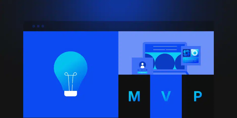
Introduction
Have you ever bailed on a purchase because you couldn’t find the checkout button?
Of course, you have. We all have. And here’s the uncomfortable part: when it happens on your site, somebody just walked out of your store holding money they wanted to give you.
That moment, the tiny flash of “ugh, where do I click,” is the whole ballgame. Good user experience (UX) exists to make that moment disappear. Not to make your site prettier. To make it obvious.
Key takeaways
- Roughly 70% of online carts get abandoned, and clunky checkout is a top cause (Baymard Institute, 2025).
- You don’t need a giant study to spot the problems. Five users will reveal about 85% of them (Nielsen Norman Group).
- Design-led companies grew revenue 32 percentage points faster than rivals over five years (McKinsey).
- Hire for the problem, not the pretty pictures. Ask what the business problem was, what the agency changed, and what happened to the numbers.
Most companies don’t fix this stuff alone. They bring in a UX design agency, which, despite the fancy name, mostly does something pretty down-to-earth: it watches real people use your product and removes the parts that make them think too hard.
That’s it. That’s the job. The rest of this is details.
Why does a good-looking site still lose customers?
A gorgeous website with a confusing checkout is just a well-decorated room with the door in the wrong place. Look at it sideways, and the math is brutal. In its 2026 data, the Baymard Institute put the average online cart abandonment rate at 70.22%, drawn from 50 separate studies, and “the checkout was too long or complicated” is one of the reasons people give most often. (Baymard Institute, Cart Abandonment Rate Statistics, 2026). Pretty doesn’t save you. Clear does.
Here’s the distinction nobody explains well, so I’ll try.
- UI (user interface) is the paint, the furniture, the nice fonts.
- UX (user experience) is whether the doors are in places that let you walk through the house without barking your shin.
You can nail the first and completely whiff the second. Designers have a word for the shin-barking: friction. Every bit of friction on the path to “buy” is a little jammed door. Enough jammed doors, and people leave.
| Online checkout outcome | Share |
| Carts abandoned | 70.22% |
| Carts completed | 29.78% |
Most people who add to the cart never finish. Friction is usually why.
Source: Baymard Institute, 2025 (aggregate of 50 studies).
So, how do you find the jammed doors? You look. A ui ux design services company is basically a team of people paid to look at your product the way a confused first-time customer would, and to point out the doors that don’t open.
A quick checklist of the invisible problems they hunt for:
- Buttons that blend into the background instead of begging to be clicked.
- Sign-up forms that demand your life story before they’ll let you in.
- Menus so vague that finding one thing feels like a corn maze.
None of that shows up in a screenshot. All of it shows up in your sales numbers.
What does a UI/UX design agency actually do all day?
They watch people, and they take notes. The classic finding from Jakob Nielsen still holds up: you only need about five users in a test to surface roughly 85% of the usability problems on a screen (Nielsen Norman Group). Five. Not five hundred.
That number surprises people, so let me say why it’s good news. You don’t need a research lab or a six-figure budget to find out your menu is confusing. You need five regular humans, a screen, and someone willing to shut up and watch them struggle
And watching matters more than asking. You, the owner, are the worst possible judge of your own product. You built it. You can’t be confused by it anymore. A UI/UX design agency brings the one thing you’ve lost: fresh eyes that don’t already know where the button is.
Think of it as the detective method. You don’t ask the suspect how the crime happened. You watch the footage. When a real user hovers, squints, and clicks the wrong thing three times, that’s your evidence. Move that one button, and sometimes daily sales just… go up. It’s not magic. It’s noticeable.
The money part: why testing pays for itself
Here’s the line that gets a CFO to lean in. In its 2018 study of 300 public companies, McKinsey found that the most design-led firms grew revenue 32 percentage points faster than their industry rivals over five years and delivered 56 points more in total shareholder returns (McKinsey, The Business Value of Design, 2018). That’s not “design is nice.” That’s “design is on the balance sheet.”
| Annual revenue growth | Rate |
| Design-led (top quartile) | ~10% |
| Everyone else | ~5% |
Companies that take design seriously don’t grow a little faster. They grow a lot faster. Source: McKinsey, The Business Value of Design, 2018.
The reason testing is such a bargain is timing. Fixing a confusing flow on a clickable mockup costs you an afternoon. Fixing the same flow after engineers have built it, shipped it, and wired it to your payment system costs you a small fortune and a very awkward meeting. It’s the difference between erasing a pencil line and knocking down a wall.
This is the part worth remembering when you’re comparing options. The top UX design consultancy companies in 2026 save you money by finding the expensive mistakes before anyone writes the expensive code.
How does an agency figure out what you actually need?
Before anyone draws a single screen, a decent agency does the boring, valuable part: they ask questions. Designers call it the discovery phase. You can call it “surveying the land before you pour concrete.” Skip it and you’ll build something beautiful that solves a problem nobody has.
In practice, discovery starts inside your building, not your customers’. The team sits down with you and asks the unglamorous questions. How does this product make money? What does “it worked” actually look like in six months? You’d be amazed how often the founders in the room give three different answers. Better to find that out now.
What you typically get at the end of discovery:
- User personas — short, honest profiles of the people you’re really building for.
- Empathy maps — a simple picture of what those people think, feel, and do.
- A research summary—plain evidence of which features people need versus which ones sounded cool in a meeting.
None of this is complicated. It’s just writing down who you’re building for before you build, so the design solves a real problem instead of a guessed one.
What do you actually get? (the deliverables)
You’re not paying for “some designs.” You’re paying for a stack of things you can hand to developers and to your own team. A good ui ux design services company spells these out before you sign, so nobody’s surprised at the end.
Here’s the usual list:
- Research findings — who your users are, where they get stuck, what they actually need.
- User flows and information architecture — the map of how someone gets from “hello” to “done.”
- Wireframes — the rough, gray-box layout before anyone picks colors.
- High-fidelity UI designs — the real, polished screens.
- A design system / component library — reusable buttons, forms, and styles so the product stays consistent as it grows.
- A clickable prototype — so you can feel it before it’s built.
- Developer handoff files — specs, assets, and notes so engineers build it right the first time.
If an agency can’t tell you which of these you’re getting, that’s your answer about how organized the rest of the project will be. Ask for the list in writing.
How long does a UI/UX project take?
Honest answer: most real projects run 6 to 16 weeks, and anyone who promises a polished product in a few days is selling you speed, not design.
The timeline tracks the scope:
- A UX audit of an existing product: 1–2 weeks.
- A focused redesign (a checkout, an onboarding flow): 3–6 weeks.
- A full product, research through handoff: 10–16 weeks, sometimes more.
The part people want to skip is the part that saves the most time: research and prototyping up front. Testing a clickable mockup takes days. Rebuilding a shipped feature that confused everyone takes months. A saas web design agency that front-loads the testing is buying you speed later, even if it feels slow now. Slow is smooth. Smooth is fast.
What does a UI/UX design agency cost?
Straight answer: most agency projects land between $15,000 and $80,000, with hourly rates from $100 to $300 depending on who you hire and where they sit (Clutch pricing data, 2026). That’s a wide gap, so here’s how to place yourself in it.
Think of it like hiring a contractor. A handyman, a regional builder, and a high-end architecture firm will all “do your kitchen,” and they will not quote the same number. Same with a ui ux design agency. What moves the price is scope (how many screens), seniority (junior hands vs. senior thinkers), and location (a New York studio costs more than a boutique elsewhere).
| What you’re buying | Typical range | Best for |
| Hourly, boutique studio | $80–$150/hr | Small fixes, audits, overflow |
| Hourly, senior/enterprise | $150–$300/hr | Complex, specialized products |
| SaaS MVP (project) | $15,000–$60,000 | New product, research to handoff |
| Mobile app design (project) | $25,000–$80,000 | Full app; startups often $15k–$35k |
| Monthly retainer | $3,000–$25,000/mo | Ongoing design without hiring |
Source: aggregated 2026 agency pricing (Clutch; Dribbble).
One rule worth more than the table: cheap design that confuses people isn’t cheap. It’s just a bill you pay later, in lost sales, when you redo it. Pick the partner who scopes the problem honestly, not the one with the smallest invoice.
What happens after launch?
Launch isn’t the finish line. It’s the first day you have real users doing real things, which means it’s the first day you have real data about what’s still confusing. The best saas website design agency relationships don’t end at handoff. They keep watching.
Good post-launch support usually covers:
- Bug fixes and design tweaks for the things only real traffic reveals.
- A post-launch check-in — a round of usability testing once people are actually using it.
- Iteration on the weak spots — the one screen where everybody still hesitates.
- Design-system upkeep so new features don’t drift into a mismatched mess.
Ask up front whether support is included, billed hourly, or sold as a retainer. There’s no wrong model. There’s only the surprise you didn’t budget for. Settle it before you sign, not after.
Does this apply to my industry?
Short version: yes. Friction is friction whether you’re selling sneakers or software. But the kind of friction changes by industry, and the right partner has seen yours before.
- SaaS and B2B software: dense dashboards, complex settings, onboarding that makes or breaks a trial. The ux design consultancy companies 2026 buyers shortlist almost always lead with SaaS experience.
- E-commerce: the whole game is the path from product to paid. Every extra step bleeds the 70% who already abandon carts (Baymard, 2025).
- Fintech and healthcare: trust and clarity matter more than flair, and accessibility and compliance aren’t optional.
- Mobile apps: small screens punish clutter. There’s nowhere to hide a confusing layout.
When you vet an agency, ask for case studies in your world. A team that’s solved your kind of problem before will spot your traps faster.
Keeping people around: navigation that doesn’t make them quit
When someone can’t find the checkout and gives up, they don’t just leave that session. Often, they leave for good. That drop-off feeds your churn rate, the share of users who quit out of plain frustration. And frustration is usually a navigation problem wearing a disguise.
The fix starts with logical organization. Picture a grocery store. You expect produce near the front and milk in the back, and you’re annoyed when a store breaks that unwritten rule. Online, that “where things go” logic is called information architecture. Even a saas website design agency working on dense, feature-heavy software lives or dies on this: can a normal person find the thing without a map?
Once the aisles make sense, designers trace the exact path a person walks through them, screen by screen, from “hello” to “thanks for your order.” That’s user flow mapping. When it’s done right, the customer never stops to think about what to click next. Which, not coincidentally, is the entire point of good UX. Don’t make them think.
Why do the best agencies refuse to guess?
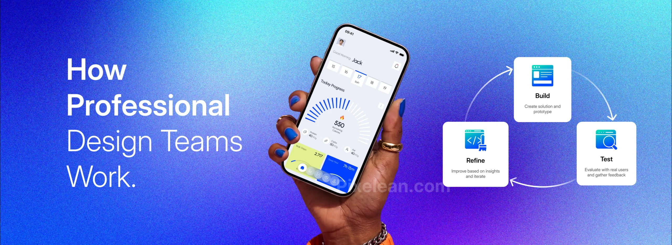
Building a product is like writing a book. Nobody publishes the first draft. Professional teams loop through the same three steps, on purpose, over and over:
- Build a rough, clickable mockup.
- Test it on actual humans.
- Refine the parts that tripped them up.
Then they do it again. This is iterative prototyping, and it’s the opposite of the “design it, build it, pray” approach that wastes so much money.
One thing this loop catches that pure guesswork never will: accessibility. A serious team checks that someone using a screen reader or who can’t use a mouse can still get through your product. This isn’t a feel-good extra. In many markets, it’s a legal baseline, and it’s a chunk of customers you’d otherwise lock out for no reason. A good SaaS web design agency treats accessible design as part of the floor, not a bonus on top.
Should you hire an agency or build an in-house team?
Should you hire outside experts or grow your own team? Honestly, it depends on one thing: how steady the work is.
If you need design changes every single day for years, an in-house team makes sense, like keeping a full-time maintenance crew for a building you’ll own forever. But launching something new, or ripping out a tired old site and starting fresh, calls for a concentrated burst of senior expertise you don’t need year-round. That’s the case for an outside firm.
There’s also a distinction people miss, and it costs them. A creative agency is mostly about branding and marketing, making things look and feel like you. A UX firm is more like a structural engineer, making sure the thing actually works when someone uses it. Both are useful. They are not the same hire. When you’re scanning UX design firms, make sure the ones you’re talking to are engineers of experience, not just decorators.
And when you review their work, don’t get hypnotized by pretty case-study screenshots. Ask three questions about every project:
- What was the business problem?
- What did you change?
- What happened to the numbers?
An agency that can’t answer the third question with a straight face is selling you art, not results. The strongest portfolios read like before-and-after stories: here was the confusing old flow, here’s what we changed, here’s the conversion lift. Forrester research has long argued that a better-designed interface can raise conversion rates substantially when the work is done right (Forrester, via UX ROI research). The exact number matters less than whether the agency thinks in numbers at all.
What should you ask before you sign?
Most people interview an agency by looking at pretty pictures. Pretty pictures tell you almost nothing. Ask these instead, and watch how they answer:
- Can you show me three live products you’ve shipped? Live, not concepts. Real things real people use.
- Can I talk to two past clients directly? A confident agency hands you the phone numbers.
- What’s your process when you don’t yet know the answer? You want “we test,” not “we just know.”
- Did you ask about my users before my budget? The order matters.
- Who actually does the work? Sometimes you meet the senior team and get handed juniors. Ask.
- Do you push me to cut scope, not add features? Good partners protect your budget.
- What does handoff look like for my developers? And is pricing and timeline written down?
The best ux design firms will enjoy these questions. The ones to avoid will get cagey. That tell is worth more than any portfolio. Check all seven and you’ve found a real partner.
What does good work actually look like? (case study)
Remember the three questions you should ask any agency: what was the problem, what did you change, what happened. Here’s one of ours, answered in that order.
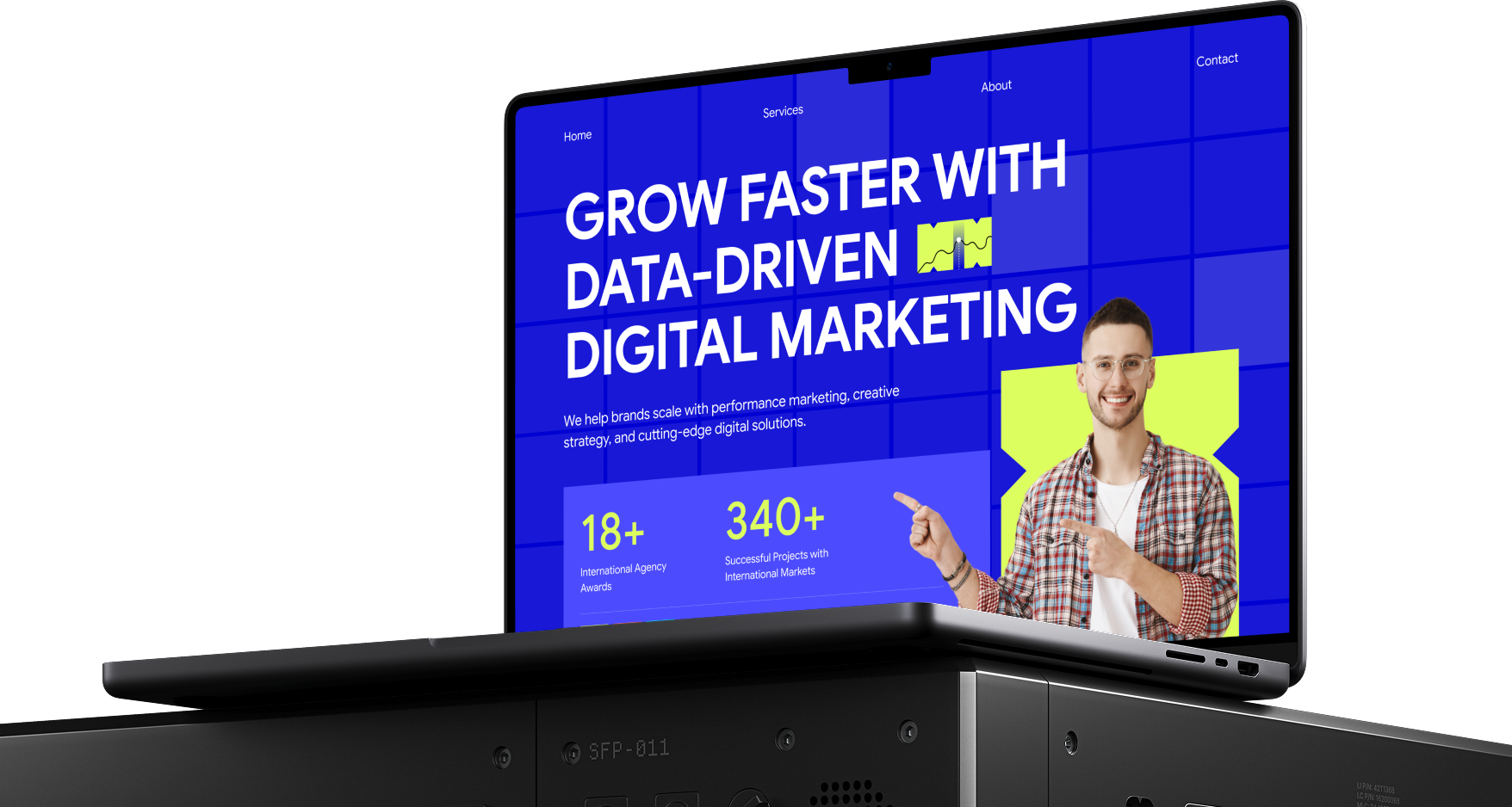
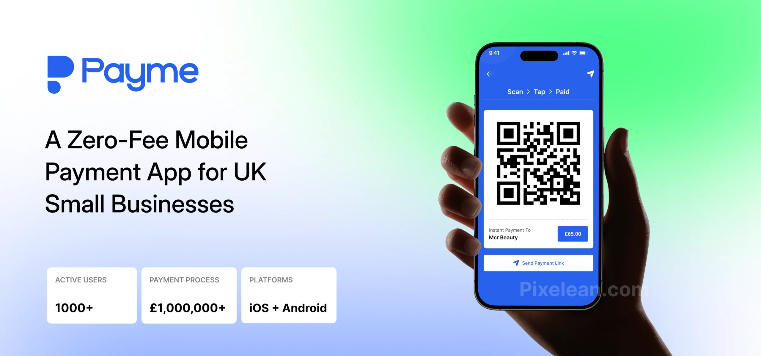
Payme is a UK fintech app that lets small businesses take payments by bank transfer, through a QR code or a link, with zero percentage fees. Its promise is right on the tin: keep 100% of every payment. Our job was the complete UI/UX, from a blank page to 40+ production screens across iOS and Android.
The problem. Card machines quietly bleed small businesses. Every tap of a card costs them 1.5% to 2.5%, plus hardware, plus WiFi, plus the odd failed checkout. The honest alternative, a plain bank transfer, was worse to actually use: read out your sort code, spell your account number, wait, hope, and have no clean way to confirm the money landed. Two bad options. Payme needed a third one that felt as easy as tapping a card machine, and the catch was that the thing underneath, Open Banking, account-to-account transfers, is exactly the kind of phrase that makes a non-technical user freeze.
What we did. Structure before style. In a payment app, the layout is the trust, so we got the flows right before anyone picked a color. The merchant side had to reach a QR code in as few taps as possible: open the app, type an amount, done, with a Quick Amounts preset for the lash tech who always charges £45. Onboarding is where fintech apps hemorrhage users, so we broke it into one question per screen, with a visible progress bar and plain copy explaining why each step exists. And we solved the scariest part, “connect your bank,” by showing familiar bank logos and framing it as secure and one-time, borrowing the mental model people already trust.
The clever bit is the customer side. With Payme, the person paying downloads nothing. They scan the code, it opens their own banking app with the details prefilled, and a clean branded receipt closes the loop. We removed the single biggest friction point in bank transfers by designing the handoff, not another app to install.
The result. Payme is live on the App Store and Google Play and has processed over £1,000,000 in payments since launch (usepayme.com). Plans start at £4.99 a month, up to roughly 6x cheaper than card-machine fees for a typical trader. Customers complete payments having installed zero extra apps. That £1M says the quiet part out loud: real businesses are running real money through the flows we designed.
The principle behind all 40+ screens was the same one that runs through every project we take on: clarity through reduction. One question per screen. One obvious action. Take out the steps between the user and the thing they came for. Make it so simple nobody has to think about it, especially when the thing they’re doing is handing over money.
Your move: a 15-minute head start
The best design is invisible. When an app feels like it’s reading your mind, that’s a UI/UX design agency sweating the details so you don’t have to. Treat UX as an investment, not a decorating bill, and it tends to pay you back.
Before you talk to anyone, do this. It takes about fifteen minutes and it’ll make every agency conversation sharper:
- Find your single biggest drop-off point. Where do people quit?
- Write down who your main users actually are. Be specific.
- Decide what a profitable, successful outcome looks like for your team.
Then do the most useful thing of all: open your own website and try to buy your own product, or contact your own team, like a stranger would. Note every place you hesitate. That list of hesitations? That’s your real brief. Hand it to whichever partner you pick, whether a broad firm or a focused SaaS web design agency, and you’ll get a much better answer than “make it pop.”
You don’t need a meeting to start. You need a stopwatch and an honest fifteen minutes.
Still guessing where your users get stuck?
The hardest part of fixing UX isn’t the redesign. It’s seeing the friction in the first place, the jammed doors you’ve stopped noticing because you built the place. That’s the work a good design partner does: fresh eyes, real user testing, and changes you can measure.
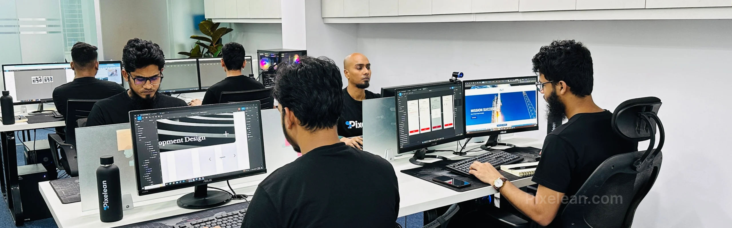
Pixelean designs UI/UX, SaaS applications, mobile apps, and websites with that detective mindset built in, not bolted on after launch. We’ve worked with startups and scaling SaaS teams across six continents, and the work we do is exactly what this article is about: removing friction, proving it with real users, and turning drop-off into revenue.
If you’re choosing a UX partner, or just trying to find your own biggest leak first, this is what we do.
See how Pixelean can help
Frequently asked questions
What does a UI/UX design agency actually do?
A UX design agency studies how real people use your website or app, finds the spots where they get stuck, and redesigns those spots so the product is easier to use. The work usually includes research, prototyping, and usability testing. The goal is fewer abandoned carts and more completed actions, since around 70% of carts are abandoned today (Baymard, 2025).
How much usability testing do I really need?
Less than you’d think. Testing with just five users typically uncovers about 85% of the usability problems on a given screen (Nielsen Norman Group). You’re better off running small tests often than one giant test once. Frequent, cheap rounds catch problems while they’re still cheap to fix.
What’s the difference between UI and UX?
UI is how a product looks: the colors, fonts, buttons, and layout. UX is how it works when someone tries to get something done. A product can have beautiful UI and still fail if the UX is confusing. Good UX means a user moves from start to finish without stopping to wonder what to click next.
Should I hire a UX firm or a general creative agency?
It depends on the problem. A creative agency focuses on branding and marketing. A UX firm focuses on making the product genuinely easy to use. If your issue is “people can’t figure out how to buy,” you want a UX firm. If it’s “our brand looks dated,” a creative agency may fit better. Many of the strongest UX design firms do both, but always confirm which one they lead with.
How do I evaluate a UX agency’s portfolio?
Skip the eye candy and ask three things about each project: what was the business problem, what did the agency change, and what measurable result followed. Strong case studies tell a clear before-and-after story with real numbers, not just attractive screenshots. Design-led companies have grown revenue 32 points faster than peers (McKinsey), so a good agency should think in business outcomes.