Aeroatlas
Mobile App Design

aeroatlas
Client

Aeroatlas

Industry

Travel & Aviation

Headquarter

USA

Services

Product Design & UI/UX

About project

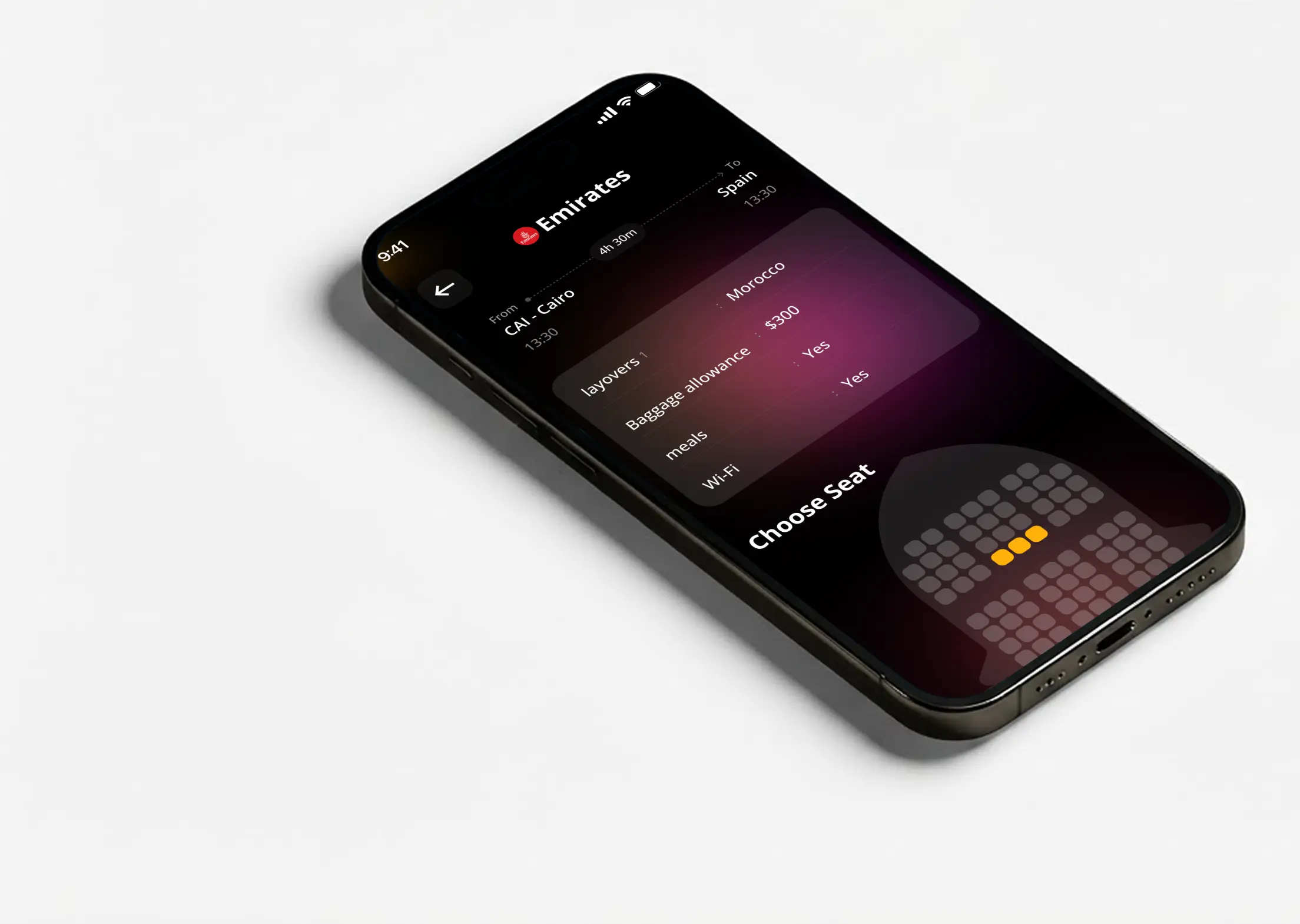
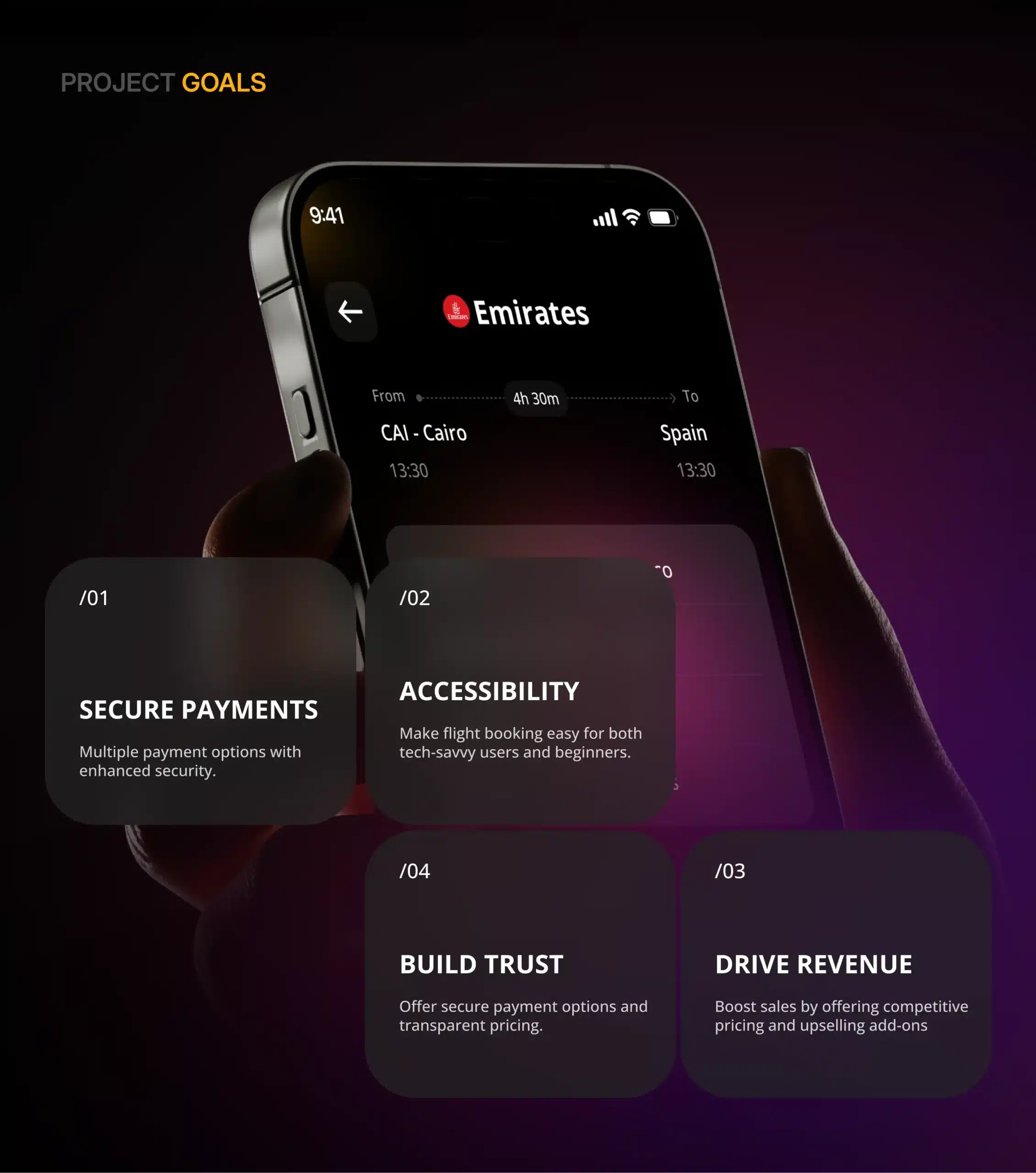
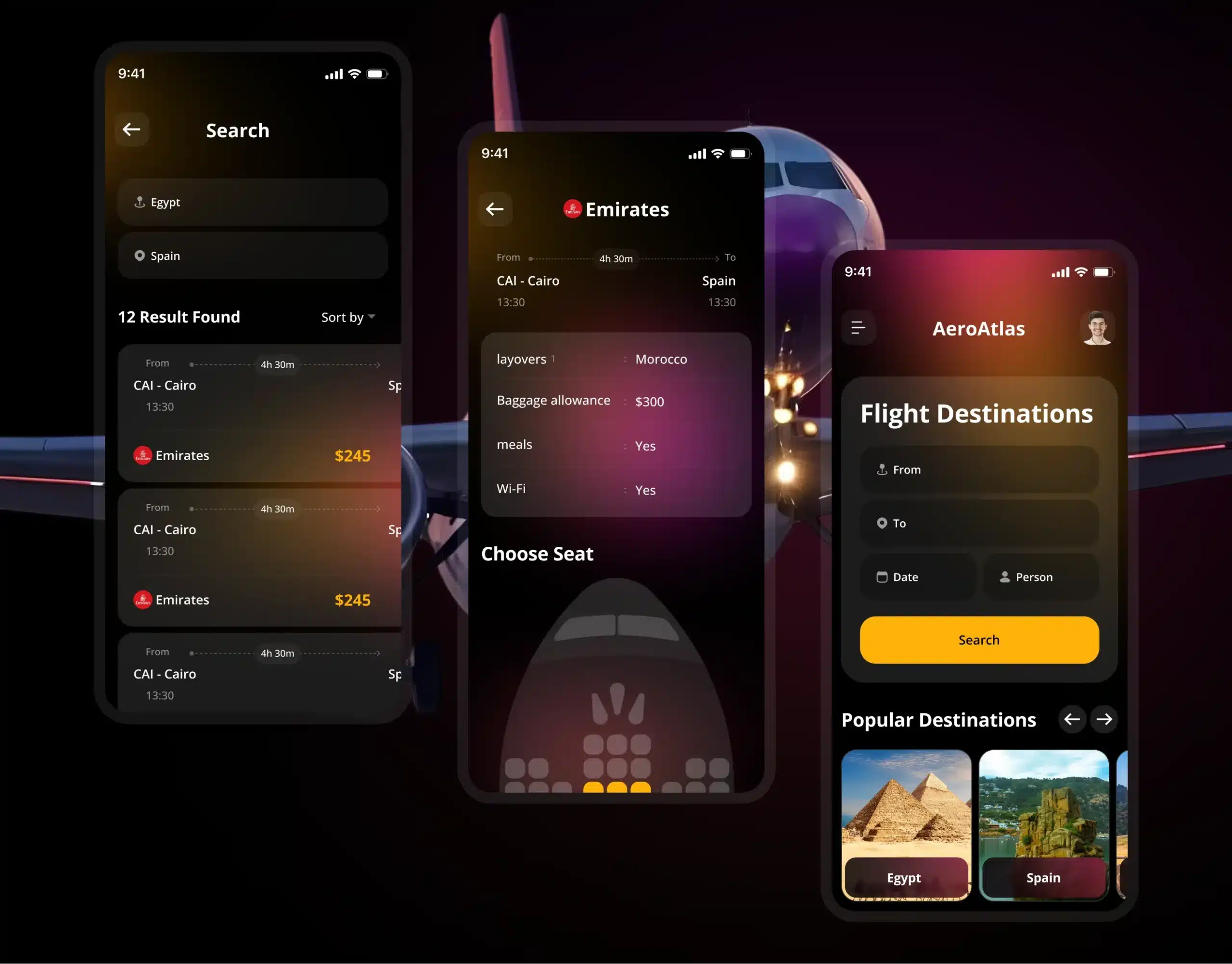
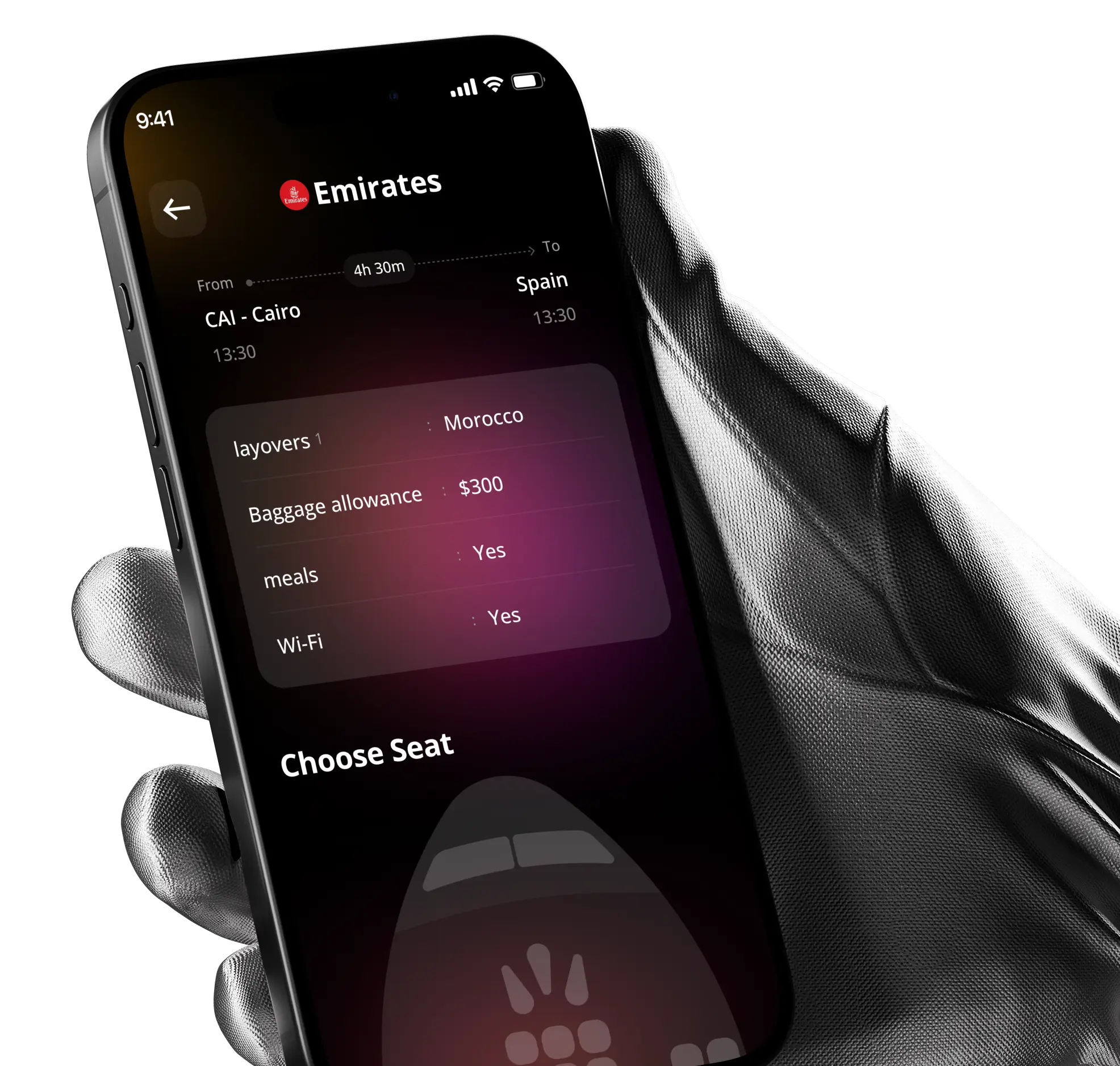
AeroAtlas set out to revolutionize the flight booking experience by creating a user-centric mobile application. The app simplifies the complexities of searching, comparing, and booking flights, making travel planning more accessible, transparent, and convenient for everyone.

The previous digital experience lacked a clear content hierarchy, intuitive navigation, and consistent visual language. Visitors struggled to understand the agency’s offerings, making it difficult to convert traffic into qualified leads.

Project
challenges

Pixelean redesigned the entire experience around user behavior and business objectives. We introduced a clean information architecture, refined visual hierarchy, engaging interactions, modular components, and responsive layouts to create a website that communicates credibility while encouraging conversions.

Visual system

Colors & typography

White

#FFFFFF

Yellow

#FFB10A

Black

#000

Heading & body

Headings & key typography for fintech: sleek, modern, and innovative.

Open Sans

Aa

aeroatlas
aeroatlas

Design process

Discovery

Kickoff day

UX design

Iteration day

UI design

Sprint two

Delivery

Sprint four

Wireframing

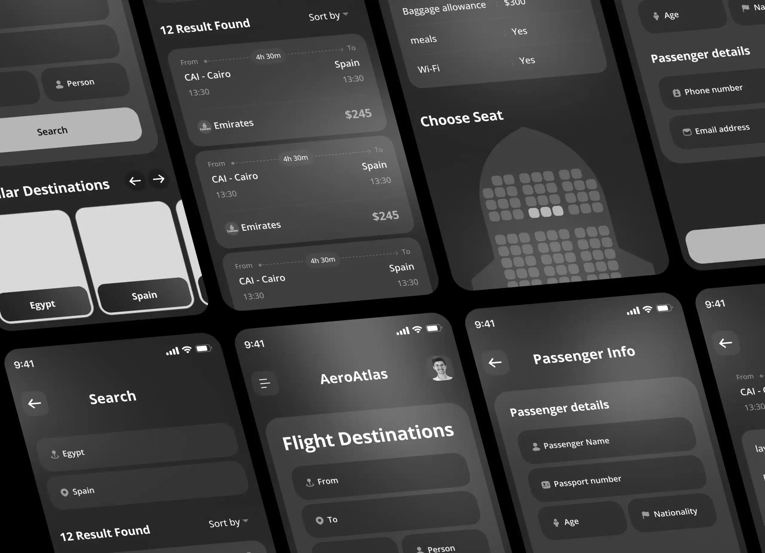
Before moving into high-fidelity design, we explored low-fidelity wireframes to simplify the complete flight booking journey. This helped us establish clear navigation, organize search results, prioritize essential flight information, and create a smoother path from discovering a flight to completing a booking.

aeroatlas

UI layouts

aeroatlas
aeroatlas

Results

Simplified Flight Discovery
0

A clearer search experience helps travelers find relevant flights without navigating through unnecessary complexity.

Faster Comparison
0

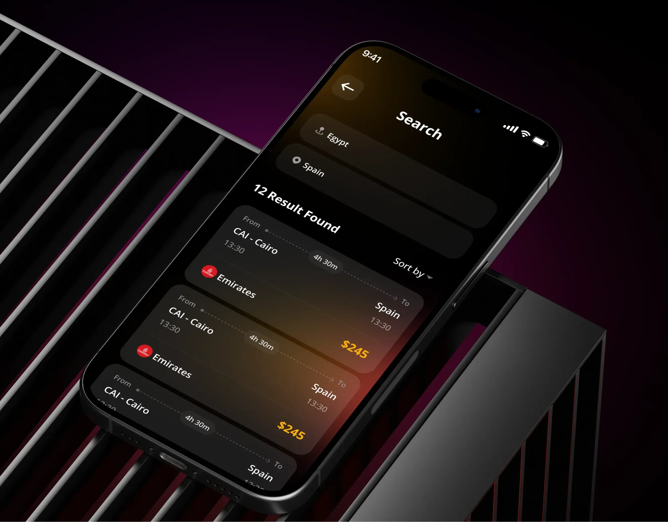
Structured flight cards and intuitive filters make it easier to evaluate multiple options at a glance.

Greater Price Transparency
0

Clear fare breakdowns help travelers understand what they’re paying before completing their booking.

Smoother Booking Experience
0

A streamlined checkout reduces unnecessary steps and creates a more confident path toward reservation.

cta logo

Tell us what you
are building

Send us what you have, a brief, a rough idea, or just a problem you need solved, and we will come back with a clear scope, platform recommendation, and honest timeline.