Dronly
Website Design

dronly banner image
Client
DRONLY
Industry
Product
Headquarter

USA

Services

Design & Branding

About Project

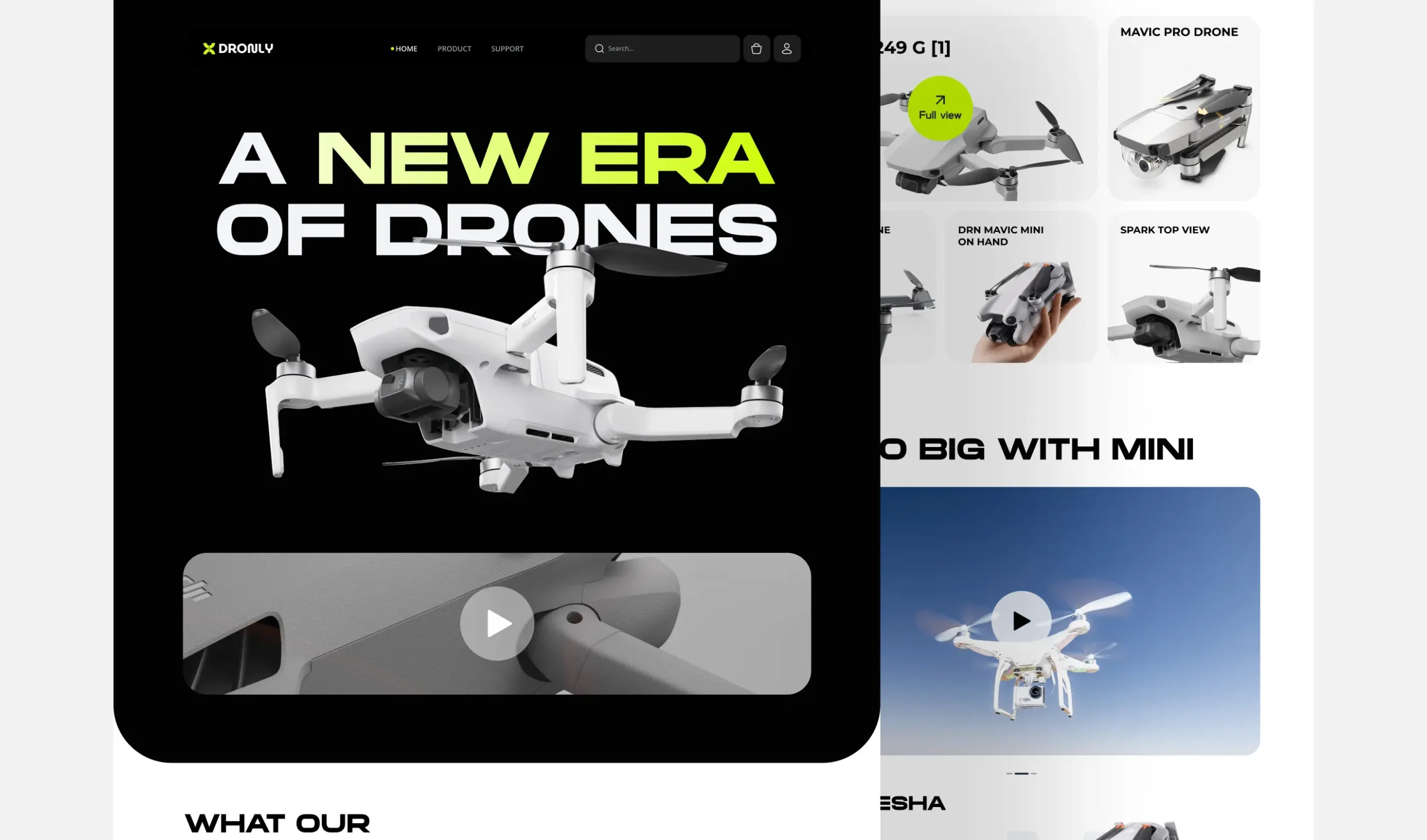
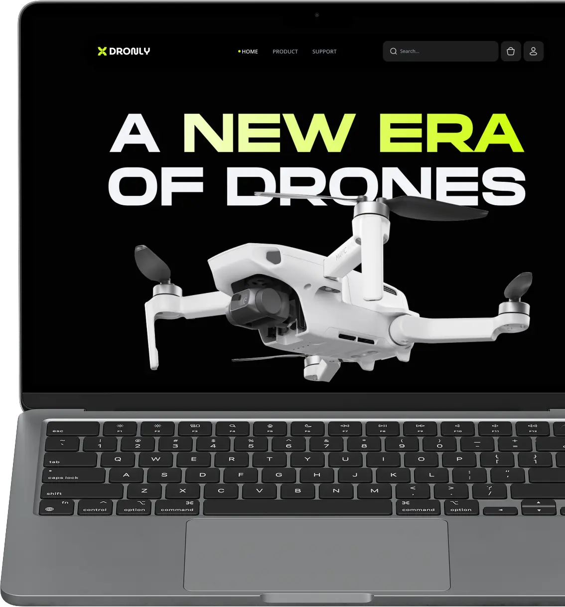
DRONLY is a premier hospitality brand seeking to digitize its booking experience. The project focuses on creating a seamless, intuitive platform that transforms how travelers discover and reserve accommodations. By removing friction from the booking process, we aim to offer a faster, more secure, and visually engaging solution for users, free from complex navigation hurdles.

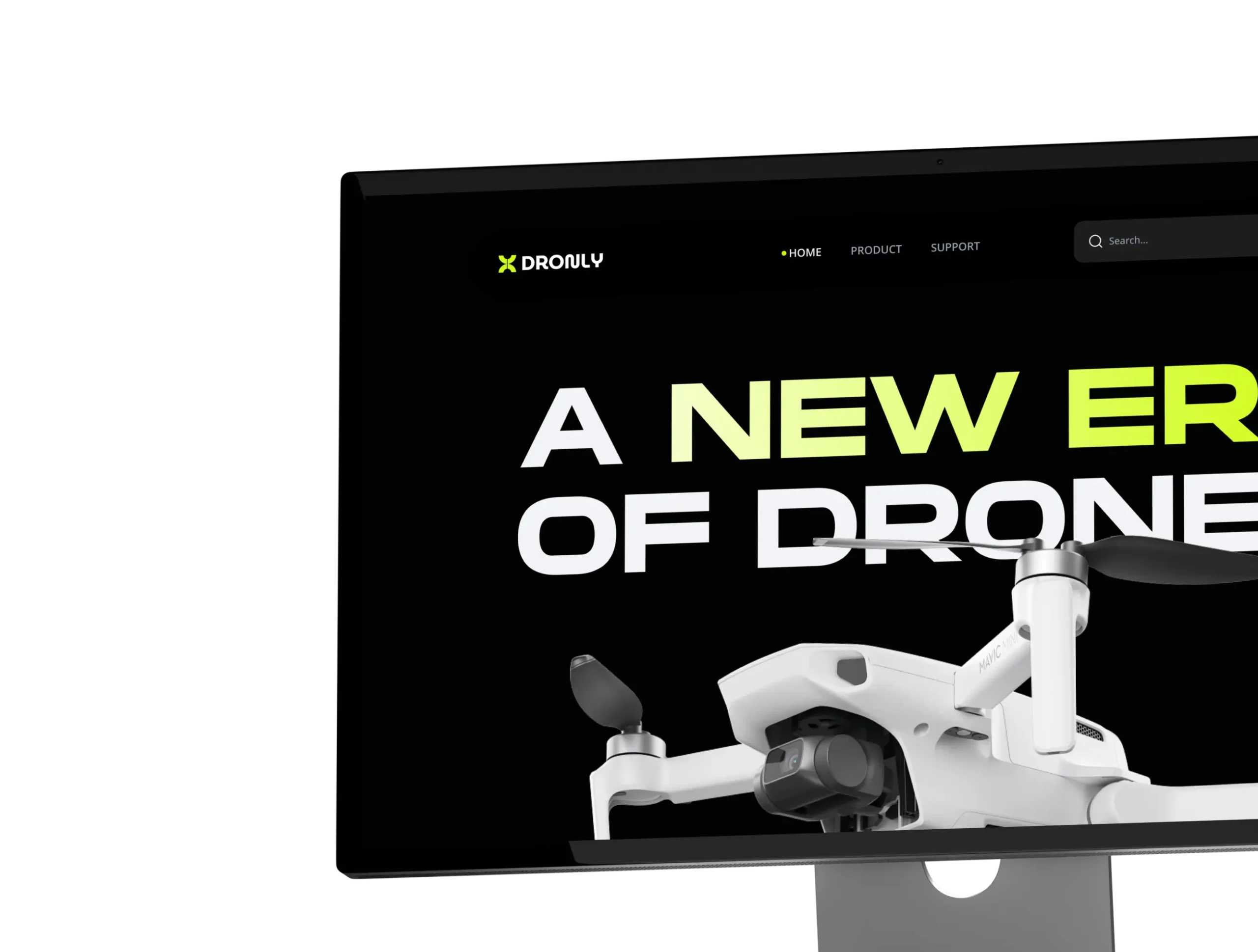
The previous digital experience lacked a clear content hierarchy and intuitive filtering, making it difficult for users to find available rooms. The booking flow was fragmented, leading to high cart abandonment rates and an inability to convert traffic into confirmed reservations.

Project Challenges

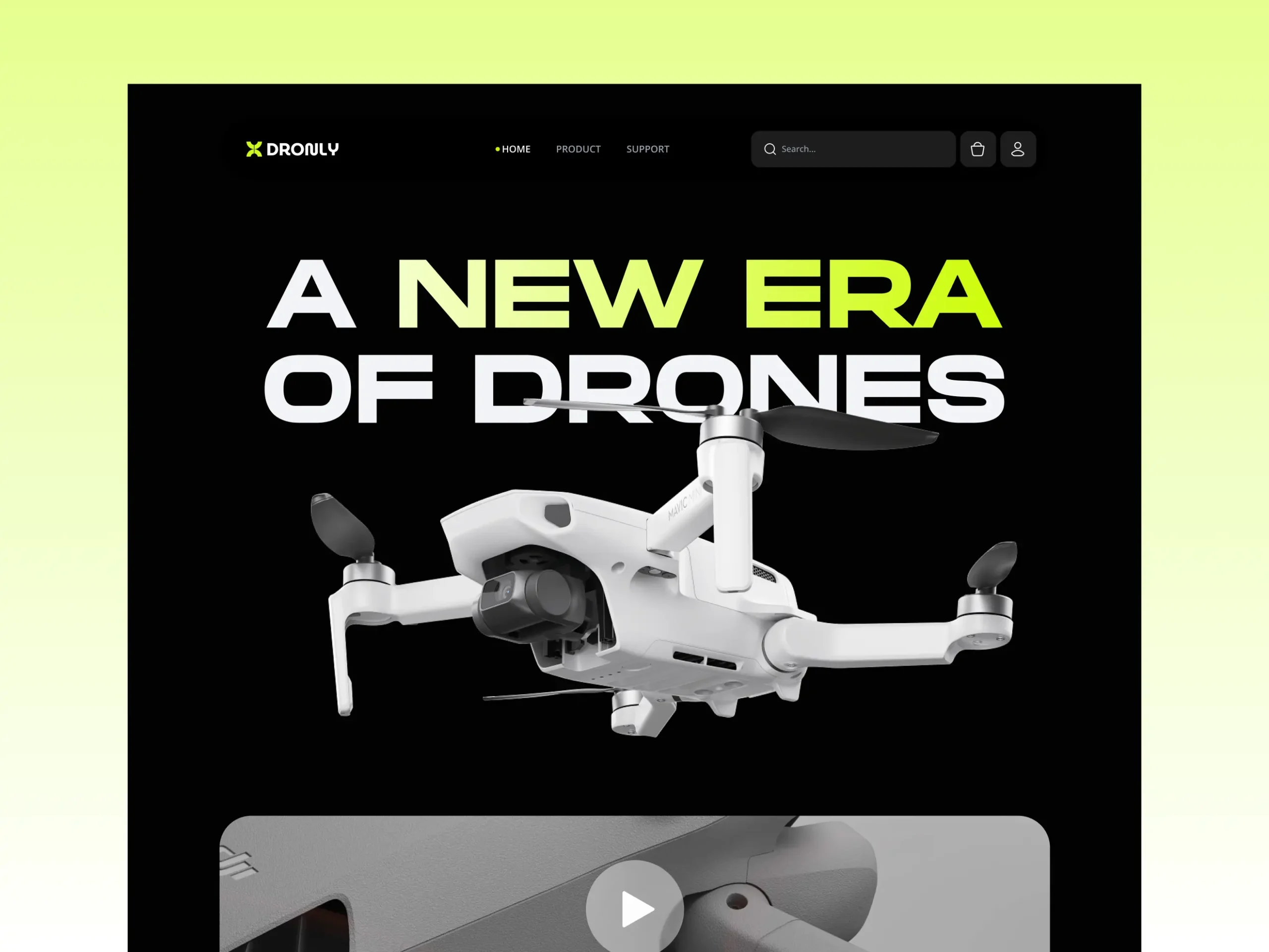
Pixelean redesigned the entire experience around user behavior and booking objectives. We introduced a clean information architecture, refined visual hierarchy, and engaging search filters. The new modular layout communicates credibility and trust while encouraging users to complete their reservations effortlessly.

Visual System

Colors & Typography

White

#FFFFFF

Lime

#CBFC01

Black

#000000

Heading & Body

Headings & key typography for fintech: sleek, modern, and innovative.

Mortend

Aa

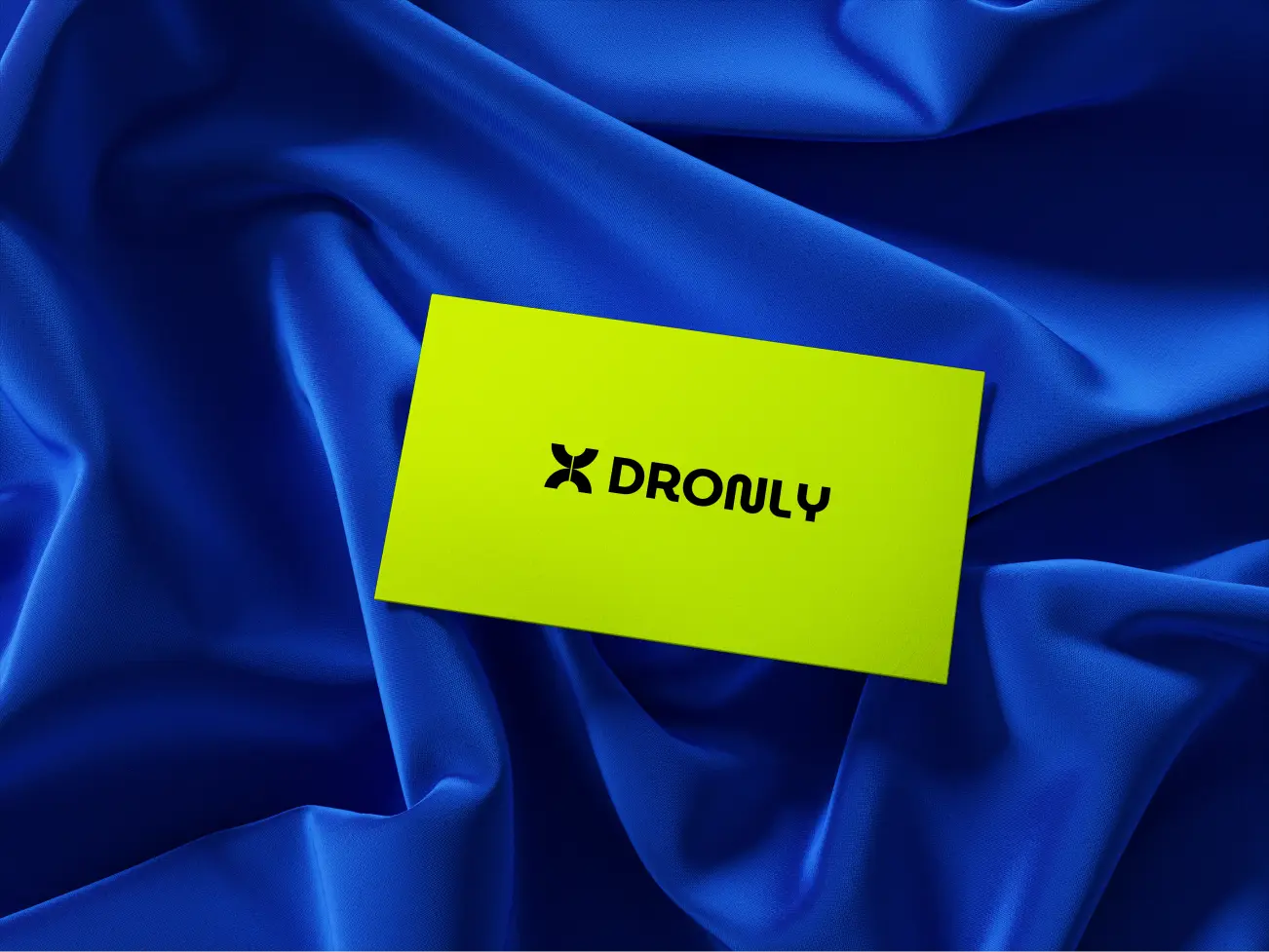
Logo Design

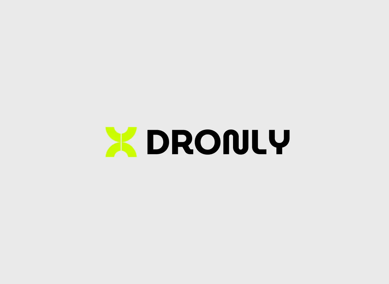
Logotype

Design Process

Discovery

Kickoff Day

UX Design

Iteration Day

UI Design

Sprint Two

Delivery

Sprint Four

Wireframing

Before high-fidelity design, we explored layouts with low-fidelity wireframes. This validated hierarchy, user journeys, and content placement early. Each section guided visitors from discovery to booking while ensuring simple navigation.

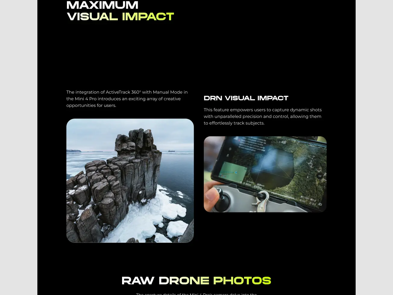
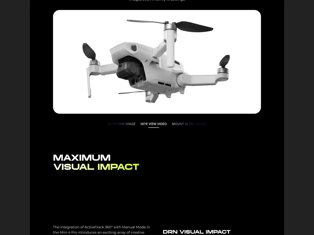
UI Layouts

dronly image 10

Results

Increased Booking Completion Rate
+ 0 %

Simplified checkout process and optimized room selection resulted in a notable rise in successful reservations.

Higher User Retention
+ 0 %

Personalized recommendations and a seamless loyalty program integration led to improved repeat booking rates.

Expanded Mobile Engagement
+ 0 %

The introduction of a mobile-first design and quick-book features attracted a broader audience to the platform.

Boosted Customer Support Efficiency
+ 0 %

Implementation of AI chatbots and a comprehensive help center increased response rates and guest satisfaction.

cta logo

Tell us what you
are building

Send us what you have, a brief, a rough idea, or just a problem you need solved, and we will come back with a clear scope, platform recommendation, and honest timeline.