Most startup apps don’t fail because of the code. They don’t fail because of the budget, either, or because a bigger competitor showed up first. They fail because somebody opens the app, can’t figure out what to tap next, and deletes it before they finish their coffee. That’s not a development problem. That’s a design problem, and here’s the annoying part: it started before anyone wrote a line of code.
People hear “design” and picture the fun part. Colors. Fonts. The little bounce an icon does when you tap it. That stuff matters, eventually. But by the time anyone’s picking a shade of blue, the decisions that actually determine whether your app works have already been made. Who it’s for. What they’re trying to get done. Whether they can get there without stopping to think about it.
This guide is about mobile app design services: what they actually include, which ones a startup genuinely needs right now, and how the whole thing runs from a rough idea to a file your developers can build from without guessing. No upsell, no filler. Just what you’re paying for and why it matters.
Key takeaways
- 88% of users abandon an app after one bad experience. 32% won’t return to a brand they liked after that same experience. Design is where most first bad experiences start. (Applause, PwC)
- Mobile app design services cover seven distinct phases. Most startups only budget for two of them.
- Designing the core flows before building them costs far less than building everything at once and discovering the problems after launch.
- The deliverable that decides whether any of this was worth it is a developer-ready handoff file. Skip it, and your developers build their best guess instead of your design.
- Design and development are two different jobs. You’re allowed to hire them from two different places.
What are mobile app design services?
Mobile app design services cover the whole process of turning an idea into something a developer can actually build: research, structure, screens, a working prototype, and a handoff file. That’s the job, start to finish. Everything a designer does lives somewhere on that path, from the first conversation with a user to the last annotated layer in Figma.
The word “design” is where people get tripped up. They hear it and picture the visual layer: colors, polish, the stuff that looks nice in a pitch deck screenshot. That’s real, and it comes near the end. The bigger part of the job happens earlier, and it’s structural: figuring out who’s using the thing, what they came to do, and the shortest path that gets them there without confusion.
This is the distinction that saves startups real money. Design and development are two separate services done by two different kinds of people. A design agency hands you a blueprint. A development team builds the house. You’re free to hire them separately, and plenty of founders do, because once you understand the split, you can budget each half honestly instead of paying one vendor for a bundle you can’t see inside.
Design Services vs. Development Services
| Phase | Design or development | Who does it | Output |
| User research | Design | Design agency | Research report |
| Information architecture | Design | Design agency | Sitemap and user flows |
| Wireframing | Design | Design agency | Low-fidelity screens |
| UI design | Design | Design agency | High-fidelity screens |
| Prototyping | Design | Design agency | Clickable prototype |
| Handoff | Design | Design agency | Figma files and specs |
| Coding | Development | Dev team | Working app |
| QA testing | Development | Dev team | Bug-free build |
| App Store submission | Development | Dev team | Published app |
Look at that table for a second. Almost everything the design agency does happens before a developer touches a keyboard. That’s on purpose. The cheapest place to change your mind about how something should work is in a Figma file. The most expensive place is in shipped code, three sprints deep, with a launch date already announced.
What design services does a startup actually need?
Not all of them. Not yet, anyway.
The most common budgeting mistake founders make is paying for scale-stage design work when they’re still at the MVP stage. You don’t need a fully documented design system with a fifty-component library to ship a first version of anything. You need the essentials done properly, and you need to save the rest for later, once real users have told you what actually needs building next.
Think of it as three stages. At MVP, you’re proving the core idea works and that people will actually use it. At growth, you’re refining based on what you learned from people who did. At scale, you’re building the infrastructure a bigger team needs so it can move fast without stepping on itself.
Essential vs. Optional by Stage
| Design service | MVP stage | Growth stage | Scale stage |
| User research | Essential | Essential | Essential |
| Information architecture | Essential | Essential | Essential |
| User flows (core) | Essential | Essential | Essential |
| Wireframes | Essential | Essential | Essential |
| UI design | Essential | Essential | Essential |
| Prototype (core flows) | Essential | Essential | Essential |
| Developer handoff | Essential | Essential | Essential |
| Full design system | Optional | Recommended | Essential |
| Accessibility audit | Optional | Recommended | Essential |
| Usability testing | 1 round | 2 to 3 rounds | Ongoing |
| Motion and micro-interactions | Skip | Optional | Recommended |
Read that table from top to bottom, and the shape of a sensible MVP becomes obvious. Seven services are non-negotiable no matter what stage you’re at. Everything else scales up as the product does. If a mobile app design agency insists you need the full stack on day one, either they’ve misread your stage, or they’re padding the invoice. Neither one is a good sign.
One thing worth flagging before we move on. Skipping motion design at MVP is fine, nobody’s first version needs a delightful loading animation. Skipping user research to save money is a different kind of cut entirely, and it’s the one that always costs more later than it saved now.
The mobile app design process: stage by stage
Most founders have never actually watched an app get designed, so the whole thing feels like a black box. Money goes in one end, screens come out the other, and the middle is a mystery. It shouldn’t be. Here’s what happens, in order, roughly how long each part takes.
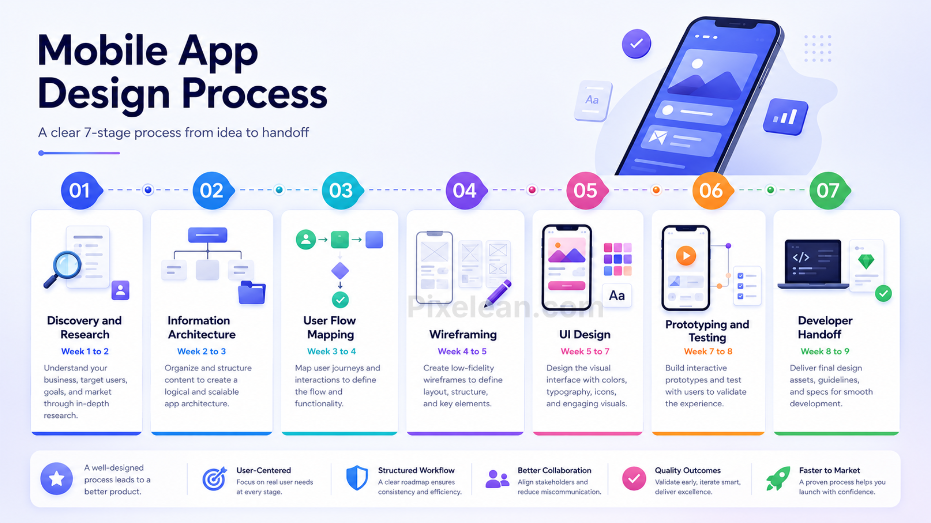
Stage 1: Discovery and Research (Week 1 to 2)
Before anyone draws a screen, a decent agency starts by asking questions. Who’s the user? What job are they hiring your app to do? What does success look like three months after launch? The team runs stakeholder interviews, looks at competing apps, builds a persona or two, and writes down the metrics that will decide whether the design actually worked.
This stage feels slow, because nothing you can point at comes out of it. It’s also the stage that prevents the expensive mistakes. You end up with a research report, a couple of clear personas, and a brief everyone in the room actually agrees on.
Stage 2: Information Architecture (Week 2 to 3)
Now the team maps how the app is organized: which screens exist, how they relate, how a user gets from one to the next. This is the app’s skeleton. Get it wrong here and no amount of visual polish fixes it later. The output is a sitemap and a navigation structure.
Stage 3: User Flow Mapping (Week 3 to 4)
Next, the designer traces the exact path a user walks through each task: sign up, onboarding, the main action the app exists for, payment. Then the paths people forget about: errors, empty states, permission requests. A typical app needs somewhere between eight and twelve documented flows. This is where structural gaps show up while they’re still cheap to fix.
Stage 4: Wireframing (Week 4 to 5)
Wireframes are the app in grayscale. Structure, layout, hierarchy, with none of the visual styling. Stripping out color on purpose forces everyone to argue about whether the layout makes sense before anybody falls in love with a shade of blue. You review the structure here, approve it, and only then move on to visuals. The output is a full wireframe set.
Stage 5: UI Design (Week 5 to 7)
This is the part people picture when they hear “design.” Color, typography, spacing, components, the full set of screens rendered in high fidelity. A team that actually knows what it’s doing also designs the states most apps forget about: empty states, error states, loading states. Those are exactly where cheap design gets exposed. The output is a complete, polished set of screens.
Stage 6: Prototyping and Testing (Week 7 to 8)
The screens get wired together into a clickable prototype. Then five real people try to use it while someone watches over their shoulder. Five is not a typo. The Nielsen Norman Group’s research on usability testing found that testing with five users surfaces most of a screen’s usability problems, which is why several small tests beat one giant one. Whatever trips people up gets fixed here, before any code exists.
Stage 7: Developer Handoff (Week 8 to 9)
The final stage decides whether the previous eight weeks survive contact with development. The designer packages up organized, annotated Figma files with specs for spacing, sizing, and color, exports assets in the right formats, and stays reachable to answer developer questions once the build starts. A clean handoff is the difference between developers building your design and developers building their interpretation of it.
Timeline at a Glance
| Stage | Duration | Primary output |
| Discovery and research | 1 to 2 weeks | User personas, research report |
| Information architecture | 1 week | App sitemap, navigation structure |
| User flow mapping | 1 week | 8 to 12 documented flows |
| Wireframing | 1 to 2 weeks | Full wireframe set |
| UI design | 2 to 3 weeks | Complete high-fidelity screens |
| Prototyping and testing | 1 to 2 weeks | Tested interactive prototype |
| Developer handoff | 1 week | Figma files, specs, assets |
| Total (MVP) | 8 to 12 weeks | Full design package |
UI design vs. UX design: why startups need both
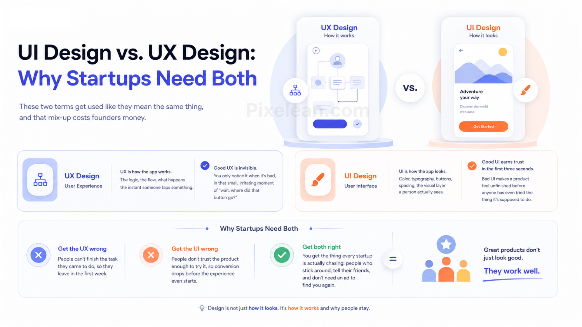
These two terms get used like they mean the same thing, and that mix-up costs founders money.
UX, user experience, is how the app works. The logic, the flow, what happens the instant someone taps something. Good UX is invisible. You only notice it when it’s bad, in that small, irritating moment of “wait, where did that button go?”
UI, user interface, is how the app looks. Color, typography, buttons, spacing, the visual layer a person actually sees. Good UI earns trust in the first three seconds. Bad UI makes a product feel unfinished before anyone has even tried the thing it’s supposed to do.
Here’s why a startup can’t skimp on either one. A first impression is visual and functional at the same time, whether you planned it that way or not. Get the UX wrong, and people can’t finish the task they came to do, so they leave in the first week. Get the UI wrong, and people don’t trust the product enough to try it, so conversion drops before the experience even starts. Get both right, and you get the thing every startup is actually chasing: people who stick around, tell their friends, and don’t need an ad to find you again.
What you actually get: deliverables
Founders sign design contracts all the time without knowing what’s actually going to land in their inbox at the end. That’s a bad position to be in, because it makes it hard to tell a fair deal apart from a thin one. Here’s the full list of what a complete mobile app design services engagement should hand you.
- Research report covering user insights, competitive findings, and design direction
- App sitemap showing the full screen architecture
- User flow diagrams, typically eight to twelve documented flows
- Wireframe set with every screen in low fidelity
- UI design screens, every screen in high fidelity, edge cases included
- Interactive prototype, clickable and shareable
- Design system with a component library and style guide
- Developer handoff file, annotated and spec-ready
- Asset package with icons, illustrations, and images in the right formats
Here’s the useful part. When a quote comes in noticeably cheaper than everyone else’s, it’s usually because something on that list quietly disappeared. No research report means they guessed who your users are. No wireframes means they jumped straight to visuals and skipped the structural thinking entirely. No prototype means the flows were never actually tested on a real person. No handoff specs means your developers are going to interpret the design and build their best guess.
Cheap design is rarely cheap. It’s just a bill that shows up later, during development, wearing a different name.
How to evaluate a mobile app design agency
Once you know what the work actually involves, telling agencies apart gets a lot easier.
Look at the portfolio, but look for the right thing. You want apps in a category close to yours, not just work that looks impressive on a screen. A gorgeous consumer app tells you very little about whether a team can handle a dense B2B tool with forty edge cases.
Ask about process. A team that knows what it’s doing can walk you through each stage clearly, and it asks about your users and your goals before it asks about your budget. If the first question out of their mouth is “What’s your budget?” you’re talking to a vendor, not a partner.
Ask to see a sample handoff file. This is the one deliverable most agencies never volunteer to show, and it’s the one that matters most for your actual build. A clean, annotated, well-organized Figma file tells you a team respects the developers who come after them.
When you review any past project, ask three questions:
- What was the business problem?
- What did you change, and why?
- What happened to the numbers after launch?
A mobile application design agency that can answer the third question with a straight face is thinking about outcomes. One that can’t is selling you decorations.
5 Mistakes startups make with mobile app design services
- Treating design as the last step. The plan is always “build first, design later.” The result is always an expensive rewrite once real users show up and reveal what the rushed version got wrong.
- Hiring on aesthetics alone. The most beautiful portfolio in the world doesn’t guarantee the team understands your users or your business model. Pretty is table stakes. Thinking is the part that’s actually hard to find.
- Skipping research to save budget. Cutting research doesn’t remove the cost of understanding your users; it just moves that cost further down the line, into development, where a wrong assumption is much harder and much more expensive to unwind than it would have been in a Figma file.
- Not defining success before design starts. Without a target, activation rate, trial-to-paid conversion, day-seven retention, the design has no north star to aim at. Every decision turns into a matter of taste instead of a matter of evidence.
- Confusing a mockup with a handoff-ready file. A beautiful set of screens with no specs, no annotations, and no component organization forces your developers to guess. Guessing produces bugs, delays, and an app that doesn’t match the design anyone actually approved.
What does mobile app design cost?
Cost comes down to scope, and scope comes down to how many screens you need, how many kinds of users you’re designing for, and how tangled the flows are. Here are realistic ranges for design work at a boutique app UI design company.
| Scope | Estimated cost | Timeline |
| MVP app (8 to 20 screens) | $5,000 to $20,000 | 6 to 9 weeks |
| Standard app (20 to 40 screens) | $20,000 to $60,000 | 9 to 14 weeks |
| Complex or SaaS app (40+ screens) | $60,000 to $120,000 | 14 to 20 weeks |
These ranges cover the whole design scope: research, information architecture, wireframes, UI design, prototype, and developer handoff. Development is a separate budget entirely. Any agency quoting you a firm number before knowing your screen count and user types isn’t estimating. It’s guessing with more confidence than it’s earned.
Not sure what your app actually needs?
Scope determines cost. We’ll tell you both, in the first call. Talk to Pixelean
What good work looks like
Payme is a payment app we designed and shipped. It’s live on the App Store and Google Play, and it has processed more than one million pounds in transactions.
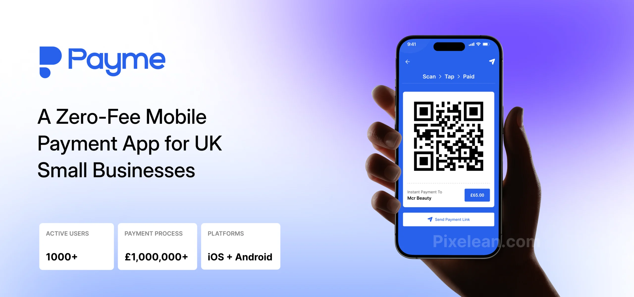
The core problem was friction in a place where friction costs actual money. Users needed to move money quickly and trust that it landed where it was supposed to. Any confusion in a payment flow doesn’t just cost you one conversion; it costs you the user’s confidence in the whole product.
The design work focused on cutting the steps between intent and completion, so a payment felt like one decision instead of a five-screen process, with clear confirmation at every point where someone might otherwise wonder if it actually worked. The result is a product people use to move real money without reaching for a workaround or a second app to double-check it.
The principle behind it is the same one behind every project we take on: find the friction, remove it, and prove the change happened with real usage, not a mood board.
Frequently asked questions
What do mobile app design services actually include?
Mobile app design services cover the complete process of turning a product idea into developer-ready specifications: user research, information architecture, user flow mapping, wireframing, UI design, interactive prototyping, and developer handoff. Design is separate from development. A design agency produces the visual and structural blueprint, and a development team builds from it.
How long does mobile app design take for a startup?
An MVP-scope app typically takes eight to twelve weeks to design, from discovery through developer handoff. The timeline depends on your screen count, your number of user types, and how quickly feedback comes back at each stage. Rushing the wireframe or research phase rarely saves time. It usually creates structural problems that add weeks back in during development.
Do startups need a full design system, or just the screens?
For an MVP, you need the core screens, a basic component library, and a clear style guide. A full design system, with documented tokens, usage rules, and a complete component set, becomes worth the investment once the product is live, you understand how people actually use it, and the team is scaling. Building one before launch is usually an expensive way to solve a problem you don’t have yet.
What’s the difference between a wireframe and a UI design?
A wireframe is a low-fidelity structural layout showing where things go and how content is organized, with no visual styling at all. UI design applies color, typography, and visual treatment to that structure. Wireframes exist so layout problems get caught and fixed before the more expensive UI phase begins. Skip them, and structural issues surface during UI design instead, where they cost more to fix.
Can I hire a design agency separately from a development company?
Yes. Design and development are separate disciplines with separate budgets. Plenty of startup mobile app design engagements work exactly this way: a design agency produces Figma handoff files, and those files go to a development team for the build. It lets you pick the best team for each half of the job. The design agency’s work is done at handoff. The developer’s work starts there.

Need a custom design solution?
Tell us what you’re building. We’ll tell you exactly how we’d approach it.


Your app’s design starts before the first screen.
Pixelean provides mobile app UI/UX design services for startups across North America, Europe, Asia, and beyond, from the first wireframe to the developer handoff. If you’re building your first version or rethinking one that’s already live, the work starts the same way: understanding your users and what a successful launch actually looks like.