Every January, the design blogs publish their “Top 10 Web Design Trends” list. Every December, half of those trends are quietly forgotten, and nobody writes the follow-up admitting it. So before we get into the UI/UX design trends for 2026, let’s agree on the harder question: not what’s trending, but which trends are worth your time.
So let’s skip the part where I hand you another list to forget.
Here’s what’s actually going on in 2026. AI doesn’t just write your copy anymore; it clicks the buttons for your users. Augmented reality finally works on a normal phone without making people seasick. And for the first time, a chunk of “best practice” design is now literally against the law in places where you have customers.
That last one is new. It changes the job.
The real skill in 2026 isn’t knowing the trends. Knowing the trends is easy; you’re soaking in them. The skill is knowing which ones to act on and which ones are just designers being bored. This piece is my attempt to give you that filter. I’ll tell you what’s real, what’s hype, and how to tell them apart for your product, which is the only product that matters to you.
If you’re weighing a redesign right now, the same thinking runs through our UX design agency work every day.
Let’s go.
The short version
The big shifts aren’t visual trends; they’re three underlying forces: AI that takes action, design rules that are now law, and screens that come in every shape. (More below.)
Most “trends” are optional. The legal stuff isn’t. Thirteen US states now regulate dark patterns through their privacy laws, and the EU’s AI transparency rules kick in August 2026.
The most useful thing in this article is a four-question filter (Part 4.5) for deciding whether a trend belongs on your site or in someone else’s portfolio.
The shifts that are actually new
Most of what gets called a “2026 trend” is a color, a font, or a texture. Fine. But underneath the surface stuff, three things are genuinely reshaping how we work. They’re not trends. They’re the reasons the trends exist.
The three forces driving everything else
Force one: AI started taking actions. For years, AI on websites meant “here are some recommendations.” Now it means “I went ahead and booked it.” That’s a different thing entirely, and we’ll get to why it scares me a little.
Force two: ethics became law. “Don’t trick your users” used to be a thing nice designers said. Now it’s a thing attorneys general fine you for. As of January 2026, nineteen US states have comprehensive privacy laws, and thirteen of them specifically regulate dark patterns (IAPP / Perkins Coie, 2025). The EU’s Digital Services Act bans them outright.
Force three: there is no “the screen” anymore. Phone, laptop, tablet, watch, car dashboard, a speaker on the kitchen counter. Designing for all of them at once isn’t an edge case you handle later. It’s Tuesday.
Why bother framing it this way? Because once you can see the force behind a trend, you can guess whether the trend will last. Bold typography is a reaction to AI making everything look the same; that force isn’t going away, so the trend has legs. A specific neon gradient? That’s just this year’s haircut.
Agentic UI: the part nobody explains in plain English
Here’s the shift that actually keeps me up at night, and it gets buried under buzzwords.
Old AI: “Based on your history, you might like this restaurant.”
New AI (“agentic”): “I booked you a table for two at 7:30. You can change it here.”
See the difference? The old version hands you a suggestion and waits. The new one does the thing and tells you afterward. You’re no longer designing a screen that shows information. You’re designing a system that takes actions on someone’s behalf, and that’s a much bigger responsibility than picking a button color.
This isn’t speculative, either. In Figma’s 2025 AI report, 51% of people building AI products said they’re now building agents, up from 21% the year before (Figma 2025 AI Report). It’s the fastest-growing category they tracked.
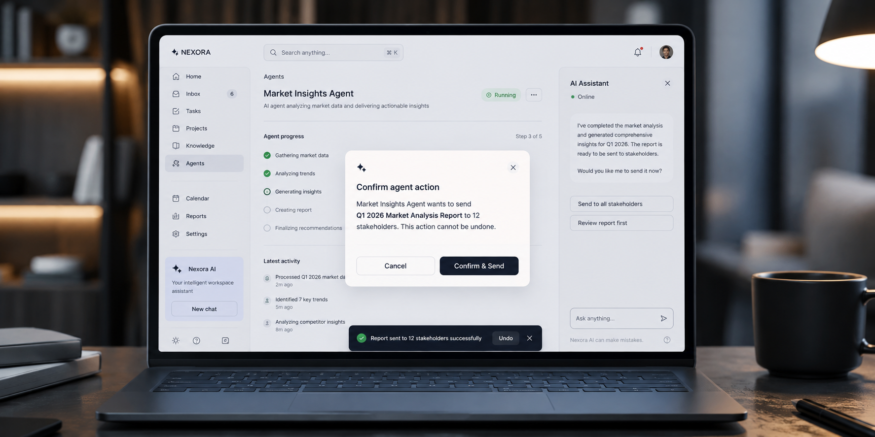
So what does an agent actually need from a designer? Three things, mostly:
- A clear “I’m about to do this” moment. Before the agent acts, the user has to see what’s coming and be able to stop it. (Think of the airline asking “Confirm this $400 change?” before charging you.)
- An undo. Always. If the system can act, the human has to be able to take it back.
- A trail. What did it do, when, and why? People forgive a robot that explains itself. They don’t forgive one that just shrugs.
If you remember one thing here: you’re not designing what the user sees. You’re designing what the user trusts. (That trust problem sits at the center of good SaaS dashboard design).
How the web looks in 2026
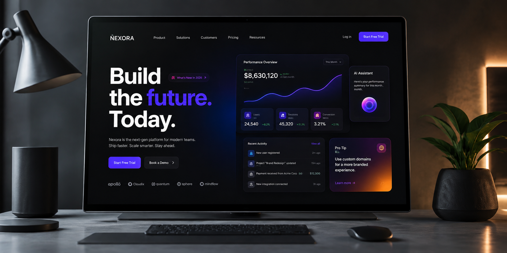
Okay, the fun stuff. The visual trends are real, and they’re worth knowing. Just hold onto a little skepticism.
Typography that means something
Big, loud type is everywhere this year, and there’s a good reason for it: when AI can spit out a thousand competent-but-identical layouts in a second, a strong typographic voice is one of the few things that still says “a human cared about this.”
But here’s the trap. Type that’s “edgy” and impossible to read on a phone isn’t bold; it’s broken. Typography earns its keep when it carries meaning: hierarchy, tone, and what to read first. Not when it just shows off.
The good news for 2026 is that variable fonts and scroll-driven type effects are now well-supported across normal browsers, so you don’t need a science project to do this. Just remember the test: can someone read it at arm’s length, on a cracked phone screen, in the sun? If not, it’s decoration pretending to be communication.
Minimal vs. maximal: pick a side
For years people argued minimalism versus maximalism like one had to win. They both win. They just win at different things.
- Minimalism buys you focus, speed, and a “this is a serious, premium thing” feeling. Great for tools people use every day.
- Maximalism buys you personality, story, and the kind of memorability that makes someone screenshot your homepage. Great for brands that need to be felt.
The genuinely bad choice in 2026 is the mushy middle: a little bit bold, a little bit clean, committed to nothing. That’s the design equivalent of a shrug. Pick a lane and mean it.
Color: dopamine or restraint
Bright, saturated “dopamine” color is having a moment, a direct rebellion against five years of identical pale-blue-and-gray SaaS sites. It’s fun. It works when it fits the brand.
Two honest notes:
Dark mode is not a feature anymore. It’s an expectation. But “dark mode” doesn’t mean flipping every color to its opposite and calling it a day. Inverted-by-accident dark mode looks awful and often fails contrast. It has to be designed as its own thing.
Bold color plus bold type plus bold motion all at once equals a mess. One element gets to be the loud one. The rest support it. If everything shouts, nobody hears anything.
The human-made stuff is back (on purpose)
Here’s a nice irony. Because AI can now generate stock-quality images instantly and for free, the thing that stands out is the thing AI is worst at faking: a clearly human hand. Hand-drawn illustrations, a weird little mascot, an imperfect texture.
And it’s not only about looking nice. A clean custom illustration usually loads faster than a big photograph, and it makes your brand recognizable in a way a stock photo never will. Those tiny moments of personality, the celebratory animation when you finish a task, and the friendly drawing on an empty page do more for how people feel about your product than most of the homepage.
3D and AR: finally useful, mostly
Immersive 3D and augmented reality used to be the thing you saw in a conference demo and never again. In 2026, they crossed over. Tools like Three.js and Spline dropped the difficulty enough that a normal team can ship real 3D and “try it in your room.” AR genuinely moves the needle for furniture, fashion, and anything where people are nervous about buying something they can’t touch.
The catch, and it’s a big one, is that heavy 3D can absolutely wreck your loading speed. So here’s the rule, and it’s the only rule you need: Every 3D element has to earn its place with a reason beyond “it looks cool.” Does it help someone understand the product? Reduce a real doubt before buying? Great. Is it a spinning background? Cut it.
How the web works in 2026
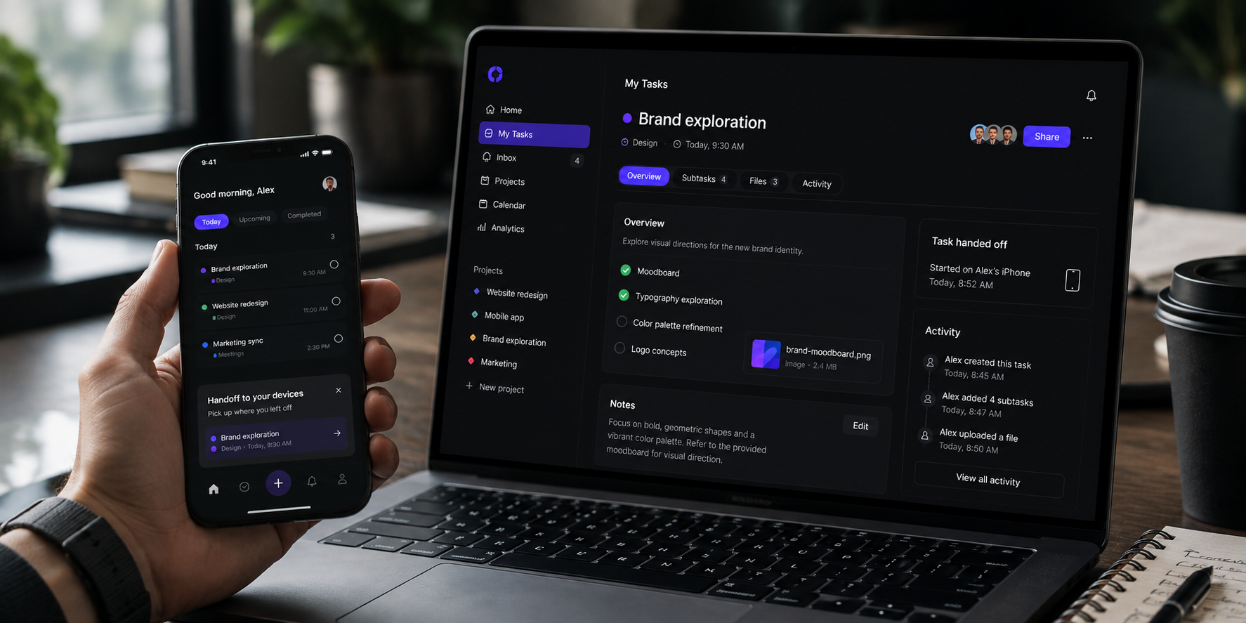
Looks are half of it. Here’s what’s changing in how sites behave.
Motion that does a job
Motion in 2026 isn’t garnish. The good stuff is functional: it tells you a thing happened, shows you where something came from, teaches you how the interface works without a tutorial.
There’s a newer wrinkle, too. When an AI assistant is doing something in the background, motion is often the only thing telling the user “the robot is working, hang on” versus “it’s your turn now.” That little distinction matters more than it sounds.
The test for any animation: ask it, “Why do you exist?” If the answer is “to confirm the user’s action” or “to show where this panel went,” keep it. If the answer is “it looked neat,” it’s costing you load time and someone’s patience. And always, always respect the user’s “reduce motion” setting. Some people get physically sick from the stuff you think is delightful.
Micro-interactions: small things, big feelings
A micro-interaction is the tiny response when you do something, the button that gives a little press, the field that gently shakes when you fumble a password, the satisfying check when a task is done.
These matter more in AI-heavy products, because they’re what make a system feel alive and listening instead of frozen. The four that pull the most weight: confirming an action, catching a mistake before it happens, showing a change in state, and the occasional small celebration. The mistake teams make is treating these as polish to add at the end. They’re not polish. They’re how the interface talks to people.
Voice and multimodal: real, but know its job
Voice and gesture and “the system already knows where I am” interactions are real and growing, no question. But I’d be lying to you if I quoted a precise “X% of browsing is voice now” number, because the honest answer is nobody has a trustworthy one, and most of the figures floating around are made up.
So here’s the grounded version. Voice is genuinely useful for speeding up a task, especially hands-busy on mobile. It is not a replacement for a screen. And it has a sneaky design problem: with no visual interface, how does the user know the system heard them? You still owe them feedback: a sound, a vibration, a spoken confirmation. “I did the thing” can’t be silent just because there’s nothing to look at.
The state problem nobody maps
People hop from phone to laptop to tablet dozens of times a day, often mid-task. The bar in 2026 isn’t “Does my layout resize nicely?” It’s “Can someone start something on their phone on the train and pick it up on the exact same spot on their laptop at their desk.”
That’s state continuity, and it’s mostly invisible until it’s missing, at which point it’s infuriating. A solid design system makes it possible, because components and behaviors line up across devices. But here’s the question almost nobody actually asks: have you mapped where your users hand off between devices and where they drop the thread? Most teams haven’t. It’s worth an afternoon.
The stuff most trend articles skip
This is the part that earns the article. Everything above, you can find elsewhere. This, mostly not.
Sustainable design is now a line item
It used to be that “is your website environmentally friendly” got you a polite nod and nothing else. In 2026, enterprise and EU clients are starting to ask for it sometimes in the contract.
What makes a website heavy on energy is the same stuff that makes it slow: giant unoptimized images, autoplaying video, mountains of JavaScript, fonts you’re not using, and a dozen tracking scripts. The handy thing is that fixing any of it makes the site lighter and faster, which helps your Core Web Vitals, which helps your search ranking. You can measure a page with a free tool like the Website Carbon Calculator and set a target. None of this requires making the site uglier. It mostly requires making it less wasteful, which it should be anyway.
Design under the law
This is the one I really want you to read twice, because it’s the part that can actually get your client fined.
Dark patterns, the sneaky tricks that nudge people into things they didn’t mean to do, are no longer just rude. They’re illegal in a growing list of places. Thirteen US states now prohibit them through their privacy laws, with penalties running up to $7,500 a violation (and as high as $50,000 in a couple of states) (Cozen O’Connor, 2025). The EU’s Digital Services Act bans them across the block.
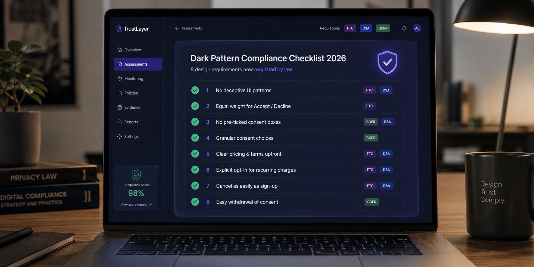
The patterns specifically in the crosshairs:
- Hiding the unsubscribe or cancel button.
- Pre-checked boxes that sign people up for things.
- Fake urgency (“Only 2 left!” when there are plenty).
- Ads dressed up to look like regular content.
And there’s more coming. Under the EU AI Act, starting in August 2026, if a user is talking to an AI they have to be told it’s an AI, and AI-generated content has to be marked as such (EU AI Act, Article 50). That’s a design requirement, not just a legal footnote; somebody has to design the disclosure.
So here’s a checklist worth running on any live product today:
- Can a user cancel or unsubscribe as easily as they signed up?
- Are any boxes pre-checked in the user’s disfavor?
- Is any urgency or scarcity message actually true?
- Are ads clearly labeled as ads?
- Is “no thanks” as visible as “yes please”?
- Does anything mislead about price until the last step?
- If an AI is involved, is the user told?
- Is AI-generated content marked?
A “no” on any of these isn’t a style opinion. It’s a risk.
Designing for how brains actually differ
WCAG, the accessibility standard, is great, and you should follow it. But it mostly covers sensory access: can people see it, can a screen reader read it. It barely touches cognitive access: can people’s brains comfortably use it.
That’s a real gap, because cognitive differences are common. About 6% of US adults have a current ADHD diagnosis (CDC, 2024), and by some estimates as many as 15–20% of people have some symptoms of dyslexia (International Dyslexia Association). Add anxiety, autism, and plain old “tired human with three browser tabs and a screaming toddler,” and “neurodivergent-friendly” stops being a niche. It’s most of your users on a bad day.
Six principles that help, and not just for the people they’re aimed at:
- Predictable beats surprising. Navigation that stays put. No layout jumping around as things load.
- Offload the thinking. Break things into chunks. Reveal complexity gradually. Don’t show ten choices when three will do.
- Let people control motion. The speed, or turning it off, does not just inherit a system setting they may not know exists.
- Offer a calmer reading mode. A simplified layout, adjustable line spacing, and a font choice.
- Manage focus. Make it obvious what’s selected, and quiet the distractions while someone’s mid-task.
- Always answer three questions: Where am I, what just happened, what can I do next.
None of that hurts a “typical” user. It’s just better design. That’s the whole point.
Performance is a fairness issue
Here’s a reframe worth sitting with. We usually treat website performance as a technical chore or an SEO lever. It’s also a fairness issue.
Who actually suffers from a bloated, slow site? People on metered mobile data. People on older phones they can’t afford to replace. People with a weak connection in a rural area or a developing market. In other words, often the people with the least slack to spare. Meanwhile, the 2026 fashion heavy 3D, big video, and lavish motion is making the web heavier, which quietly shuts those people out.
So treat your performance budget as an ethical commitment, not just an engineering one. Reasonable 2026 targets: get your main content showing in under 2.5 seconds, keep JavaScript per page under roughly 150 KB, and lazy-load anything below the fold. Bonus: a lighter site uses less server energy, which loops right back to the sustainability point. It’s all the same discipline. (Performance is baked into how we approach web design and development from the first wireframe).
The four-question filter (this is the actual tool)
Everything up to here was “what’s out there.” This is “what do I do about it.” When a trend lands on your desk, run it through four questions.
1. Does this solve a user’s problem or a designer’s boredom?
Bold typography solves a real hierarchy and stands out. Keep it. A giant 3D background usually solves “this’ll look great in the pitch deck.” Only keep that if the user genuinely benefits from seeing something in 3D.
2. What kind of product is this?
- Marketing or brand site: maximalism, big type, 3D, loud color, go play.
- SaaS or a tool people work in: clarity first. The SaaS UX design best practices that win reduce cognitive load, confirm actions, and stay predictable beat any trend. Apply the rest with a scalpel, not a bucket.
- E-commerce: speed and trust win. Get immersive only if it removes a real doubt about buying.
3. Have you tested it with your actual users?
Most trend articles quietly assume your audience is young, design-literate, and on a fast new phone. Yours might be a 58-year-old nurse using a hospital portal on a five-year-old tablet. Neobrutalism on that is a small disaster. Test before you commit.
4. Can you keep it up?
Custom illustration needs someone to keep drawing. Motion design needs developers who have time. A trend with no maintenance plan looks dated within a year, and dated is worse than plain.
What’s dying in 2026
The fun part. Here’s what to stop doing, and why.
| What’s on the way out | Why |
| Infinite scroll built to trap you | Regulators are eyeing it, users find it manipulative, and it’s rough on accessibility. |
| The AI chatbot that pops up in three seconds | It interrupts before you’ve read anything, and it erodes trust fast. (No, I don’t have a clean stat for the dismissal rate but watch yourself the next time one does it). |
| The same 3D isometric-people illustration everyone uses | AI generates these in seconds now. Custom art is the differentiator. |
| Autoplaying video with sound | Hurts performance, fails accessibility, and people experience it as an ambush. |
| Sneaky onboarding (hidden skip, forced signup wall) | Now illegal in the EU and 13 US states, and it spikes churn the moment people feel played. |
| Hamburger menus on a wide desktop screen | You’ve got the room. Make people hunt less. Persistent or bottom nav usually converts better. |
| The reflexive “hero + three features + CTA” template | It works, but it whispers “low effort.” Narrative or interactive structures hold attention longer. |
| One responsive layout for literally everything | The bar moved to adapting across voice, spatial, and traditional screens, not just shrinking to fit. |
How to actually use any of this
Insight is cheap. Here’s the part you bookmark.
A 2026 website redesign checklist for a site you already have
Treat this as your website redesign checklist, run it before you start bolting trends on:
- Does it pass Core Web Vitals (main content under 2.5s, interaction response under 200ms, layout not jumping around)?
- Is dark mode actually designed, not just color-flipped?
- Do all animations respect “reduce motion”?
- Is there anything on here a regulator would call a dark pattern?
- On mobile: Are tap targets big enough (roughly 44×44 px), and is there no sideways scroll?
- Does every AI feature have a non-AI fallback when it fails?
- Have you mapped where users hop between devices — and where they lose the thread?
- Do you know the site’s carbon footprint, and is it improving?
- Has anyone tested this with users whose brains work differently?
Which trends fit which products
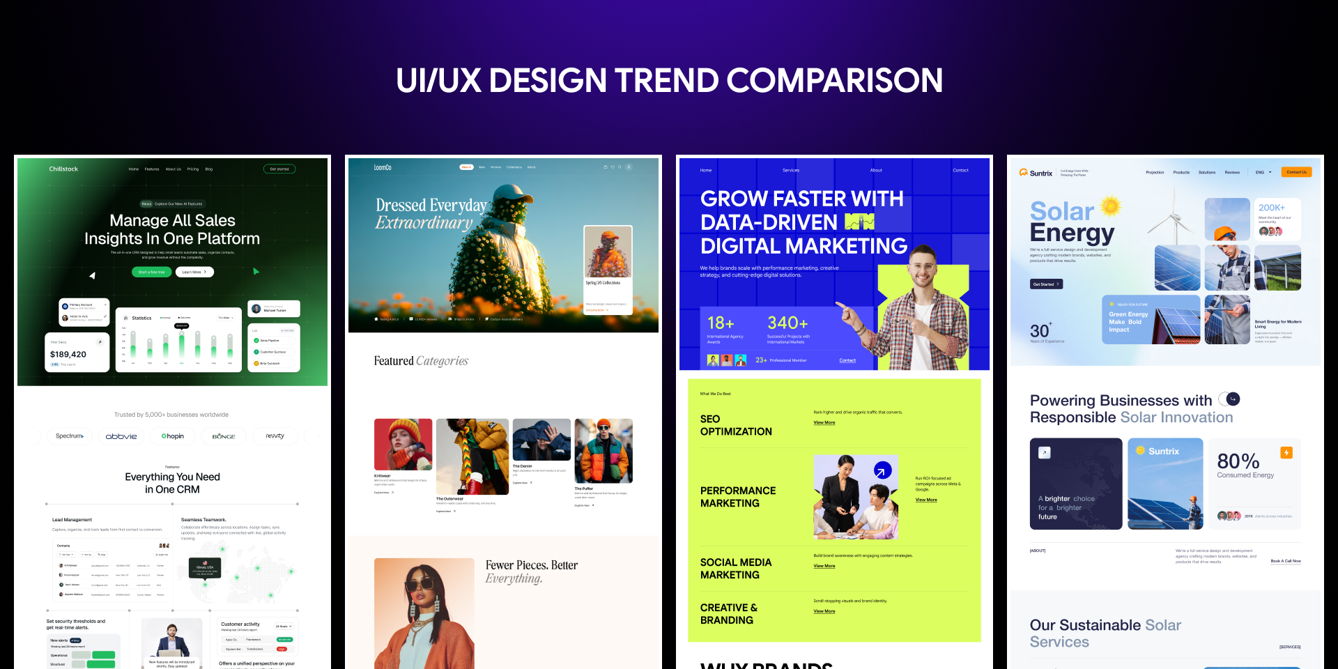
| Product type | Lean in | Handle with care |
| SaaS app | Cognitive-friendly design, meaningful motion, agentic patterns | Loud maximalism, heavy 3D |
| Marketing / brand site | Bold type, 3D, dopamine color, narrative scroll | Performance watch the budget |
| E-commerce | AR preview, micro-interactions, cross-device state | Autoplay, heavy motion on product pages |
| Healthcare / fintech | Cognitive-friendly design, trust patterns, accessibility first | Brutalism, playful motion |
| Agency portfolio | Maximalism, 3D, experimental type | Over-building until it won’t load |
So where does that leave you?
The best designers in 2026 aren’t the ones cramming the most trends onto a page. They’re the ones who can look at the year’s whole pile of shiny new things and calmly say “that one, not those,” because they know their users and their product.
Because the honest truth is that this year pulls you in opposite directions all at once. Bold and restrained. Human and AI. Impressive and fast. Creative and compliant. There’s no trick that resolves the tension. The job is to hold it on purpose to make each call deliberately for this product, for these people.
That’s harder than following a trends list. It’s also the only thing that actually works.
Want someone to make those calls with you?
Sorting out which of these trends belongs on your product and which would just slow it down or land you on the wrong side of a regulation is exactly the work we do at Pixelean, a UI/UX design agency for SaaS and web apps. We design products that stay clean, fast, and genuinely usable, not just on-trend.
If you’d rather have a team weigh these decisions with you instead of guessing, explore our UI/UX design services or tell us about your project. We’ll help you figure out what actually matters for the people using your product.
Frequently asked questions
What are the biggest UI/UX design trends for 2026?
The defining UI/UX design trends in 2026 are agentic interfaces (AI that takes actions, not just suggestions), typography and color that push back against AI sameness, motion used as a functional language, and accessibility plus dark-pattern compliance becoming legal requirements. The real skill is choosing which of these fit your specific product.
What’s the single biggest web design change in 2026?
AI that takes actions, not just makes suggestions. In Figma’s 2025 AI report, 51% of teams building AI products are now building agents, up from 21% a year earlier. That changes the designer’s job from “design a screen” to “design something users can trust to act for them.”
Are dark patterns really illegal now?
In many places, yes. As of January 2026, thirteen US states regulate dark patterns through their privacy laws, with fines up to $7,500 (and up to $50,000 in some states) per violation, and the EU’s Digital Services Act bans them outright. Hidden cancel buttons and pre-checked sign-up boxes are common targets.
Do I have to disclose when my site uses AI?
In the EU, soon yes. Under the EU AI Act’s Article 50, starting August 2026, users must be told when they’re interacting with an AI, and AI-generated content has to be marked. Even outside the EU, it’s quickly becoming an expectation of trustworthy design.
Is minimalism or maximalism better for 2026?
Neither it depends on the job. Minimalism wins for focus, speed, and tools people use daily. Maximalism wins for brand personality and memorability. The genuinely weak choice is the noncommittal middle. Pick the one that serves your user’s task and commit to it.
How do I decide which trends to actually use?
Run each one through four questions: Does it solve a user’s problem or a designer’s boredom? What kind of product is this? Have you tested it with your real users? Can you maintain it over time? If a trend can’t survive those four questions, it belongs in someone else’s portfolio, not on your site.