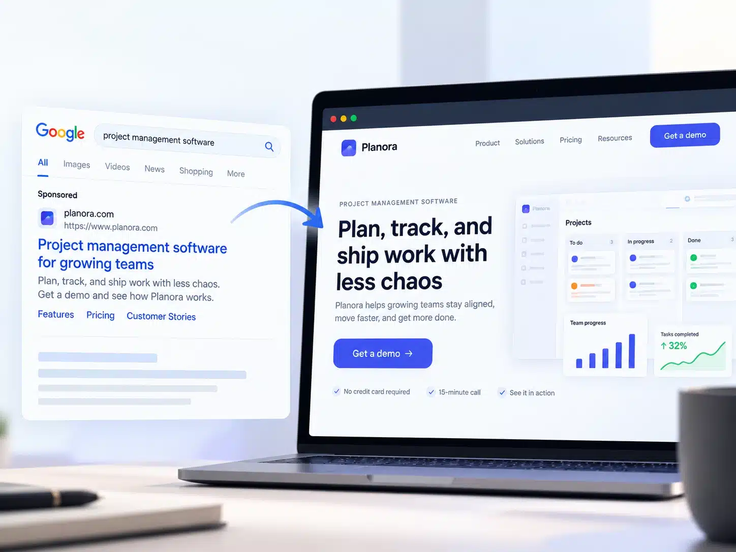
A SaaS landing page has one job. It answers one click.
We read two other lists of SaaS landing page examples while planning this post. Both show you the page. One notes the keyword. Neither puts the ad next to the headline, so you never see if the page answers what the visitor was promised.
This list does. Twelve pages, no homepages, each with the click that leads to it, the first line the page says back, one thing to copy and one thing to leave.
We design landing pages. Our rule is simple. Show us the ad before the page.
We opened every page on 6 October 2026. The ads come from Google search results set to a United States location. Ads rotate, so yours may differ.
Key takeaways
- A landing page serves one source and makes one ask.
- The headline should repeat the words that sent the visitor. Five of the nine search pages here do it.
- Five of the twelve hold to a single ask on the first screen. Seven add a second.
- My AskAI and TermsFeed match the click as closely as ActiveCampaign does.
How we picked and checked these
Search ad pages came from Google results set to the United States. Free tool pages drew no ads, so the click is the search itself. For demo pages, the click is the demo link on the company’s homepage.
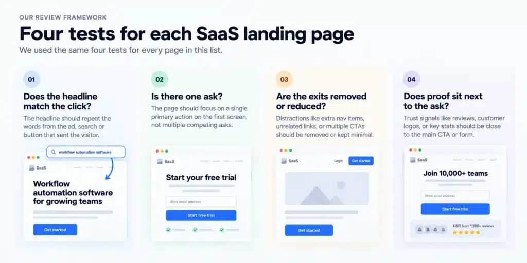
Four tests for each page. The headline test is scored only on the nine pages where a search or an ad set the words.
- Does the headline match the click?
- Is there one ask?
- Are the exits removed or reduced?
- Does proof sit next to the ask?
We did not submit a form or run a tool, so field counts cover the first step only.
You will find no conversion rates here. We cannot see them, and we will not guess. For benchmarks, read our landing page examples post.
12 SaaS landing page examples at a glance
| Page | Where the click comes from | What it asks for | What to copy |
| Deel | Search ad, “payroll software” | Book a demo | Ask one question before the form |
| Kantata | Search ad, “project management software” | Request a demo, one email field | Name the audience under the headline |
| Vtiger | Search ad, “crm software” | Free trial, one email field | Repeat the ad’s proof under the button |
| GoHighLevel | Search ad, “crm software” | 30 day free trial | Say the offer on the button |
| ActiveCampaign | Search ad, “mailchimp alternative” | Free trial | Put the rival and the number in the headline |
| Dixa | Search ad, “intercom alternative” | Book a demo | Admit where the rival is the stronger fit |
| My AskAI | Search ad, “intercom alternative” | Create an AI agent on a free trial | Replace one part and keep the rest |
| Ahrefs | Search, “free backlink checker” | Enter a domain | Put the tool in the first screen |
| TermsFeed | Search, “free privacy policy generator” | Generate a policy | Use the search phrase as the headline |
| Ramp | Demo link | Schedule a demo, one email field | State the call length |
| HiBob | Demo button | Book a demo | Put the call length in the headline |
| Zendesk | Demo link | Start a product demo | Open with a choice before any field |
Pages behind a search ad for the category
This visitor typed what they want and knows no brand yet.
Deel
The click. A search for “payroll software” returned an ad headed “Employee Payroll Software”.
The first line. “Run all your payroll from one system”. It matches.
Copy this. Under the headline, Deel’s payroll page asks “What would you like to do with Deel?” and offers choices. The rating, “4.8/5 | 15K+ Reviews”, sits under the button.
Leave this. A bar at the top pushes a second offer with its own button, “Claim offer”. Two asks, one page.
Kantata
The click. A search for “project management software” returned an ad headed “Top Project Management Tool – Best Project Mgmt Software”.
The first line. “Kantata Purpose-built for professional services firms”. A partial match. The searched words arrive one line later.
Copy this. That second line, “Project management software built for how services businesses actually work”. It repeats the search and tells the wrong visitor to leave. Kantata’s page shows one field in the first screen, a business email. Customer stories from Box and Qualtrics sit under it.
Leave this. The brand name leading the headline. A second button, “Watch a Demo”, sits in the top bar, and a seven-field form waits lower down.
Vtiger
The click. A search for “crm software” returned an ad headed “CRM Software Made Easy – All-in-One CRM Solution”. The ad text says “trusted by 400K+ businesses”.
The first line. “Accelerate Your Business Growth”. A partial match. CRM appears only in a small line above it, “TOP RATED CRM SOFTWARE”.
Copy this. Vtiger’s CRM page asks for one field, a work email. The ad’s number returns under the button as “TRUSTED BY 400,000 COMPANIES WORLDWIDE”.
Leave this. The headline. It could sit on any product.
GoHighLevel
The click. A search for “crm software” returned an ad headed “CRM For Small Business – All-In-One Marketing Platform”.
The first line. “Power Up Your Business”, followed by a line about marketing and sales. It misses. The headline never says CRM.
Copy this. GoHighLevel’s trial page lists “Free 30-day Trial of HighLevel!” and the button says “30 DAY FREE TRIAL”. One ask. Proof, “2M+ BUSINESSES”, follows it.
Leave this. A headline that ignores the search. The visitor asked for a CRM and got a slogan.
Three of the four drop the top navigation, but only one, Deel, puts the searched word in the headline.
Pages built for a competitor’s name
This visitor already knows the rival. They searched its name with “alternative” beside it. Our SaaS website examples post covers more comparison pages.
ActiveCampaign
The click. A search for “mailchimp alternative” returned an ad headed “Mailchimp Alternative | See Why Marketers Switch”. The ad text promises “30% more clicks”.
The first line. “Get 30% more clicks than Mailchimp”. It matches.
Copy this. Ad and headline make the same promise, rival and number included. Only do this if you can back the number. ActiveCampaign prints both click rates lower down, and its note shows they come from different years. ActiveCampaign’s Mailchimp page shows one button in the first screen, “Get a free trial”, and no navigation. A named customer, Parrish Law, appears above the button. For message match, this is the best SaaS landing page on the list.
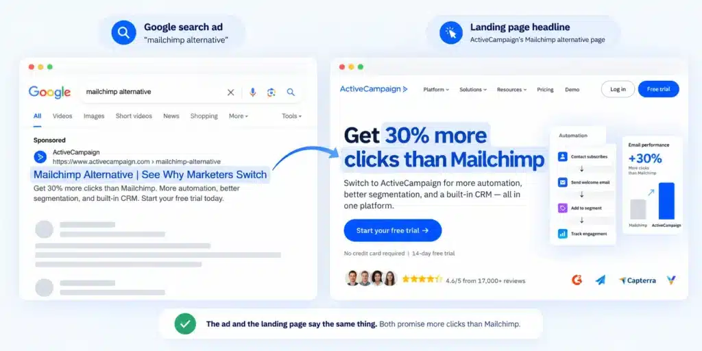
Leave this. The one-sided case. We found no line saying where Mailchimp is the better choice.
Dixa
The click. A search for “intercom alternative” returned an ad headed “Intercom Alternatives”.
The first line. “Support costs you can predict, on a platform built for ecommerce”. A partial match. The rival is named in the small line above, “#1 INTERCOM ALTERNATIVE FOR ECOMMERCE BRANDS”.
Copy this. Dixa’s page admits where the rival wins. It tells software companies that Intercom’s in-app messaging and product tours “make it the stronger fit”. It has one ask, “Book a demo”, repeated in the navigation. A migration line and “Trusted by exceptional consumer brands” sit under it.
Leave this. The full top navigation. Each link is a way off the page.
My AskAI
The click. A search for “intercom alternative” returned an ad headed “Keep Intercom – Why Freecash Replaced Fin”.
The first line. “Keep Intercom. Replace Fin’s $0.99-per-resolution pricing.” It matches. The headline opens with the same two words as the ad.
Copy this. The smaller ask. My AskAI’s page asks the visitor to keep the tool and replace one part. That is a smaller decision than a migration. It prints its own price too, “Plans start at $199/month”. A customer quote sits under the buttons.
Leave this. Two buttons, “Create AI Agent” and “Book Demo”. Pick one.
Dixa is the only one of the three with a sentence that says where the rival is the better choice.
Free tool pages
This visitor wants a job done now.
Ahrefs
The click. A search for “free backlink checker”. Ahrefs held the first organic result, titled “Free Backlink Checker by Ahrefs”.
The first line. “Backlink Checker”. It matches.
Copy this. The tool is the first screen. The Backlink Checker page shows one input and one button, “Check backlinks”.
Leave this. The full site navigation and the sign-up buttons. Ahrefs can afford the exits. A company nobody has heard of cannot.
TermsFeed
The click. A search for “free privacy policy generator”. TermsFeed held the fourth organic result.
The first line. “Free Privacy Policy Generator”. It matches, word for word.
Copy this. The headline is the search phrase, and the button, “Generate Privacy Policy”, is the job. TermsFeed’s page needs no translation. A rating, “rated 4.7+”, follows the button.
Leave this. The top navigation, with “Log In” and “Sign Up” beside the tool.
The page behind “Book a demo”
This visitor has already decided to talk. The page can only lose them. Our SaaS website examples post checked demo pages and found none that said how long the call takes. Ramp and HiBob book a call, and both say it takes 30 minutes.
Ramp
The click. A link on Ramp’s homepage that says “See a demo”.
The first line. “See how Ramp works”.
Copy this. One sentence on Ramp’s demo page sets the cost in time. “Schedule an expert-run, 30 minute tour of the platform.” One field, an email.
Leave this. Three routes on one page. A live demo, an interactive tour and product videos.
HiBob
The click. A button on HiBob’s homepage that says “Get a free demo”.
The first line. “Get Your Personalized 30-Minute Demo”. The call length is in the headline.
Copy this. Length in the headline and no navigation. On HiBob’s demo page, “Join 5,500+ companies who trust HiBob” sits under the form.
Leave this. The placement. Proof under the form is the last thing a visitor sees.
Zendesk
The click. A link on Zendesk’s homepage that says “Get a demo”.
The first line. “Customize your free Zendesk demo”.
Copy this. No call to book. Zendesk’s demo page opens a set of product demos behind one choice, “Who will you help most often with Zendesk?”, with three answers.
Leave this. Two more asks sit in the top bar, “Watch video demos” and “Start a free trial”.
What these twelve pages have in common
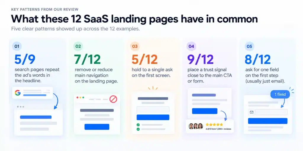
The headline repeats the click on five of the nine search pages. Deel, ActiveCampaign, My AskAI, Ahrefs and TermsFeed do it, while Kantata, Vtiger and Dixa carry the words in a smaller line and GoHighLevel misses.
Seven of the twelve removed the top navigation. Deel, Kantata, GoHighLevel, ActiveCampaign, My AskAI, Ramp and HiBob have none. Vtiger and Zendesk cut it to a few links, and Dixa, Ahrefs and TermsFeed keep the full navigation.
Five of the twelve hold to one ask on the first screen. Vtiger, GoHighLevel, ActiveCampaign, Dixa and HiBob do. An ask is a button or link that starts a trial, demo, sign-up, offer or tour. Navigation and login links count as exits. The other seven add a second ask.
Nine of the twelve show proof next to the ask. One of the nine, ActiveCampaign, places it above the button. We saw none on the first screen at Ahrefs, Ramp or Zendesk.
Eleven of the twelve show one field or none on the first screen. Vtiger and Ramp show one email field. Kantata repeats the ask lower down with a seven-field form. HiBob’s form differed between two reads, so we leave it out of this count.
The pattern we see across these pages is clear. About half match the message, and fewer than half hold the page to one ask.
Where SaaS landing pages go wrong
A homepage or product page used as the ad destination. A homepage speaks to every visitor, and an ad click arrives with one question that the homepage was never built to answer. One ad we checked, from Wrapbook, led to a product page with the full site navigation.
A headline that names the product and ignores the click. GoHighLevel’s ad says CRM and its headline does not. The visitor has to work out if they are in the right place.
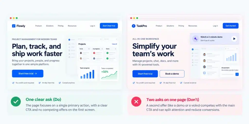
Two asks on one page. Deel runs an offer bar above a demo page and My AskAI shows two buttons.
A form longer than the offer is worth. None of the eleven pages we could settle makes it on the first screen.
See also the four pages you should not copy.
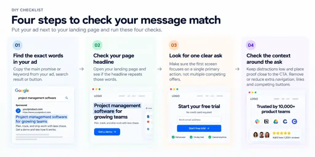
Put your ad next to your page
A four-step message match check for your own page.
- Paste your ad and your page headline one above the other.
- Underline the main term from the ad. If the headline does not carry it, rewrite the headline.
- Count the ways off the page before the button.
- Count the fields on the first step. Move everything after the email to a second step.
How we design SaaS landing pages
We start from the traffic source. One source, one page. We design and build it in Webflow, Framer or WordPress.
Our position on one page for five campaigns is firm. Five clicks ask five questions, and one headline can answer one of them.
A company with one traffic source needs one page, and a company with no campaign traffic yet needs a clear homepage before any of this.
If your ad and your page disagree, see our landing page design service.
Frequently asked questions
What is a SaaS landing page?
A SaaS landing page is a standalone page a software company builds for one traffic source, such as a search ad or a demo button, with one ask, usually a free trial or a demo. It repeats what the visitor was promised.
What is the difference between a SaaS landing page and a homepage?
A homepage serves everyone who arrives, so it carries the full navigation and several paths. A landing page for a SaaS product serves one click. It repeats the words that sent the visitor, removes or reduces the exits and makes one ask.
How many landing pages does a SaaS company need?
It depends on how many sources send you clicks. Build one page per source. A category search, a competitor search and a demo button each bring a visitor with a different question.
Does a startup need a landing page before the product is ready?
Only if it has a click to answer. A startup landing page needs a source, such as an ad or a launch post, and one ask, such as an email signup. With no traffic source, the page has nothing to match.
What should a SaaS landing page headline say?
The words that sent the visitor. If the search was “mailchimp alternative”, the headline names Mailchimp. If the search was “free privacy policy generator”, the headline says exactly that.
The bottom line
The best SaaS landing pages on this list do one plain thing. They say back what the visitor just read. HiBob puts the call length in the headline.
Great SaaS landing pages match the click. The click decides the page. Start there.
Got an ad and a page to compare?
Email us one ad and the page it points to at hello@pixelean.com, and we will show you where they stop matching. Talk to us about landing page design.
Sources
Each page was opened on the check date stated above. Ads were read from Google Search with the location set to the United States.
- Deel, payroll page
- Kantata, project management page
- Vtiger, CRM page
- GoHighLevel, trial page
- ActiveCampaign, Mailchimp page
- Dixa, Intercom alternative page
- My AskAI, Intercom Fin alternative page
- Ahrefs, Backlink Checker
- TermsFeed, Privacy Policy Generator
- Ramp, demo page
- HiBob, demo page
- Zendesk, demo page