Every list of the best SaaS websites shows you the same companies. We read five of the top-ranking lists before writing this one. Ramp appeared in three of them. Stripe and Loom showed up twice each. Ramp’s site is good. You have seen it three times already, so its spot went to one you have not.
That is not the real problem. The real problem is what those lists leave out. A lot of what makes Stripe’s site work is being Stripe. You cannot copy a brand.
We design SaaS websites at Pixelean, and many of the briefs we receive open with a link to a site on this list. So we built the list we wish founders read first.
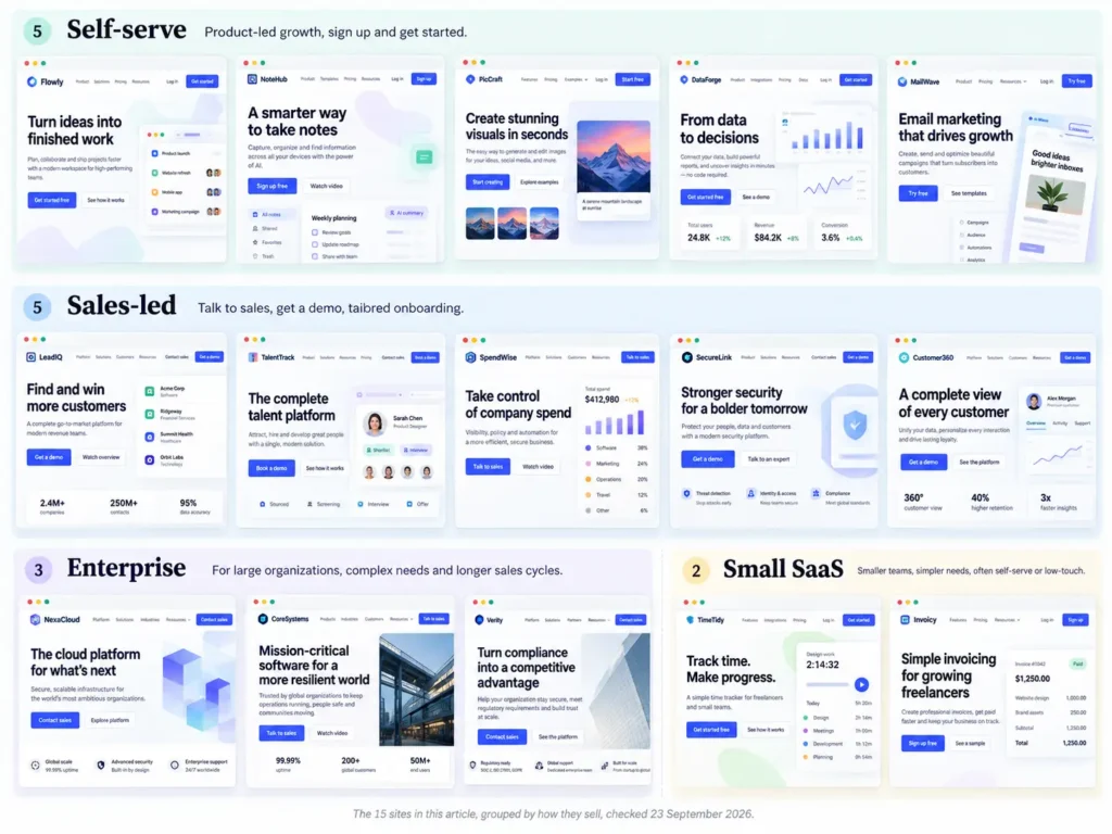
Fifteen sites. Grouped by how they sell, because a free tool, a demo-led platform, and an enterprise vendor need different websites. One thing to take from each and one thing to leave. Then the pages past the homepage, where buyers actually decide.
We checked every site live on 23 September 2026.
Key takeaways
- The hero answers three questions in one screen. What is it, who is it for, and what happens after the click.
- Sales motion decides a SaaS website more than visual style does.
- Showing the product beats describing it.
- The best SaaS sites price in public, or explain why they do not.
- The homepage is one page of a system. Pricing, comparison, and security pages close the deal.
How we picked these
Plenty of roundups rank the best SaaS website designs by how they look. We ranked by how they sell.
Every site had to pass four tests.
- Headline clarity. A stranger can say what the product does after one line.
- Proof before the ask. A real number, name, or logo sits near the first button.
- A button that says what happens next. Not “Learn more.”
- A path for each buyer. The solo user, the team lead, and the security reviewer can each find their page.
We did not count awards, brand fame, or animation for its own sake. The best designed SaaS websites in a gallery are not always the ones that sell.
This is not a top 100 SaaS sites list. It is fifteen, picked on purpose. Household names sit next to companies you may never have heard of, because the famous ones teach taste and the small ones teach what you can ship.
Two more rules. We describe only what was on each page on 23 September 2026. Sites change, so details will drift. And no conversion claims. If a company has not published a result, we do not guess one. The “Built with” column comes from each site’s page source.
The list at a glance
| Site | Sales motion | Built with | What to copy |
| Linear | Self-serve | Next.js | A changelog on the homepage as proof |
| Cal.com | Self-serve | Framer | A working booking widget as the hero |
| Calendly | Self-serve | Astro | Sign-up with the work account you already use |
| Loom | Self-serve | Next.js | A second button that installs the product |
| Framer | Self-serve | Framer | One comparison page per alternative |
| Gong | Sales-led | Next.js | A one-field demo form with proof beside it |
| Rippling | Sales-led | Next.js | Three ways in, from tour to demo |
| Attio | Sales-led, with free sign-up | Next.js | Public pricing next to “Talk to sales” |
| Vanta | Sales-led | Webflow | A demo page that lists what the call covers |
| Stripe | Enterprise | Next.js | Separate doors for startups and enterprises |
| Datadog | Enterprise | Hugo | Analyst proof in the first line |
| Cloudflare | Enterprise | Astro | A link for the buyer in crisis |
| Plausible | Small | Jekyll | Name the tool you replace |
| Tally | Small | Next.js | A button that says exactly what starts |
| Screen Studio | Small | Next.js | Name the platform and the job up front |
Self-serve SaaS websites (product-led)
These sites sell to one person with a credit card. Nobody books a call. The page does the whole job.
All five follow the same shape. The biggest button is free. Pricing is one click from the top bar on four of them, and Loom tucks it into the menu. And the product shows up before the adjectives do.
1. Linear. The changelog is the pitch
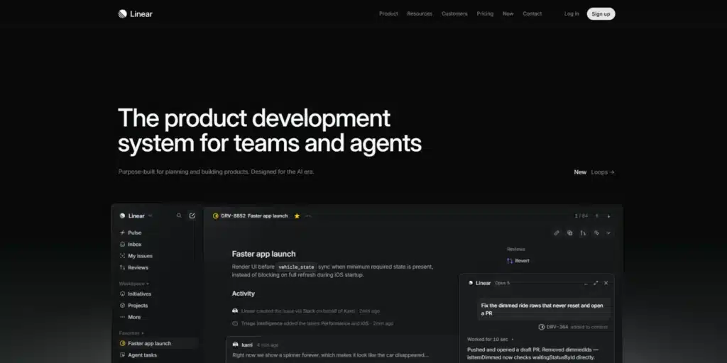
What you see first. A dark page and a headline that fades in word by word. “The product development system for teams and agents.” The page then walks through the work in order, from intake and planning to build and ship, and includes a changelog.
Why it works for this buyer. Linear sells to product and engineering teams who judge a tool by its craft. A changelog is proof they can check. It says the team ships, without one adjective.
Copy this. Put your last five releases on the homepage. It costs nothing and it proves momentum.
Leave this. The animated headline. Linear has earned the patience it asks for. A visitor who has never heard of you will not wait for your headline to arrive. We covered Linear’s homepage from another angle in our landing page examples.
2. Cal.com. The product is the hero
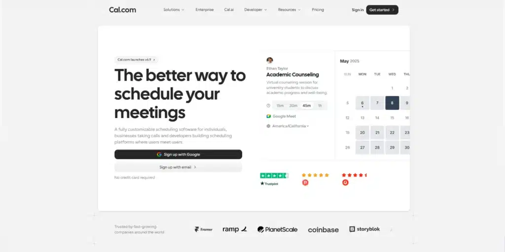
What you see first. “The better way to schedule your meetings.” Right under it sits a working booking calendar with 15, 30, and 45 minute slots. Two buttons, sign up with Google or with email. Then four words that do a lot of work. “No credit card required.”
Why it works for this buyer. A scheduling tool is judged by its booking screen. Cal.com shows that screen before it makes a single claim. You try the product in the hero.
Copy this. Put a working piece of your product in the first screen, even a small one. A live widget beats any screenshot.
Leave this. The subhead speaks to three audiences in one sentence. Individuals, businesses taking calls, and developers building scheduling platforms. A new product that talks to three audiences in one line talks clearly to none. Pick one.
3. Calendly. Sign up in one click
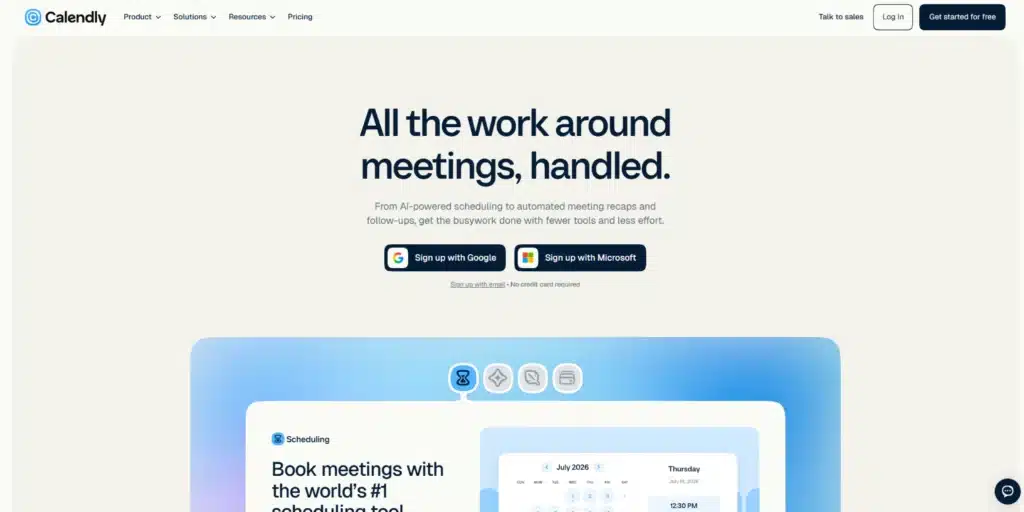
What you see first. “All the work around meetings, handled.” A “Get started for free” button, plus sign-up with Google or Microsoft. A “Talk to sales” link waits for bigger teams.
Why it works for this buyer. Calendly‘s buyer already lives inside a Google or Microsoft calendar. Signing up with that account removes the form entirely.
Copy this. Let people sign up with the account they already use at work. Every field you delete is one less reason to leave.
Leave this. The headline’s reach. “All the work around meetings” stretches past scheduling into recaps, payments, and notes. A known brand can widen its category. A new product that widens its headline just blurs it.
4. Loom. The second button installs the product
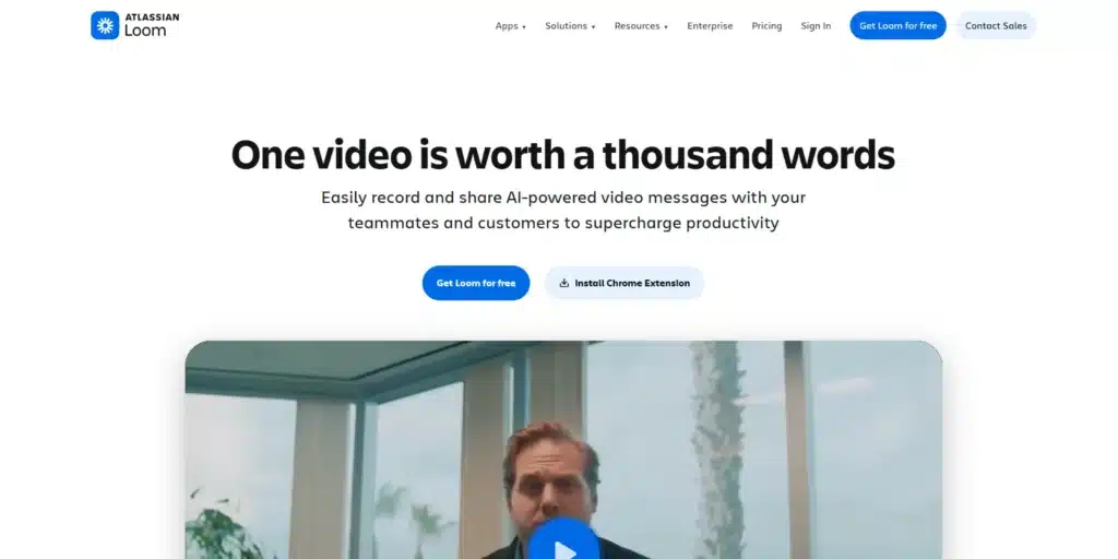
What you see first. The Atlassian logo above Loom‘s. “One video is worth a thousand words.” Then two buttons, “Get Loom for free” and “Install Chrome Extension.”
Why it works for this buyer. The second button is the smallest possible yes. One click and the product sits in the browser, ready for the next message.
Copy this. Make your second button the lightest version of the product. Not “Learn more.” Not “Watch video.”
Leave this. The proverb headline. It works because the page can claim “400,000 companies.” The subhead does the real selling, record and share video messages with teammates and customers. Your headline has to do that job.
5. Framer. A comparison page for every rival
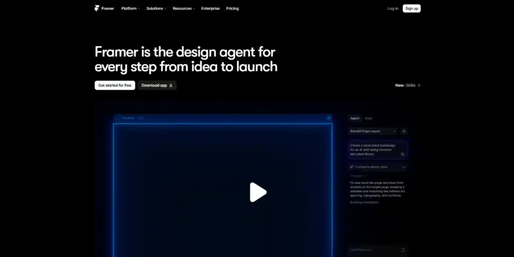
What you see first. A dark page. “Framer is the design agent for every step from idea to launch.” Two buttons, “Get started for free” and “Download app.”
Why it works for this buyer. Self-serve buyers compare alone, in tabs. Framer answers first, with a hub of “Framer vs” pages. Webflow, Figma, Squarespace, Unbounce, and more.
Copy this. Write one honest page for each alternative you lose deals to.
Leave this. The category jump in the hero. Framer can relabel itself a “design agent” because it has an audience big enough to carry the change. A new product that invents a category in its headline makes the reader do the work.
Sales-led B2B SaaS websites
These products sell through a demo. The buyer is a team, not a person. The site has to arm one champion to convince the rest.
The pattern we see in briefs is a sales-led company sending a self-serve site as its reference. Wrong group. Start here instead.
The best B2B SaaS websites in this group do three things. They put proof before features. They give each role a path. And they make the demo feel cheap to ask for.
One gap stood out. None of the demo pages we checked said how long the call takes. That line is free, and it is still open.
6. Gong. Proof stacked next to the form
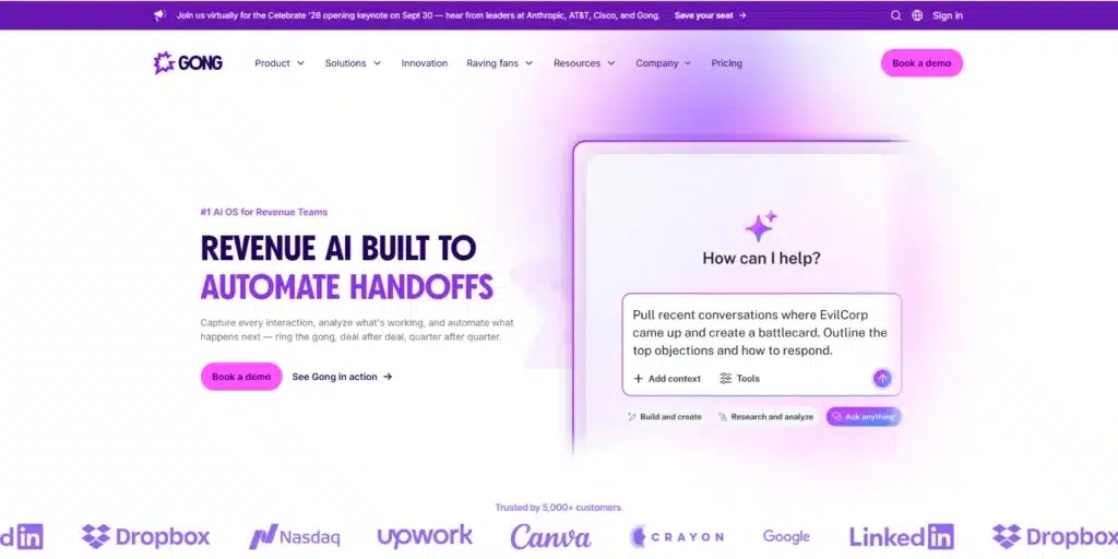
What you see first. A rotating headline. “Revenue AI built to” plus a cycle of outcomes, from closing deals faster to predicting churn. The demo page is where it gets good. One email field. One button. Then a wall of proof. 5,000+ customers, a rating across 6,200+ G2 reviews, a Forrester Wave badge.
Why it works for this buyer. A team purchase needs social cover. Proof beside the form answers “who else uses this” at the exact moment the buyer hesitates.
Copy this. Ask for one field. Put your strongest proof on the same screen as the ask.
Leave this. The rotating headline. A visitor may land on the outcome they care about least and leave before the next one spins in.
7. Rippling. Three ways in, from tour to demo
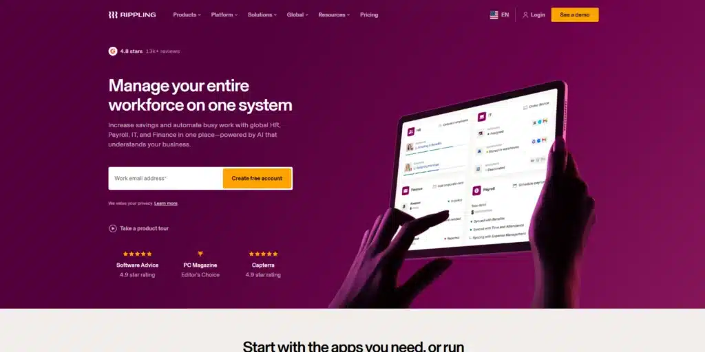
What you see first. A review badge above the headline, “4.8 stars” from “13k+ reviews.” Then “AI that knows your company, and acts like it.” An email field with “Create free account.” A “See a demo” button in the top bar and a “Take a product tour” link below.
Why it works for this buyer. People join a team purchase at different moments. The tour serves the curious. The free account serves the hands-on. The demo serves the budget holder. Further down, the demo comes “live or on demand.”
Copy this. The on-demand demo. A recorded walkthrough serves the buyer who is not ready to talk yet.
Leave this. The headline. “AI that knows your company” could sit on a hundred sites this year. Rippling‘s breadth across HR, IT, and Finance carries it. Yours has to be more specific.
8. Attio. Price in public, sell in person

What you see first. “Welcome to agentic revenue.” Then a plain subhead. “Attio is the CRM that builds pipeline, advances deals, and grows accounts around the clock.” Two buttons side by side, “Talk to sales” and “Start for free.”
Why it works for this buyer. Attio sells both ways. A small team can start free and check public prices. A bigger one can talk to a person. Neither has to pretend to be the other.
Copy this. The first five words of the subhead. “Attio is the CRM that.” It names the category in plain English.
Leave this. The headline. “Agentic revenue” is a category phrase, not an outcome. The subhead rescues it. Put your subhead’s sentence in your headline and skip the rescue.
9. Vanta. A demo page that says what the call covers
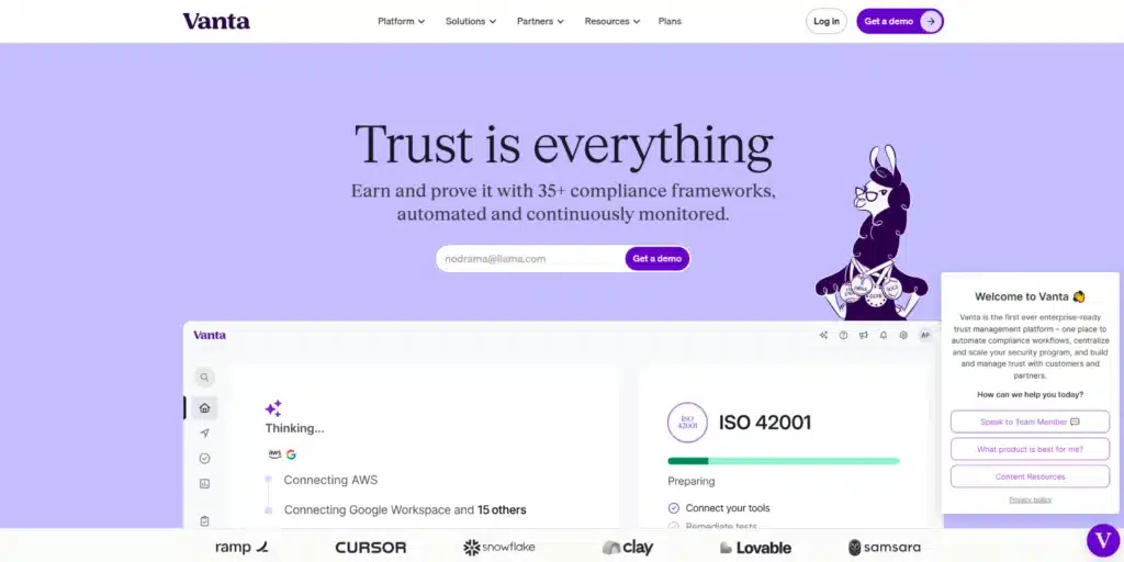
What you see first. “Trust is everything.” Subhead, “Earn and prove it with 35+ compliance frameworks, automated and continuously monitored.” An email field with “Get a demo,” and customer logos right below it.
Why it works for this buyer. Compliance buyers are nervous buyers. Vanta‘s demo page tells them what happens on the call before they book it. Meet one-on-one with an expert, discuss what the business needs and does not need, see the platform, plan the automation.
Copy this. List what the call covers on your demo page. Then go one step further than Vanta and say how long it takes.
Leave this. The two-word headline. “Trust is everything” could sell insurance. The specific part, 35+ frameworks, lives in the subhead.
Enterprise SaaS websites
Enterprise deals involve procurement, a security review, and a cycle measured in months. The person who signs is rarely the person who uses the product. So the site has to serve at least two readers at once.
All three sites below put proof in the first line and offer a self-serve door next to a sales route. Datadog and Cloudflare also link a security or trust section straight from the homepage. Stripe’s homepage links only its privacy pages. That is a gap, not a pattern.
10. Stripe. Two doors from one top bar
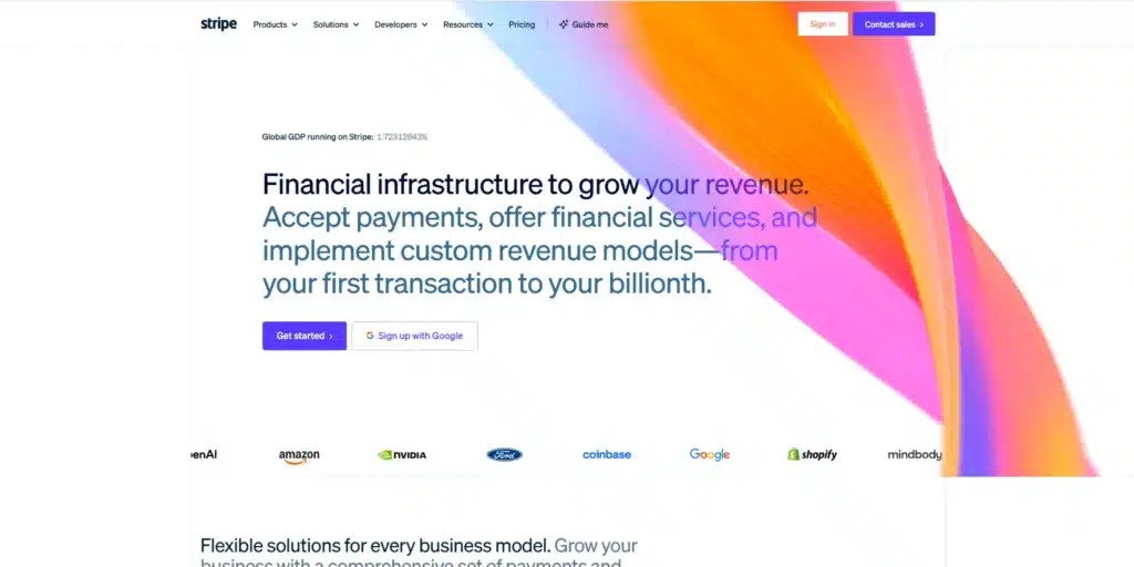
What you see first. A live counter above the headline. The share of global GDP running on Stripe, just over 1.7% on the day we checked. Then “Financial infrastructure to grow your revenue.” Two buttons, “Get started” and “Sign up with Google.” “Contact sales” sits in the top bar. Below, logos from OpenAI, Amazon, NVIDIA, Ford, and Coinbase.
Why it works for this buyer. The startup founder and the enterprise payments team both land here. The site splits them early, with separate routes for startups and enterprises.
Copy this. Split your paths by company stage in the navigation. Each buyer gets a door with their name on it.
Leave this. The GDP counter. That is proof at a scale almost nobody has. Copy the move with your own live number instead, even a small one. We looked at Stripe’s hero in detail in our landing page examples.
11. Datadog. The analyst report in the first line
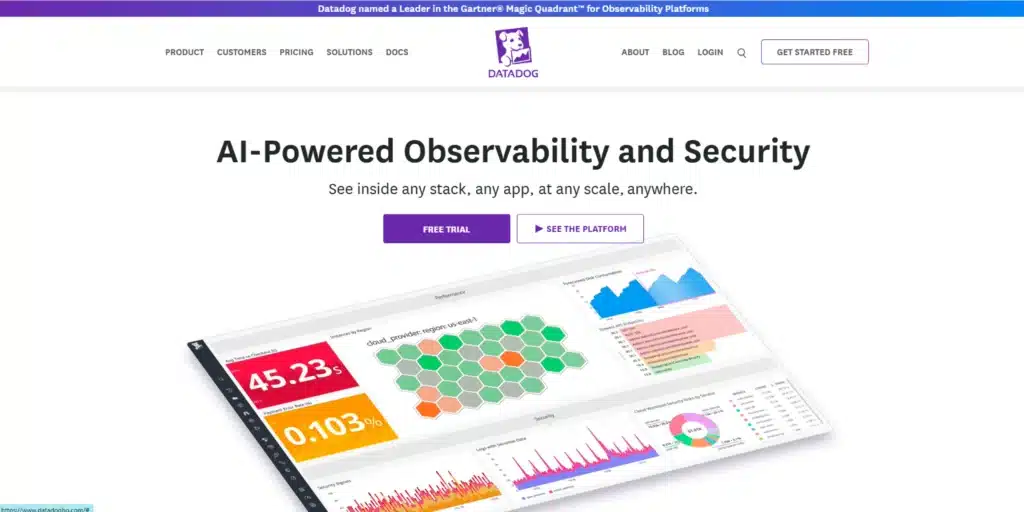
What you see first. A top banner saying Datadog was named a Leader in the Gartner Magic Quadrant for Observability Platforms. Then “AI-Powered Observability and Security.” Two buttons, “Free trial” and “See the platform.” A product dashboard fills the rest of the screen.
Why it works for this buyer. The evaluator needs third-party proof for the internal memo. The engineer wants to try it. Datadog serves both in one screen, and its main button is a free trial, not a sales call.
Copy this. Put your strongest third-party proof in the first line of the page, above the headline if you have to.
Leave this. The pricing page. It lists a separate price for product after product, each with its own unit. That depth fits a company selling dozens of products. A SaaS site with one plan needs one table.
12. Cloudflare. A link for the buyer having the worst day
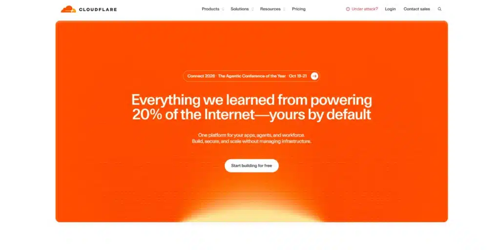
What you see first. A headline built on one number, powering 20% of the Internet. A “Start building for free” button. And in the top bar, a link most sites would never think of. “Under attack?”
Why it works for this buyer. Some enterprise buyers arrive in a crisis. A link named in their words skips the funnel and gets them help. Next to it sits “Contact sales” for the buyer who is evaluating, not panicking.
Copy this. Give your most urgent buyer a route, named in the words they would type.
Leave this. The 20% line. That is a number only Cloudflare can say. Open on your own real number instead.
Small SaaS websites that work without a famous brand
Stripe can lean on being Stripe. You cannot. So we looked for small companies whose sites still pass all four tests. Three stood out. None of them spends a line on brand. Each one does four things instead.
- A narrow headline that names one job.
- A named customer type or platform in the first screen.
- A real number or real proof placed early.
- Plain pricing.
13. Plausible. Name the tool you replace
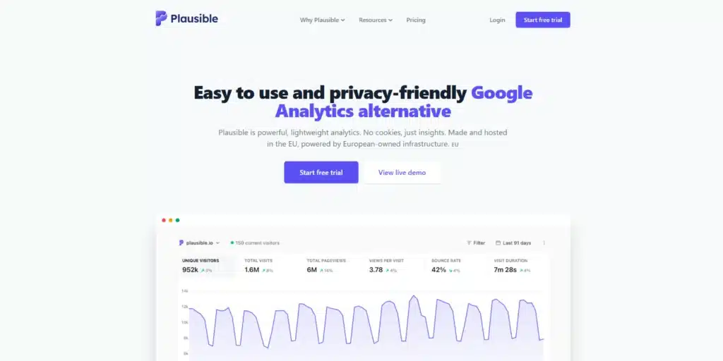
What you see first. “Easy to use and privacy-friendly Google Analytics alternative.” The subhead adds no cookies and EU hosting. Two buttons, “Start free trial” and “View live demo.” Below them, a live dashboard full of real traffic numbers. Pricing sits on the homepage.
Why it works for this buyer. One line names the job, the buyer, and the rival. The best part is under the hood. The marketing site runs on Jekyll, a free static site generator. No expensive build required.
Copy this. Name the tool you replace in the headline.
Leave this. The privacy angle is Plausible‘s real reason to exist. Do not borrow a positioning that is not yours.
14. Tally. A button that says exactly what starts
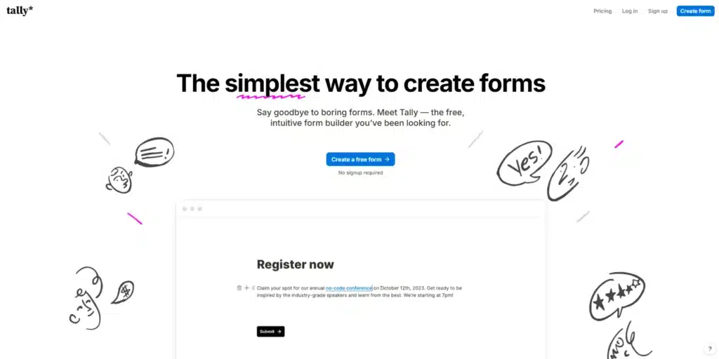
What you see first. “The simplest way to create forms.” The button says “Create a free form.” Under it, three words. “No signup required.” Then a line of proof, “Powering 500,000+ teams.”
Why it works for this buyer. That button is the whole lesson. A verb, an object, and the friction removed before you click. Pricing is plain too, a free plan and two paid tiers. Tally also runs alternative pages against Typeform, Jotform, and Google Forms.
Copy this. Say what starts on the button, and remove the friction under it.
Leave this. The subhead does not name a customer type. Tally gets away with it because forms are for everyone. Your product probably is not.
15. Screen Studio. Name the platform and the job
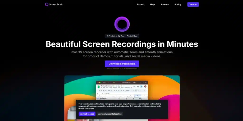
What you see first. A badge sits above the headline, “#1 Product of the Year” from Product Hunt. Then “Beautiful Screen Recordings in Minutes.” The subhead names the platform, macOS, and the jobs, product demos, tutorials, and social media videos. One button. “Download.”
Why it works for this buyer. A Mac user making a product demo reads one line and knows the tool is for them. The badge answers “is it any good” before they scroll.
Copy this. Name the platform and the job in the subhead.
Leave this. The dark theme fits Screen Studio‘s buyers, who make videos for a living. It is not a default. Pick your colors for your buyer, not for the gallery.
The famous sites teach taste. These three teach what a team your size can ship next week.
Beyond the homepage, the pages buyers decide on
The homepage gets the click. Other pages close the deal. Six of them do the most work, one example each.
Pricing page
Attio lists its tiers in public, starting at free, with “Talk to sales” on the same page. The buyer can price the product alone and still reach a person.
Product and feature pages
Datadog gives each product its own page, from Cloud Security to Code Security. A buyer searching for one job lands on the page for that job, not on a platform overview.
Integrations page
Calendly groups its integrations by job. Payments, recruiting and ATS, sales and CRM, video conferencing. The buyer finds their stack in seconds.
Comparison pages
Framer runs a whole hub of “Framer vs” pages. Plausible has one against Google Analytics. Cal.com has one against Calendly. If a buyer is comparing you anyway, be the page they compare on.
Security and trust page
Attio runs its trust center on its own subdomain. Cloudflare has a trust hub. Vanta sells trust centers as a product of their own.
Customer stories
Rippling’s customers page names Y Combinator, Kleiner Perkins, Barry’s, and Clay. Stripe’s names Anthropic, Cursor, and Figma. A named company carries more weight than an anonymous quote.
What the best SaaS websites have in common
Great SaaS websites share six habits. Each one is a single sentence you can test on your own site today.
The headline names the job, and the subhead names the buyer. Plausible’s headline names the tool it replaces, and Cal.com’s subhead names the people who book calls.
The first button says what happens next. Tally’s button reads “Create a free form,” with “No signup required” right under it.
The product appears before the pitch. Cal.com puts a working booking calendar in the hero, and Datadog fills its first screen with a live product dashboard.
Proof sits next to the ask. Rippling puts its review badge above the headline, and Gong stacks customer counts and analyst badges beside its demo form.
Pricing is public, or the page offers a lighter step. Twelve of these fifteen sites publish prices, and the three that do not, Gong, Rippling, and Vanta, all sell through demos.
Every buyer gets a door. Stripe splits startups from enterprises, and Cloudflare gives the buyer under attack a link of their own.
What looks great in a gallery and hurts conversion
The best looking SaaS websites in a gallery are judged as pictures. Your buyers judge them as tools. Five choices win the first contest and lose the second.
Scroll and load animation that delays the headline. Linear’s headline fades in word by word. If the script stalls or loads slowly, the headline is the part the visitor waits for.
Category headlines that name the market, not the outcome. “Welcome to agentic revenue” tells you what Attio wants to be. The subhead tells you what it does.
“Get started” when the reader cannot tell what starts. It is everywhere. SaaS Research Lab studied the pricing pages of 110 SaaS products. “Get Started” was the main button on 28.2% of them, second only to “Start Free Trial” at 29.1% (SaaS Research Lab, March 2026). The sample covers 110 products in 12 categories, all with a public pricing page, so it leans self-serve. Tally shows the fix in four words.
Hidden pricing with no reason given. Enterprise deals can justify it. A $30 tool cannot.
Dark themes chosen for style. Linear, Framer, and Screen Studio sell to engineers, designers, and creators. Dark fits them. In our experience, great SaaS website design picks colors for the buyer. A finance or HR buyer is a different buyer.
How to use this list on your own site
Six steps. Screenshot this.
- Name your sales motion in one sentence. Self-serve, sales-led, or enterprise. Then study only the sites in your group.
- Rewrite the headline to name the job. Then make the subhead name the buyer.
- Replace “Get started” with a verb and an object. Add what happens after the click.
- Move one real proof point next to the first button. A number, a named customer, or a review count.
- Publish your pricing, or write one sentence explaining why not.
- Build the next page buyers check before you touch the homepage. Pricing, comparison, or security.
Planning a full relaunch? Our website redesign checklist covers every step. But a redesign is not always the fix. Sometimes a UX audit finds the three changes that matter for a fraction of the work.
How we design SaaS websites
We start from the sales motion, not the mood board.
Before we draw anything, we ask how the product sells. Who signs. Who uses it. What they need to see before they say yes. In our experience, that one conversation changes more of the site than any mood board. The answer decides the hero, the buttons, and which pages get built first. Good taste is part of the best SaaS website design, but it is the last part.
We build on Webflow, Framer, and WordPress, and we pick the platform after we know who will edit the site.
This is not the right fit if you want Linear’s look without a product that earns it. It is also not the right fit if you do not yet know who buys. Talk to customers first. Then call us.
If you are comparing studios, here is how to choose a SaaS design agency, and what to check before you sign. Our SaaS design work starts with the same questions this article does.
Frequently asked questions
What makes a good SaaS website?
A good SaaS website tells a stranger what the product does, who it is for, and what happens after the click, all in the first screen. Then it places proof next to the ask. The best SaaS website for you is the one built for how you sell, not the one with the nicest animation.
What should the first screen of a SaaS website show?
The first screen should show the job the product does, the buyer it serves, one clear button, and one real proof point. Cal.com adds a working booking calendar. Plausible adds a live dashboard. If your product can appear in the first screen, put it there.
Should a SaaS website show pricing?
Yes, unless every deal is custom. Twelve of the fifteen sites in this article publish prices, including enterprise vendors like Stripe and Datadog. If you hide pricing, say why on the page, and offer a lighter step such as a product tour or a recorded demo.
What is the best platform to build a SaaS website?
There is no single best platform. On this list, Vanta runs on Webflow, Cal.com and Framer run on Framer, and most others use custom builds on Next.js, Astro, Hugo, or Jekyll. Pick the one your marketing team can edit without a developer. Our Webflow vs WordPress comparison and Webflow development page go deeper.
How is a B2B SaaS website different from a B2C one?
A B2B SaaS website sells to a team, so it needs proof for the skeptic, paths for each role, and pages for security and procurement. A B2C SaaS site sells to one person in one session, so it needs a fast free start and plain pricing. Any site buyers praise can inspire you, but copy the one that sells your way.
When should a SaaS website offer a free trial instead of a demo?
Offer a free trial when one person can get value alone in the first session. Offer a demo when a team buys, when setup needs help, or when security review is part of the deal. Rippling offers both. In the same SaaS Research Lab analysis of 110 pricing pages, “Start Free Trial” was the main button on 29.1% and “Request Demo” on 15.5% (SaaS Research Lab).
The bottom line
A website is a sales pitch that works without you in the room. The best SaaS websites know which pitch they are making. A free tool, a demo-led platform, and an enterprise vendor each make a different one. Mix them and you learn nothing.
So pick your group. Study those sites. Take one thing from each and leave the rest, especially the parts that only work with a famous name.
Then fix the headline, the first button, and the proof. Start there, before any redesign. Send us your URL. We will check it against the patterns in this article and name the two changes that matter most.