You have read the list. Simplify onboarding. Clean up the navigation. Reduce friction. Every line is true. None of it tells you what to fix first, and you can only fix one thing at a time.
Here is the real problem with the genre. The advice gets written as if every SaaS product were the same product. It is not. A tool with fifty users and a platform with two hundred paying customers share the word SaaS and almost nothing else.
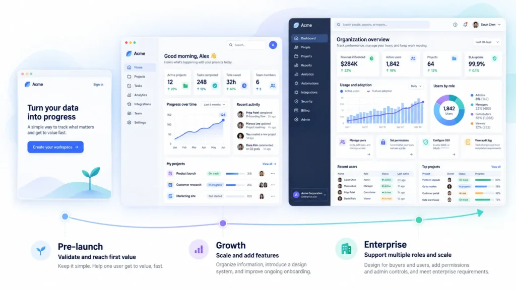
So we sorted the SaaS UX design best practices by where the product actually is. Before product market fit. Growing and adding features. Enterprise and multi-role. The practice that saves you at one stage is the practice that wastes your time at the next.
We design SaaS products at Pixelean. The brief we receive more than any other is a list of everything wrong, which is another way of saying nobody has decided what matters yet.
Key takeaways
- The SaaS UX practices worth your time depend on the product stage, not on a universal checklist.
- Before product market fit, get one user to first value fast and design the empty state first.
- At growth, information architecture and a design system carry the load, and second-week onboarding matters more than the first.
- At enterprise, the buyer is not the user, and every role you add multiplies the design.
- A best practice is a default, not an answer. The skill is knowing which screen is the exception.
Why most SaaS UX advice does not help
The standard list fails for three reasons, and they are worth naming before we replace it.
It is stage-blind. The same seven practices get handed to a pre-launch build and a platform with a signed enterprise contract. A team still hunting for product market fit does not need the same work as a team defending a renewal, yet the article treats them as one reader.
It is unranked. A list of fifteen practices is a list of fifteen priorities, and that is no priority at all. It is the same failure we describe in what a UX audit actually finds, under a different name. When everything is important, the founder finishes the article knowing nothing about what to do on Monday.
It hides the trade-offs. Real practices conflict. Remove a step and you speed everyone up, until someone deletes a workspace they meant to keep. A list cannot hold a conflict, so the list quietly leaves it out.
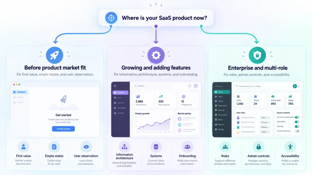
What follows is sorted into three stages. Then the conflicts. Then the short set of practices that hold no matter where you are. Here is the whole map before we walk it.
| Product stage | Fix first | Leave for later |
| Before product market fit | Time to first value, the empty state, watching five real users | A design system, deep accessibility, dashboard depth |
| Growing and adding features | Information architecture, a design system, disclosure by role, second-week onboarding | Enterprise admin tooling, a full rebrand |
| Enterprise and multi-role | Designing for the buyer and the user, roles and permissions, the admin experience, accessibility conformance | Nothing new, the earlier work is now the baseline |



Not sure how your current Saas design site was built?
Send us the URL. We will tell you what is under it and what that means for your next redesign.
Stage 1, before product market fit
Who this is. You have under a few hundred users. You are still changing the product most weeks. You do not have a dedicated designer, and the founder is still the one drawing screens.
Three things matter here. Not seven.
Get one user to the value, fast
Time to first value is the only activation number worth watching this early. Name the single action a new user has to complete to feel the point of the product, then measure how many people reach it and how long it takes them.
Figma does this in a way you can watch. It loads an editable sample file at first login, so the first session is spent doing the thing, not setting it up. The new user is inside the product before they have decided whether to care.
The target that counts is the one you set for your own product.
Design the empty state first
Every new user starts at zero. The screen they see most in the first week is the one with nothing in it yet, and the team almost always designs it last.
An empty state is not a blank canvas. It is the most important onboarding screen you own. It should show what goes here, why it matters, and the one action that fills it. We count states the way we count screens, and the empty version is the one that decides whether the second session happens. That state count drives the shape of the work and the cost of it.
Stop polishing, start watching
Five users through the core flow beats another week of refinement. You will learn more in an afternoon of watching people miss the button than in a month of moving it.
This is the cheapest research you will ever run, and the one founders skip most. Sit behind five real users, give them the core task, and say nothing. The method is a UX audit scaled down to a laptop and a notebook.
What does not matter yet.
A design system does not matter yet. You do not have enough surface to justify one, and the product will change underneath it before the ink dries.
Accessibility conformance beyond the basics does not matter yet. Keep contrast and keyboard focus honest, and move on. The full standard becomes a requirement later, and we come back to it at the enterprise stage.
Dashboard sophistication does not matter yet. You do not have enough data to put in a dashboard, and a rich one built on three data points is a stage-three answer to a stage-one question.
Stage 2, growing and adding features
Who this is. You have paying customers and a roadmap. Features are arriving faster than the interface can absorb them, and the product that felt clean a year ago is starting to sprawl.
Information architecture is now the whole game
The navigation that held nine features breaks at twenty. This is the quiet crisis of the growth stage, and it shows up in two places every time.
The first symptom is a settings page that has turned into a junk drawer. The second is a navigation item called More, which is where features go when nobody decided where they belong. When you see either one, the problem is no longer the feature. It is the map. Fixing information architecture at this stage returns more than any new screen you could ship.
Build the design system now, not before
Now the design system earns its keep. The trigger is simple to spot. When two designers draw the same component two different ways in the same month, the system is already overdue.
Before this point a system is premature. After it, the cost of not having one compounds every sprint. For what actually goes into one and how to build it without over-engineering, see our guide to what a design system is and how to create one.
Progressive disclosure, and its limit
Hiding complexity helps the new user and frustrates the power user who pays you the most. Progressive disclosure is right until it hides the thing an expert reaches for forty times a day.
The Nielsen Norman Group describes it well. Progressive disclosure defers advanced or rarely used features to a secondary screen, which makes an application easier to learn and less error-prone (Nielsen Norman Group). The tension is real, and the answer is usually to surface by role rather than to hide by default. Give the beginner the clean path and the expert the shortcut, and stop pretending one layout serves both.
Onboarding for the second week, not the first
SaaS onboarding UX usually stops after setup. The drop that kills growth-stage products happens in the second week, when the first push is over and the habit has not formed. The pattern we see is that the second-week moment gets built by accident, if it gets built at all. Build it on purpose. A reason to come back beats another tooltip on the way in.
What does not matter yet.
Enterprise admin tooling does not matter yet, unless a real enterprise deal is on the table. Building for a buyer you do not have is how a roadmap stalls.
A full rebrand does not matter yet. The structure is the problem at this stage, not the surface, and repainting the walls while the floor plan is broken fixes nothing. If a rebrand is genuinely on the table, price it with eyes open using what a rebrand actually costs. And if the dashboard is where the sprawl shows first, the patterns worth copying live in our roundup of SaaS dashboard design examples that work, not in this article.
Stage 3, enterprise and multi-role
Who this is. Procurement is in the room. There are admins. Someone has asked about single sign-on and audit logs, and the sales cycle now runs in months.
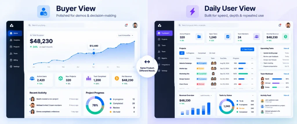
The buyer is not the user
The person who signs the contract may never open the product. The person who uses it every day had no say in buying it. Design for both, and know exactly which screens each one sees.
This is the split that business-to-consumer thinking cannot handle. The evaluator sees a demo and a pricing page. The daily user sees the same working screen four hundred times a year. A product that dazzles the first and exhausts the second wins the deal and loses the renewal. Business-to-business SaaS UX lives or dies on holding both truths at once.The same split shapes the marketing site. See how enterprise vendors handle it in our roundup of the best SaaS websites.
Roles and permissions multiply the design, not the code
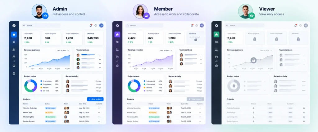
Three roles is not one interface. It is three interfaces, plus the awkward states where a user sees a thing they are not allowed to touch.
Engineers add a role with a flag. Designers add a role with a week, because every screen now has to answer what an admin sees, what a member sees, and what happens when a viewer bumps into a locked door. This is one of the largest drivers of scope in enterprise work, and it is the part that surprises teams who priced the build like a single-user app. We break down how roles push the number in what UI and UX design costs.
The admin experience is a product of its own
The admin panel gets designed last, usually by a developer, and it is the surface the renewal runs through. That is a dangerous order of operations.
The admin is the person who provisions seats, sets permissions, and pulls the report that justifies the spend to their boss. Treat their experience as a real product with its own flows, or watch the account quietly decide not to renew because managing it was a chore.
Accessibility becomes procurement, not principle
At enterprise, accessibility stops being a good idea and becomes a purchase requirement. Teams that treated it as optional discover it during vendor review, with a signature on the line.
Say the plain version. At enterprise, buyers ask for an accessibility conformance report, usually a VPAT measured against WCAG 2.1 AA, the same way they ask for a security questionnaire. Public sector deals in the US add Section 508, and EU public procurement adds EN 301 549. The teams that built it in from Stage 2 pass without drama. The teams that deferred it rebuild under deadline pressure, which costs far more than doing it once.
When best practices conflict
This is the section a list cannot hold. Real practices pull against each other. Here are four conflicts you will actually face, and how to decide.
Fewer steps versus fewer mistakes
Removing the confirmation dialog speeds everyone up, right until someone deletes a workspace and files a furious ticket. Decide by the cost of the error, not by the click count. A cheap, reversible action should lose the friction. An expensive, permanent one keeps its guardrail.
Simple for new users versus fast for daily users
The guided tour that helps in the first week becomes an obstacle in the sixth month. Decide by who generates the revenue. If daily power users pay the bills, the default should favor speed, and the hand-holding should be something a beginner opts into rather than something an expert fights through.
Consistency versus the better pattern
Your design system says one thing, and this particular screen clearly needs another. Decide by how often the screen is used. A high-traffic screen earns a considered exception. A screen someone visits twice a year should stay consistent and boring, because the cost of learning a one-off pattern is not worth the polish.
Showing power versus showing simplicity
Sales wants the product to look capable. Users want it to look manageable. Decide by which screen the argument is about, because the demo and the daily view do not have to be the same screen. Let the demo show the ceiling. Let the working surface show the floor. Trying to make one screen do both is how products end up cluttered and unconvincing at the same time. A best practice is a default, not an answer. The job is knowing which default this screen is an exception to.
The practices that apply at every stage
A short list. Four items. These are the SaaS design principles that hold no matter the stage. Compare that to the fifteen-item lists elsewhere, and notice how little actually carries across the whole life of a product.
Write the words before the screens. The label, the empty state message, the error text. The copy is the interface, and fixing the words is the cheapest usability win you will ever ship.
Design every state, not the happy path. Loading, empty, error, and permission-denied are where real users live. The polished success screen is the one they see least.
Make errors recoverable. An error message should be visible, should say what to do next, and should preserve what the user already typed (Nielsen Norman Group). A dead end that eats a form is the fastest way to lose trust.
Watch real users at least once a quarter. Not a survey. Not a heatmap. A person, a task, and your silence. Everything else on this list gets easier once you are watching.
How we approach SaaS UX
We start every SaaS project the same way. We ask what stage the product is in and what one number the team is trying to move. The answer decides the work, and the way we sequence it from research to handoff follows our design process.
We push back on the everything-at-once brief. When a founder hands us a list of fifteen fixes, we send back two. The other thirteen are real, and they are not this quarter’s problem. Shipping the wrong fix fast is still the wrong fix.
We are not right for every team. If you want a rebrand while the information architecture is broken, or an enterprise admin panel before you have an enterprise customer, we will say so out loud. For a wider view of how to pick a partner and the questions worth asking, read how to choose a SaaS design agency. The work itself lives under SaaS application design and the broader UI and UX design practice.
Frequently asked questions
What are SaaS UX design best practices?
SaaS UX design best practices are the design decisions that help people understand a subscription product, reach value quickly, and keep coming back. The useful ones are sorted by stage, because a pre-launch tool and an enterprise platform need different work. Retention is the goal, not a one-time conversion.
What is the difference between SaaS UX and regular web design?
Web design usually optimizes for a single visit and a conversion. SaaS UX optimizes for the fiftieth visit and the renewal. The success metric moves from getting someone to act once to helping them succeed repeatedly, which changes what you design and what you measure. The whole SaaS user experience is built around the return visit, not the first click.
What is the most important SaaS UX practice?
It depends on the stage, and that answer is the honest one. Before product market fit, getting one user to first value fast matters more than anything else. At growth, information architecture carries the load. At enterprise, designing for both the buyer and the daily user does.
How do you reduce churn with UX design?
Reduce churn by removing the confusion that makes people quit. Get users to value quickly, design the empty and error states so nobody hits a dead end, and build a reason to return in the second week. Some churn is a UX problem wearing a pricing complaint. Some is the reverse. Watch five users before you decide which one you have.
When should a SaaS product build a design system?
Build a design system once two designers start drawing the same component differently in the same month, or once inconsistency is slowing the team down. Before that point it is premature, because the product will still change underneath it. After that point, not having one compounds cost every sprint.
What is a good time to value for a SaaS product?
A good time to value is the shortest honest path to the moment your product proves its worth, and it varies by category. Simple tools should aim for minutes. Complex platforms can take longer. The number that matters is the one you define and measure for your own product, not an industry average.
How is B2B SaaS UX different from B2C?
In business-to-business SaaS, the buyer is often not the user, the decision runs for months, and the daily work spans teams with different roles. That means role-based design, an admin experience that earns the renewal, and screens built for repeated expert use rather than a single delighted first impression.
The bottom line
The generic SaaS UX list is not wrong. It is unranked, and unranked advice is useless to a founder who can only fix one thing this month. Sort the SaaS UX best practices by stage and the fog clears. Before product market fit, get one user to value and design the empty state. At growth, fix the information architecture and build the system. At enterprise, design for the buyer and the user, and treat roles and the admin as real products. Then learn which screen is the exception to every rule above.
Ready to name your two or three?
Tell us your stage and the one number you are trying to move. Activation, second-week retention, or the renewal. We will name the two or three practices that matter for you right now, and the ones you can safely ignore until later. That is the whole offer, and yes, sometimes the honest answer is that you do not need us yet. When you are ready, see what it costs to work with us.