Every guide to the ui ux design process gives you a different number of steps. Six. Eight. Ten. None of them tell you the one thing you need, which is what you are supposed to do while it happens.
This walks the UI/UX design process step by step, the same seven stages every studio runs. The difference is the chair you are sitting in. Every other version of this article is written by a designer, for a designer. This one is written for the person who signs the invoice, the one who has to approve the work, supply half of it, and live with the result.
For each stage you get four things no competitor puts in writing. What we need from you. What you receive at the end. How long it takes. What goes wrong here, and whose fault it usually is. At Pixelean, we run these stages every week for startup and SaaS clients, so the timings are ours, not a textbook’s. They assume you answer within two working days. When you do not, every number here stretches.
Key takeaways
- The UI/UX design process, step by step, told from the side of the person paying, not the designer.
- Seven stages every studio runs. Each one returns something you can look at and approve. If it returns nothing, it is a billing line, not a stage.
- Some stages are safe to skip. Some are never safe to skip. We do not bill by phase, so this piece tells you which.
- The slowest projects are not the ones with weak designers. They are the ones where the client answered late.
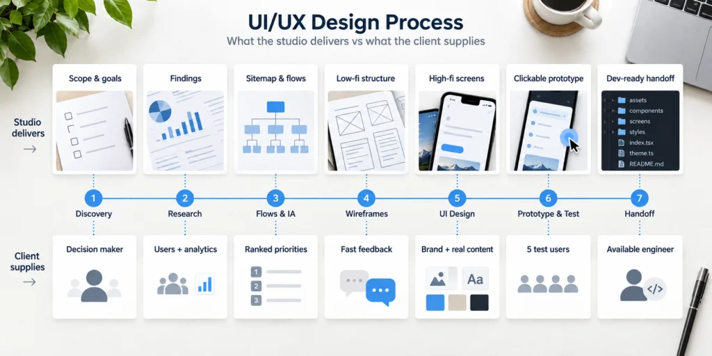
The seven stages at a glance
| Stage | What you get | Typical duration | What you must supply |
| 1. Discovery | Scope, goals, success criteria | 2-3 days | Access to whoever decides |
| 2. Research | Findings that change decisions | 3-5 days | Existing users, analytics, support tickets |
| 3. Flows and IA | Sitemap, user flows | 3-5 days | Feature priority, ranked |
| 4. Wireframes | Low-fidelity structure | 3-5 days | Fast, specific feedback |
| 5. UI design | High-fidelity screens, states | 1-2 weeks | Brand assets, real content |
| 6. Prototype and test | Clickable build, test findings | 3-5 days | Users to test with |
| 7. Handoff | Dev-ready Figma, documentation | 2-3 days | Your engineer, in the room |
| Beyond handoff | Week-two fix list | Ongoing | Analytics, session data, the support inbox |
These stages run in parallel more often than in sequence, and the durations assume you answer within two working days. Most projects land between four and ten weeks from discovery to handoff. A SaaS build with many screens runs longer, six to twelve.
Why every guide gives a different number of steps
The count is an argument about framing, not about the work. Some guides say six, some say eight, some say ten, and all of them describe the same work split into different boxes. The splits come from the framework, not from the work. Design Thinking has five stages. The Double Diamond has four. An agency process page has as many steps as it has selling points. What matters is not the number. It is whether each stage in the ux design process produces something you can look at and approve.
A test you can run on any proposal you are handed. If a stage has no named output, it is a billing line, not a stage.
The stages, one at a time
Same shape every time, so you can scan it. What happens, what we need, what you get, what breaks.
Stage 1. Discovery
Discovery is not a kickoff call. It is the hunt for the one person who can say yes, and the handful of numbers that will tell everyone when the work is done.
What happens. We find the decision maker and the success criteria before anyone draws a box. We also agree how the finished work will be judged, so nobody relitigates the goal at the end.
What we need from you. Access to whoever decides. Not a proxy who has to check upward.
What you receive. A short written scope, the goals, and success criteria you can measure against later. One page, not fifty. Enough to settle what the project is for and how everyone will know it worked.
What goes wrong. The person who can say yes is not in the room. Direction gets approved, then overruled a week later by someone who was never asked. This single failure causes more overrun than any other stage on this list. The fix is cheap. One name, written down, with the authority to approve direction.
Stage 2. Research
Research is only worth what it changes. An insight that does not move a screen did not earn its week.
What happens. We look at what already exists. Real users, analytics, support tickets. We turn that into findings that change a decision downstream.
What we need from you. Your existing users, your analytics, your support tickets. Most of the research you are about to pay for, you already own.
What you receive. Findings that change decisions, not a deck for the shelf. Three things you did not know, each tied to a screen it changes. If we cannot name the screen, we did not find anything worth the week.
What goes wrong. Research runs as a ritual. The output goes into a slideshow and nothing downstream moves. You paid for a document instead of a decision. The tell is a research phase that ends in a presentation and starts no arguments.
Stage 3. User flows and information architecture
This is the cheapest stage to fix anything in, and the one clients most want to skip because there is nothing pretty to look at yet.
What happens. We map the screens and the paths between them. The sitemap, the user flows, the skeleton every later stage hangs on. This is where the product gets its bones, and every screen later inherits the decisions made here.
What we need from you. Your feature priority, ranked. What matters most, in order.
What you receive. A sitemap and the core user flows. The structure, before anyone spends money making it beautiful.
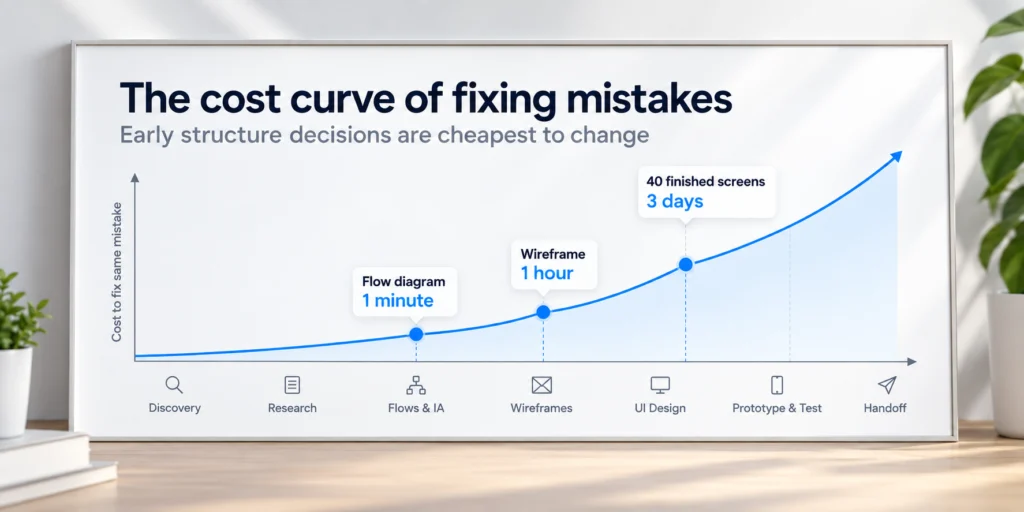
What goes wrong. It gets skipped to reach visuals faster, then rebuilt at the UI stage at what, in our experience, is closer to ten times the cost. Moving a box in a flow diagram takes a minute. Moving it across forty finished screens takes days. On a SaaS application design build, this stage carries the whole product. Gray diagrams feel like a detour when you are paying to see your product. They are the one place mistakes are still free.
Stage 4. Wireframes
Wireframes are ugly on purpose. Gray boxes get you structural feedback. Pretty screens get you color feedback.
What happens. We lay out every screen in low fidelity. No brand, no color, no polish. Only what goes where, and why.
What we need from you. Fast, specific feedback on structure. Does the order make sense. Is anything missing.
What you receive. A low-fidelity map of the product, cheap to change, which is the entire point of doing it now.
What goes wrong. You review the wireframes as if they were final designs and comment on fonts. The gray boxes were built to ask one question, and the fonts are not it.
Stage 5. UI design
This is where a twenty-screen product quietly becomes seventy artboards, because every screen has an empty state, an error state, a loading state, and a full one.
What happens. We turn the approved structure into high-fidelity screens. Real layout, real hierarchy, every state a screen can be in.
What we need from you. Your brand assets and your real content. Real copy, real product names, real edge cases.
What you receive. High-fidelity screens and their states. The thing most people picture when they think of design. Every screen gets its empty, error, and loading states too, because a product lives in those far more than in the tidy demo one.
What goes wrong. Content arrives late, so screens get built around placeholder text, then the real copy shows up twice as long and the layout breaks. The states are also where budgets move. Skipping them does not remove the work. It hands the work to your engineer, who will guess. That is the same trap behind what a design project actually costs. For a mobile app design build, the state count climbs faster still. A checkout with three states on paper has nine in practice. Empty cart, one item, out of stock, payment failed, payment pending, success, and the two error screens nobody drew.
Stage 6. Prototype and usability testing
Five users will surface roughly 85% of the usability problems in an interface, as long as it is not already highly polished (Nielsen Norman Group). You do not need a lab or a big sample to learn what is broken.
What happens. We wire the screens into an interactive prototype and put it in front of real people, then watch where they hesitate.
What we need from you. Users to test with. Five is enough, as long as they resemble your actual customers and not your team. Those five will tell you where the interface confuses people. They will not tell you whether anyone wants the product. Do not confuse the two.
What you receive. A clickable build and a short list of what tripped people up, ranked by how often it happened.
What goes wrong. Testing gets scheduled after the build starts, so the findings have nowhere to go. On a small marketing site, usability testing as a separate phase is often skippable, and you can test after launch with real traffic instead. That is a defensible call. Skipping it silently and calling the product validated is not.
Stage 7. Developer handoff
Handoff is the stage that decides whether the design you approved is the design that ships.
What happens. We hand engineering a build they can work from. Components, tokens, states, annotations, and Figma Dev Mode set up so measurements are not guesswork.
What we need from you. Your engineer, in the room, while the design is still open to questions. Not after.
What you receive. Dev-ready Figma, a documented design system, and a person who answers questions instead of a file dropped over a wall. A real handoff is components, tokens, every state, the annotations, and someone on the other end of a message.
What goes wrong. Files get thrown over a wall. The engineer rebuilds by eye. The shipped product drifts from the design by a hundred small decisions nobody signed off on. A real handoff and a design system are what keep the built product matching the approved one. This is also where design meets web development, and the two either talk or the product suffers. The best handoffs feel boring. No surprises and no rebuilds, because the answer was written down and someone was there to confirm it.
Beyond handoff, the first weeks after launch
Most guides stop at handoff. Your users do not.
What happens. The product meets real traffic. The first real users find the thing no test did, because real use is messier than any script.
What we need from you. A way to see what is happening. Analytics, session data, the support inbox.
What you receive. A short list of what to fix in week two, ordered by how much it hurts. The first real fixes are usually small. A label nobody understood. A step people skipped. Cheap to change now, expensive to have left shipped.
What goes wrong. The team treats launch as the finish line and moves on. The interface stops improving on the day feedback finally got real. Iteration is not a phase you add later. It is the phase you were building toward. Week two is where the map meets the territory. Budget for it before launch, not after the complaints arrive.
Which steps you can actually skip
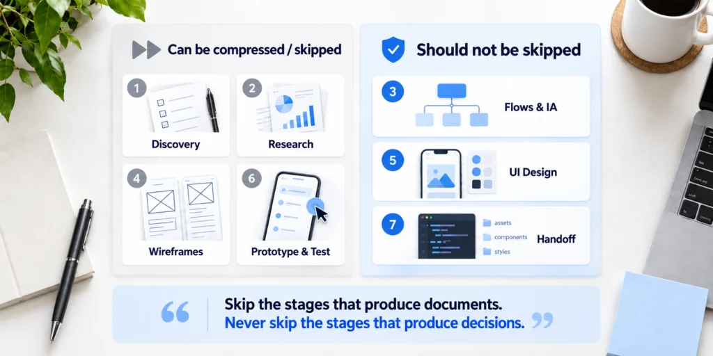
Studios that bill by the phase will tell you never to skip a phase. Of course they will. Their invoice has a line for each one. We do not bill by phase, so this is the honest version.
Safe to compress or skip.
- Formal research, when the pattern is well understood and the budget is small. A booking flow is not an unsolved problem. Someone has designed one before, and so have we.
- Formal research, when you already have users, analytics, and support tickets. That is research. You paid for it once already. You do not need to pay again to have it renamed.
- Usability testing as a separate phase, on a small marketing site. Test after launch, on real traffic. That is a real answer, not a corner cut.
Never skip.
- Flows and IA. The cheapest stage, and the one that makes every later stage cheaper. Skip it and you pay for it five times over at the UI stage.
- States in UI design. Skipping them does not delete the work. It ships the work to your engineer, who will guess, and guess differently than you would have.
- Handoff support. A design nobody is around to explain becomes a suggestion, and engineering overrules a suggestion every time.
Here is the rule under all of it. Skip the stages that produce documents. Never skip the stages that produce decisions. A document is a record of a decision already made. The decision is the part worth paying for. This is the one place our advice runs against our own invoice, which is exactly why you can trust it.
Where the clock actually goes
Design time and project time are different numbers, and the gap between them is almost entirely your decision speed.
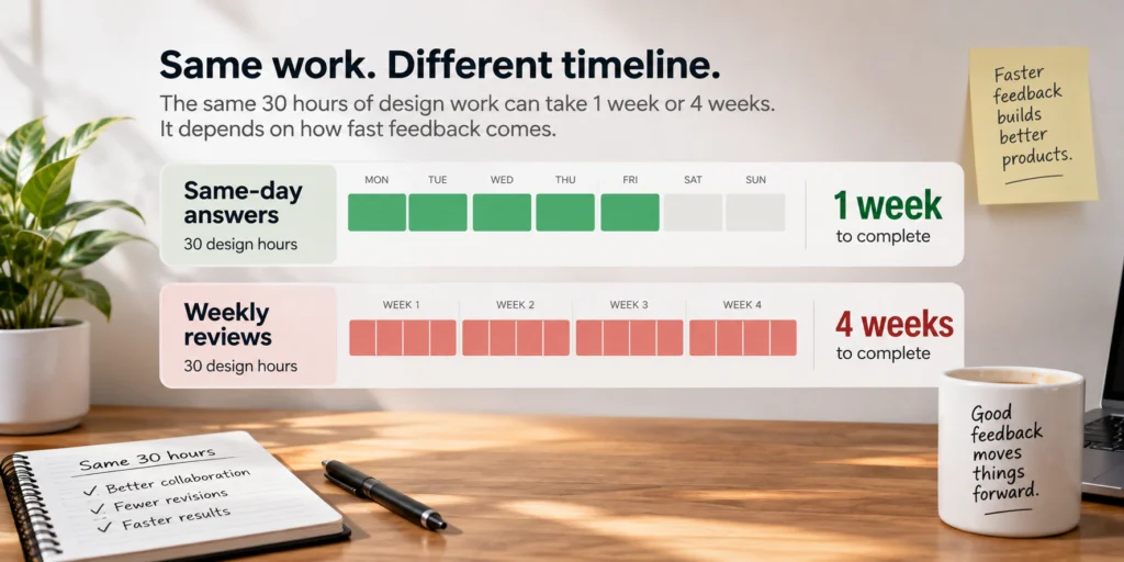
A stage with thirty hours of design in it takes three weeks when every approval takes four days. The hours did not change. The waiting did.
Name the real variable. A team that reviews within forty-eight hours finishes in half the calendar time of a team that reviews once a week. Same designers, same scope, half the timeline. The difference is you. None of this is about working faster. The designers are already fast. It is about not leaving the work in an inbox while a week of calendar burns.
The fix is not complicated. One named decision maker. A standing review slot on the calendar. Feedback in a single consolidated pass, not five people commenting separately across four days and contradicting each other on the fifth.
A worked example. A stage holds thirty hours of design. With same-day answers it clears in a week. With weekly reviews the same thirty hours stretch across a month, and nothing about the design got harder. Only the calendar did.
This is also why fast projects cost less. You are not paying for hours. You are paying for decisions. The fastest projects are not the ones with the best designers. They are the ones where the client decided quickly.
What the client owes, stage by stage
The entire client side of the project fits on one screen.
- Discovery. The decision maker, available. Not a proxy.
- Research. Your analytics, user access, and support tickets, in one place.
- Flows and IA. Your feature list, ranked by priority.
- Wireframes. Fast structural feedback, inside two working days.
- UI design. Brand assets and real content. Real copy, not placeholder.
- Prototype and test. Five users who resemble your customers.
- Handoff. Your engineer, available to answer questions.
Print it. The projects that run late almost never run late because of the design. They run late because one of these lines was missing on day one.
What AI changed, and what it did not
AI compressed the stages that produce documents. It did not touch the stages that produce decisions.
What changed.
- Research synthesis and transcript analysis are genuinely faster. A week of reading becomes an afternoon.
- First-draft copy for wireframes, so structure reviews start sooner.
- Component and variant generation inside a design system that already exists.
What it did not.
- Deciding what the product should do.
- Resolving a disagreement between two stakeholders who both sign the check.
- Knowing which of five workable layouts fits this particular business.
That maps exactly onto the skip list above. The stages AI made cheap are the ones you could already compress. The expensive stages were always the ones where a human has to decide, and those are still yours. The tools got better at making things. They did not get better at deciding which thing to make. That is the part you are hiring judgment for, and no tool has learned to fake it. We went deeper on this in AI in UI/UX design.
How we run it
Our process at Pixelean is the seven stages above, with two honest edits.
We compress research by default. If you already have users and data, we use them and skip the ritual version. If you do not, we do the smallest research that will change a decision, and no more. Anything past that is a cost you carry and a week you wait, with no decision to show for it. We treat handoff as part of design, not a delivery event. Someone stays reachable while engineering builds, because a design nobody can explain is a design that gets reinterpreted.
This does not suit every team. If you want to approve every pixel by committee, or you treat design as decoration applied at the end, the ui ux design workflow here will frustrate you. If the decisions are going to be made late and reversed often, no process fixes that, and we would rather say so before you pay us. We would rather lose the project at the proposal than halfway through, so we say the hard part first. That is how we run UI/UX design, and it is reflected in our pricing.
Frequently asked questions
What are the steps of the UI/UX design process?
There are seven. Discovery, research, flows and information architecture, wireframes, UI design, prototype and testing, and developer handoff. A step beyond handoff, post-launch iteration, matters more than most guides admit. Each stage returns something you can look at and approve, which is the only test that counts.
How long does the UI/UX design process take?
Most projects run four to ten weeks from discovery to handoff. A SaaS build with many screens runs six to twelve. The single biggest variable is not scope. It is how fast you return feedback, because idle waiting stretches the calendar far more than design hours do.
What is the first step in the UI/UX design process?
Discovery. Before anyone draws a screen, the studio finds the person who can approve direction and the success criteria the work will be judged against. Skip it and you risk building toward a target nobody agreed on.
Is UI design or UX design done first?
UX comes first. Flows, structure, and wireframes decide how the product works before UI design decides how it looks. Designing the surface before the structure is settled means redrawing the surface later, at a much higher cost.
Can you skip user research in UI/UX design?
Sometimes. If the pattern is well understood and you already have users, analytics, and support tickets, formal research can be compressed. On an unfamiliar problem with no existing data, skipping it means guessing, and guesses are expensive to unwind once they are built.
What does a designer need from the client to start?
A decision maker who can say yes, ranked feature priorities, brand assets, and real content. The fastest projects are the ones where all of this is ready on day one, not gathered stage by stage while the clock runs and the invoice grows.
What is the difference between wireframes and prototypes?
A wireframe is a static, low-fidelity layout that shows structure. A prototype is clickable and shows behavior. Wireframes answer the question of structure. Prototypes answer the question of use, whether a real person can move through the thing without getting stuck.
Putting It Into Practice
If you want this mapped to your actual project, we will build you a scoped stage plan. The seven stages applied to your product, with the durations, the decisions you will own, and the two or three stages worth compressing for your budget. No pitch deck. A plan you could hand to another studio and still use. Start a scoped stage plan.