The prototype is ready. Development starts in three weeks, and nobody outside the team has tried to use the product. Someone suggests a test, opens a search tab, and finds lists of seven, ten, or seventeen usability testing methods. Five of the six publishers behind the ranking guides we read for this post sell research software or a participant panel. Many of those lists lead, sooner or later, to the seller’s own product.
Pixelean designs products and has no affiliation with any tool named on this page. You do not need a research department for any of what follows. You need a question.
This guide gives you three things. The method that fits the question you need answered, the number of people to invite, and two scripts you can copy into your next session.
Key takeaways
- Usability testing means giving real people realistic tasks and watching where the design stops them. Pick the method from the question you need answered.
- Where do people get stuck? A moderated remote test or a moderated in-person test, with think aloud.
- Can people finish one task without help? An unmoderated remote test.
- Which of two designs works better? A comparative test.
- Is it good enough to ship? A benchmark test with task metrics.
- Does it work with a screen reader? An accessibility test with disabled users.
What usability testing is, and what it is not
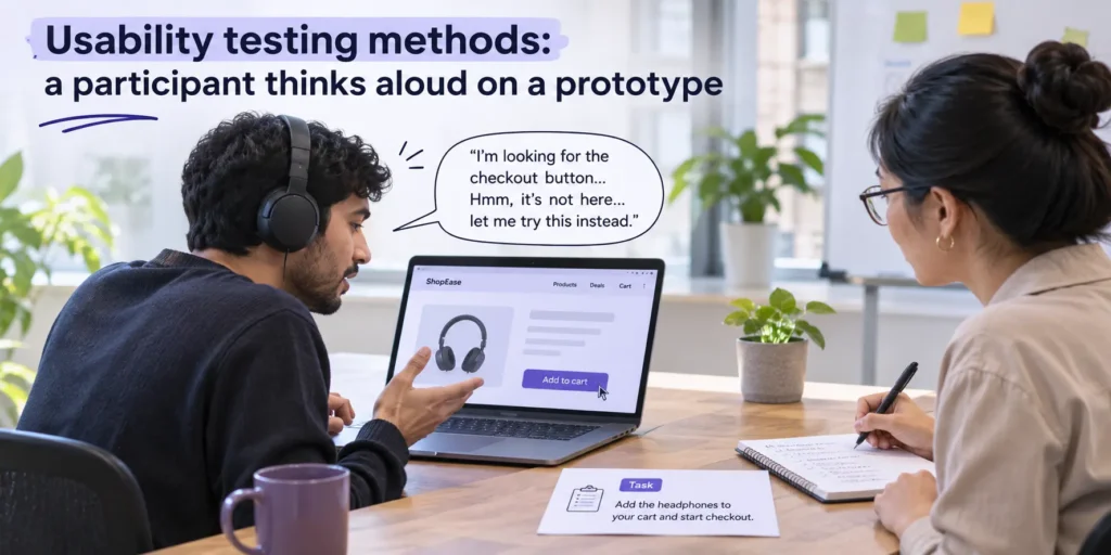
A usability test has three parts. NN/g’s Usability Testing 101 names them as “the facilitator, the tasks, and the participant.” The participant attempts the tasks. The facilitator watches, listens and stays quiet. The same article notes that usability testing is “alternately called user testing,” so the two names describe one method.
The trouble starts with the lists. Guides pad their count with methods that answer other questions. Card sorting is useful. Heatmaps are useful. They also answer different questions, and a test is only as good as the match between the question and the method. The table sorts the usual candidates by the question each one answers. Read the third column before you book anything.
| Method | The question it answers | Is it a usability test? |
| Usability test (moderated or unmoderated) | Can people complete the task? | Yes |
| Card sorting | How do people group your content? | No. It is an information architecture method. |
| Tree testing | Can people find items in your menu structure? | Partly. It tests the structure without the visual design. |
| Session recordings and heatmaps | What do real visitors do when nobody gives them a task? | No. This is analytics. |
| A/B test | Which version performs better with live traffic? | No. It is an experiment on live traffic. |
| Survey | What do people say they think or do? | No. It records opinions and reported behavior. |
| Heuristic review (expert review) | What do experts find without users? | No. It is an expert review. |
The last row deserves a word. An expert review finds a lot without a single user, and it follows its own rules. A full UX audit usually adds testing and analytics to that review. Read how a UX audit differs from usability testing before you pay for one in place of the other.
Mixing the methods up has a cost. It is how a team ends up with a heatmap when it needed to watch one person struggle with the checkout.
The three choices behind every usability test
Moderated or unmoderated
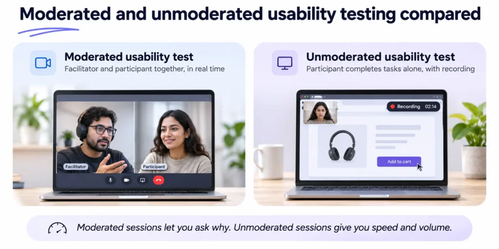
In a moderated session, “users and facilitators are in the same ‘virtual’ space at the same time,” according to NN/g’s Remote Usability Tests. Unmoderated sessions “are completed alone by the participant.” You trade the follow-up question for speed and volume.
Remote or in person
Remote sessions reach people where they live and work, on their own devices. In-person sessions show you the hands, the face and the moment someone leans back from the screen. Choose in person when the device or the setting matters, such as a payment terminal or a phone used one-handed on a train. Choose remote when the people you need are scattered or busy, which is common for software products sold online.
Qualitative or quantitative
Qualitative usability testing “focuses on collecting insights, findings, and anecdotes,” and quantitative testing “focuses on collecting metrics that describe the user experience,” per Usability Testing 101. The first tells you what is broken and why. The second tells you how much, and it needs far more people. Start qualitative. You cannot measure a problem you have not found yet.
Usability testing methods compared
Ten methods cover nearly every question a product team asks before launch. The participant numbers follow NN/g’s guidance, and the accessibility row follows W3C. Session lengths for moderated tests come from the GOV.UK Service Manual, which says sessions “usually take between 30 and 60 minutes.” Every other session length is a typical range, and we claim no source for it. Costs are relative to each other, because tool prices change too often to print.
| Method | The question it answers best | Participants | Session length | Relative cost | Best stage |
| Moderated in-person test | Where and why do people get stuck? | 5 per user group | 30 to 60 minutes | High | Prototype or live product |
| Moderated remote test | Where and why do people get stuck, wherever they are? | 5 per user group, plus 1 or 2 spare | 30 to 60 minutes | Medium | Prototype or live product |
| Unmoderated remote test | Can people finish a specific task alone? | 5 per user group for findings, about 40 for metrics | 10 to 20 minutes (typical) | Low to medium | Clickable prototype or live product |
| Guerrilla test | Is anything obviously broken? | About 5 passers-by | 5 to 10 minutes (typical) | Low | Early concept or prototype |
| Prototype test | Does this flow make sense before we build it? | 5 per user group | 30 to 60 minutes | Low to medium | Paper or clickable prototype |
| First-click test | Do people start the task in the right place? | About 40 if you report percentages | Under 5 minutes (typical) | Low | One screen, any stage |
| Five-second test | What do people remember from one screen? | About 40 if you report percentages | Under 5 minutes (typical) | Low | One screen, any stage |
| Comparative test | Which of two or more versions works better? | 5 per version for findings, about 40 for metrics | 30 to 60 minutes | Medium | Two or more drafts |
| Benchmark test | Is the release good enough to ship? | About 40 | 20 to 60 minutes (typical) | High | Final or updated version |
| Accessibility test with disabled users | Does it work with assistive technology? | No fixed number. Recruit for each assistive technology. | 60 minutes or more (typical) | Medium to high | Prototype or live product |
Think aloud appears in several of these methods, and it is a technique rather than a method of its own. The participant says what they are looking for and thinking while they work. Jakob Nielsen called it “the single most valuable usability engineering method” in Thinking Aloud, the #1 Usability Tool. The same article warns that interruptions “can very easily change user behavior,” so the facilitator speaks as little as possible.
Moderated in-person test
Use it. When you need to see why people fail and you can sit beside them. It gives the richest findings of the ten and takes the longest to set up. You see where the eyes go, where the hand hesitates and what the person mutters when the page lets them down.
Skip it. When your users are spread across countries, or the question is one simple task. Travel and room booking cost more than the answer is worth.
Pitfall. The facilitator helps. One hint at the wrong moment, and you have tested your own explanation.
Moderated remote test
Use it. For the same depth as in person, with participants on their own devices in their own rooms. For a team with no lab and customers in several cities, this is the default.
Skip it. When the participant’s setting cannot be shared on a call, such as a payment terminal.
Pitfall. Silence on a call is hard to read. Ask “What are you looking for?” before you decide they are stuck.
Unmoderated remote test
Use it. For two or three specific tasks and fast turnaround. A platform records each session while you do other work, and a round can come back within a day.
Skip it. When you will need to ask why. NN/g is blunt about the loss. “There is no opportunity to ask detailed questions specific to the user’s actions.”
Pitfall. Unclear task wording. Nobody is there to rescue the participant, so pilot every task first.
Guerrilla test
Use it. Early and cheaply, with strangers in a café or a lobby, for five minutes each. It finds the obvious failures before you spend a week recruiting the right people.
Skip it. When your users are specialists, such as nurses or accountants. Passers-by will not match them.
Pitfall. Testing whoever happens to be nearby and calling the result evidence about your customers.
Prototype test
Use it. Before any code exists, on paper sketches or a clickable prototype. Changes cost the least at this stage, and nobody has grown attached to the code yet.
Skip it. When the question depends on real data, real speed or real content the prototype does not have.
Pitfall. Participants forgive a prototype. Tell them it is unfinished, then ask them to treat it as real.
First-click test
Use it. To check one screen, usually a home page or a navigation menu. Show a task and record where people click first.
Skip it. As a replacement for a task-based test. It is a quick check of one screen and says nothing about the second screen.
Pitfall. Reporting a percentage from eight people. Percentages need a quantitative sample.
Five-second test
Use it. To learn what a landing page or screen communicates at a glance. Show it for five seconds, then ask what people remember.
Skip it. For anything that involves a task. Like the first-click test, it is a quick check of one screen.
Pitfall. Asking whether people liked the page. Ask what the page offered them.
Comparative test
Use it. When two or more designs compete and the team cannot agree. The DHS guide to usability testing approaches describes it as comparing materials “to see which one is more effective and efficient for the participant to use.”
Skip it. When neither version has passed a basic test yet.
Pitfall. Order effects. The second version always benefits from what the participant learned on the first, so rotate which version each person sees first.
Benchmark test
Use it. Before a release, or to compare a release with the last one, using task success rate, time on task and error rate.
Skip it. While you are still finding obvious problems. Fix those first, or the benchmark will only measure the problems you already know about.
Pitfall. Running it with five people. NN/g’s guidance for quantitative studies is about 40.
Accessibility test with disabled users
Use it. When people who use screen readers, magnification, switch access or voice control need to complete your flows.
Skip it. Only when no one with a disability will use the product, which is rare. Pair it with a WCAG conformance check, because the two find different problems.
Pitfall. Treating one participant as the voice of every disabled user. The section on testing with disabled users covers how to run it.
How to choose a usability testing method
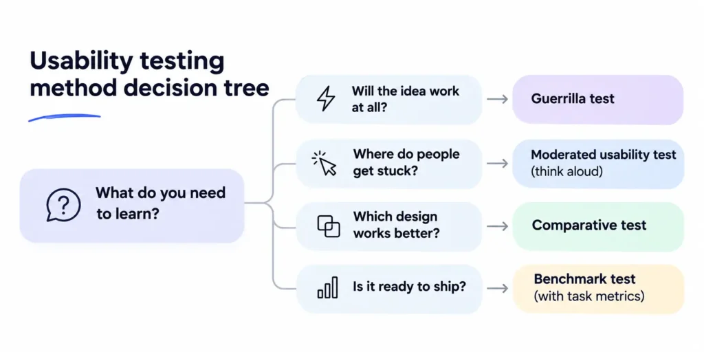
Start from the decision you face. The question decides the method, and a method chosen first will answer whatever question it happens to fit.
The US Department of Homeland Security’s guide to usability testing approaches sorts tests into four approaches by stage. Exploratory testing suits early concepts. Assessment testing works at any stage, and DHS calls it “the most common approach to usability testing.” Comparative testing weighs two or more versions. Validation testing measures final or updated versions against benchmarks such as completion rates and task times.
| If your question is… | Run this | Stage |
| Do people understand the idea at all? | Guerrilla test or prototype test | Exploratory, early concept |
| Where do people get stuck in this flow? | Moderated remote test or moderated in-person test | Assessment, prototype or live product |
| Can people finish one task without help? | Unmoderated remote test | Assessment, prototype or live product |
| Do people start this task in the right place? | First-click test | Assessment, one screen |
| What does this page say in five seconds? | Five-second test | Exploratory or assessment, one screen |
| Which of these designs works better? | Comparative test | Comparative, two or more drafts |
| Is this release good enough to ship? | Benchmark test | Validation, final or updated version |
| Does it work with a screen reader? | Accessibility test with disabled users | Assessment, prototype or live product |
Two questions in one round are fine when one method answers both. A moderated remote test can open with a single first-click task, for example. Three questions usually need two rounds.
[IMAGE SLOT. usability-method-decision-tree.webp. Decision tree mapping eight questions to the method that answers each one. Caption: Start from the question, and the method follows. Stages follow the US DHS approaches.]
Budget is the next worry, and it is usually smaller than teams expect. NN/g’s Usability Testing 101 says “Simple, ‘discount’ usability studies can be inexpensive,” though participants usually need a few hundred dollars in incentives. The same page puts the simplest study at three days of your time, “assuming that you have already learned how to do it, and you have access to participants.” A team with no researcher has neither yet. Plan for a week. The week is laid out under how to run a usability test.
How many users for usability testing
Test with five users per distinct user group for a qualitative usability test, and about 40 for a quantitative benchmark. NN/g recommends five participants “to uncover the majority of the most common problems in the product” (Usability Testing 101), and calls 40 participants “an appropriate number for most quantitative studies” (Why Use 40 Participants in Quantitative UX Research?).
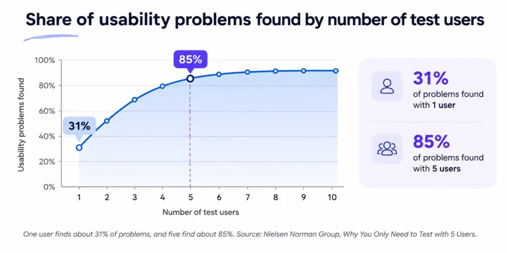
The five-user rule comes from Jakob Nielsen’s Why You Only Need to Test with 5 Users, and it rests on arithmetic. One user finds about 31% of the problems. “The typical value of L is 31%, averaged across a large number of projects we studied.” Five such users find about 85%. The rule holds under three conditions that the slogan usually drops.
- Comparable users. “The formula only holds for comparable users who will be using the site in fairly similar ways.” Several distinct groups need sessions of their own.
- A qualitative study. Five people show you problems. Five people cannot give you a reliable percentage.
- Several rounds. Nielsen’s own advice for a budget of 15 users is “Spend this budget on 3 studies with 5 users each!” Each round fixes what the last one found, so the next five people reach problems the first five could not.
With several groups, NN/g’s How Many Test Users in a Usability Study? says you can “typically … get away with 3–4 users per group,” because the experiences overlap. Card sorting is the exception, at “at least 15 users per user group.”
None of this makes five a magic number. Five is the point where watching one more person mostly shows you problems you have already seen, and the budget does more good in the next round.
For remote sessions, recruit one or two extra people. NN/g notes that no-shows run higher remotely, and that “it’s better to add a few more users than you think you need.”
Remote usability testing
Remote usability testing runs the session over a video call or a testing platform, with the participant at their own desk and on their own device. It is the default for teams without a lab, and it comes in two forms.
Moderated remote
Use it when you need follow-up questions. You see the screen and hear the voice as it happens, and you can ask “What did you expect to happen?” the moment something surprises the participant. The cost is subtle. Silence is hard to read on a call. In a room you can tell a reading face from a lost one. On a call you have to ask, and you have to ask without leading.
Unmoderated remote
Use it for a few specific tasks and fast turnaround. NN/g’s Remote Usability Tests says to “Write tasks far enough in advance to pilot-test them.” You lose the follow-up questions, so the task text does all the work. Write it, test it on one person, then rewrite it. Keep each task to one goal and one finish line. “Find a plan and invite your team” is two tasks pretending to be one.
Remote setup checklist
- Pilot the tasks and the tech with one person outside the team.
- Send joining steps the day before, with a link that opens in the browser.
- Ask for screen sharing and recording consent at the start, on the recording.
- Recruit one or two more participants than you need.
- Keep a backup link and a phone number ready.
- Store recordings securely and delete them on a set date. The GOV.UK Service Manual asks teams to make sure “any personal data you’ve collected (on paper or in recordings) is stored securely.”
Tools by job
Every tool below appears by the job it does. There is no ranking, no price and no affiliate link, and Pixelean has no affiliation with any of them.
- Moderated sessions. Video call tools such as Zoom and Google Meet.
- Unmoderated sessions. Testing platforms such as Maze, Lyssna and UserTesting.
- Recruitment. Participant panels such as Prolific, User Interviews and Respondent.
- Card sorting and tree testing. Optimal Workshop.
How to run a usability test
A usability test takes eight steps. The first one decides whether the other seven are worth the effort.
- Write the one question this round must answer. One round, one question. “Can a new user create their first project without help?” is a question. “Get feedback on the app” is a wish. If you are still writing the brief, put the test question in your design brief.
- Pick the method. Use the table under how to choose a usability testing method.
- Write three to five task scenarios. A task names a goal and leaves the path to the participant. “Click Pricing and choose the Pro plan” tests whether people can read. “Your team of six needs to share files. Find a plan that fits and get to checkout.” tests your design, and it is the kind of task a SaaS pricing page has to survive.
- Recruit people who match your real users. Colleagues, friends and investors know too much. Write a three-question screener that asks about recent behavior, such as “When did you last share a file with your team?” and “Which tools did you use to do it?” Pay people for their time. W3C’s Involving Users in Evaluating Web Accessibility lists “providing compensation” as part of planning, and we think the same courtesy applies to every participant.
- Run one pilot session. Run the whole session once with someone outside the team. The pilot finds the broken link, the confusing task and the task that takes twice as long as you planned.
- Run the sessions. GOV.UK’s limit is sound. “Plan for no more than 6 one-hour sessions a day.” Leave time between sessions to write notes while you still remember the faces. If two sessions in a row fail at the same point, note it and keep going. Changing the prototype in the middle of a round makes the sessions impossible to compare.
- Write up the findings the same day. Memory fades fast, and a recording takes as long to rewatch as it took to record. Fill in the issue grid from the next section while the sessions are fresh, and mark anything you need to check in the video.
- Fix, then test the next round with new people. This is why it pays to test before the build starts. A finding in a prototype costs an afternoon. It is also why we design and test every flow as a clickable prototype before development.
A week for a team with no researcher
- Monday. Write the question and three to five tasks.
- Tuesday. Send the screener and book five people, plus one spare.
- Wednesday. Run the pilot session and fix the tasks.
- Thursday. Run the sessions.
- Friday. Write up the findings, rate them and agree on the fixes.
Usability test script
A usability test script protects you from two failures. Sessions drift apart, so the fifth participant takes a different test from the first. And the facilitator leads without noticing, usually late in the day when they are tired. A script fixes both. Every participant hears the same words, and the questions stay neutral.
A script also keeps the session to time. Forty-five minutes disappear quickly when a participant is chatty, and the last task is usually the one you cared about most.
It will feel stiff the first time you read it aloud. Read it anyway. Both scripts below are written for this guide. Change the bracketed parts and keep the rest.
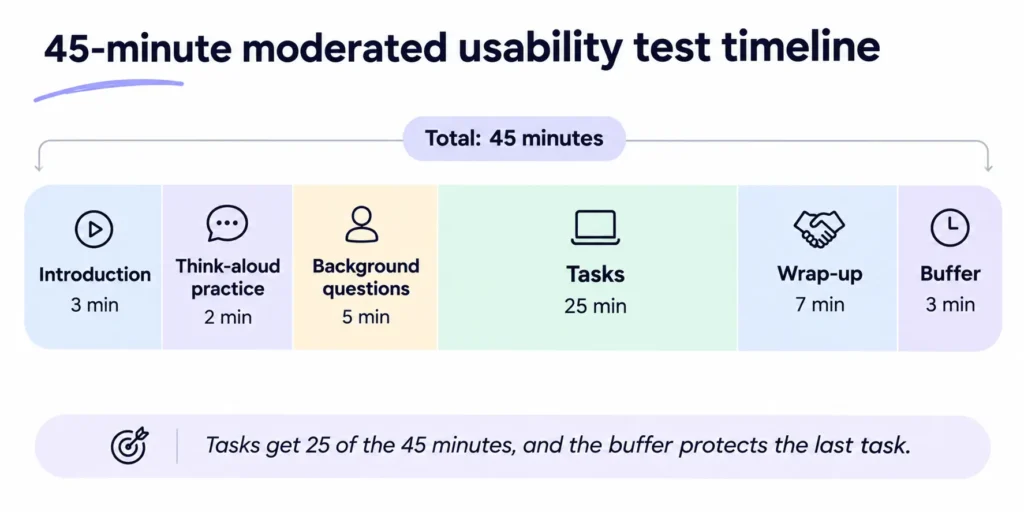
Moderated test script (45 minutes)
Introduction, 3 minutes
“Thank you for making time today. My name is [name], and I work on [product]. We are testing the product, and you cannot do anything wrong. If something is hard to use, that is a problem with the design, and finding it is the whole point.”
“With your permission, I will record the screen and our voices. Only the people working on [product] will see the recording, and we delete it on [date]. Is that all right?”
“You can stop at any time, and you will still receive the full [incentive].”
Think-aloud practice, 2 minutes
“As you work, please say what you are looking at, what you are trying to do and what you expect to happen. Let us practice once. Open the weather app on your phone and tell me how you would check tomorrow’s forecast.”
Background questions, 5 minutes
“Tell me about the last time you [did the job this product helps with].”
“What did you use to do it?”
“What was annoying about it?”
Tasks, 25 minutes
“I will give you a few tasks. Please do each one the way you would at home or at work. I may stay quiet while you work. That is on purpose.”
Read task 1. Wait. When the participant stops, ask “How did that go?” and “What did you expect to happen?”
Repeat for tasks 2 to 5.
Wrap-up, 7 minutes
“What stood out to you, good or bad?”
“If you could change one thing, what would it be?”
“Do you have any questions for me?”
“Thank you. You will receive your [incentive] by [method] within [time].”
Buffer, 3 minutes
Spare time for a late start, a slow task or a long answer.
Unmoderated test script
Welcome and consent
“Thank you for taking part. This study takes about 15 minutes. We are testing a product, and there are no wrong answers. Your screen and voice will be recorded. Only our product team will see the recording, and we delete it after [date]. Select Continue to agree, or close this window to leave.”
Thinking aloud
“Please talk as you work. Say what you are looking for, what you are thinking and anything that surprises you. If you go quiet, we lose the most useful part.”
Task card 1
“[Scenario, such as Your team of six needs to share files. Find a plan that fits and get to checkout.] Tell us when you think you are done.”
After each task
“How easy or hard was that, from 1 (very hard) to 5 (very easy)?”
“What, if anything, slowed you down?”
Task cards 2 to 4
Same format. Each card ends with “Tell us when you think you are done.”
Optional, at the end
“The last page has ten short statements about the product. Rate each one from strongly disagree to strongly agree.”
That last page is the System Usability Scale. MeasuringU’s Measuring Usability with the System Usability Scale describes it as “a 10 item questionnaire with 5 response options,” released by John Brooke in 1986.
Neutral probes, and phrases to avoid
Use these.
- “What are you looking for?”
- “What makes you say that?” (the GOV.UK Service Manual suggests this one for opinions)
- “What did you expect to happen?”
Avoid these.
- “Was that easy?” It suggests the answer.
- “Do you like this?” Liking is a different question from using.
- “Would you use this?” People are poor forecasters of their own behavior.
- “Click the blue button.” The task is over the moment you say it.
The rule behind both lists is simple. Ask about what the person did and what they expected, and never about what they might do someday.
Turning sessions into fixes
Capture
Put every issue in one grid. One row per issue, one column per participant, and a mark where someone hit it. The pattern shows itself within minutes. An issue four of five people hit is a different problem from one person’s slip, and the grid makes the difference visible to everyone in the room.
| Issue (example only) | P1 | P2 | P3 | P4 | P5 | Severity |
| Could not find where to invite a teammate | X | X | X | X | Blocker | |
| Read “Workspace” as the account name | X | X | Major | |||
| Missed the plan limit until checkout | X | X | X | Major | ||
| Expected the logo to return to the dashboard | X | X | Minor | |||
| Scrolled past the Save button on a laptop screen | X | Minor |
Rate severity
Use three levels, and rate each issue by the worst thing it did to anyone.
- Blocker. The person could not finish the task.
- Major. They finished with difficulty or with help.
- Minor. Friction that slowed them and did not stop them.
Measure
When the method is quantitative, count three things. Task success rate, time on task and error count. Add the System Usability Scale for a single number you can compare across releases. MeasuringU reports that “The average SUS score from all 500 studies is a 68,” so a score under 68 sits below the average of those studies. Report each task separately. An average across tasks hides the one task nobody finished.
Share
A one-page summary and three short clips persuade faster than a deck. Nielsen listed “Convincing” among the benefits of thinking aloud, and wrote that “The most hard-boiled developers, arrogant designers, and tight-fisted executives usually soften up when they get direct exposure to how customers think about their work” (Thinking Aloud).
Fix the blockers first. Then test again with new people, and make it a habit, as we argue in our SaaS UX design best practices.
Testing with disabled users
W3C’s Web Accessibility Initiative states the case plainly in Involving Users in Evaluating Web Accessibility. “Evaluating with users with disabilities and with older users identifies usability issues that are not discovered by conformance evaluation alone.” A checker can confirm that a button has a label. It cannot tell you that the label makes no sense when a screen reader reads it out of context. Automated help has the same limit, and an AI accessibility pre-check is no substitute for an audit or a usability test.
Four practical rules follow, and none of them needs a specialist. Recruit people who use assistive technology every day. Let them use their own setup and settings, on their own device where possible. Allow time before each session for setting up assistive technology, as W3C advises. Pay them, at least at the rate you pay everyone else. Sessions often run longer, so book more time than you would for other participants.
One tester does not speak for all disabled users. W3C says it directly. “Avoid assuming that input from one person with a disability applies to all people with disabilities.”
Mistakes that waste a usability test
- Testing with colleagues or friends. They know the product, or they know you. Either one spoils the result.
- Tasks that name the button. “Click Settings” tests reading. Name the goal instead.
- Helping the participant when they stall. Count to ten. Then ask “What are you looking for?”
- Too many tasks in one session. Five tasks fit inside 25 minutes. Ten will rush every one of them.
- Testing after the build starts. The findings have nowhere to go. The UI/UX design process puts testing at the prototype stage for exactly this reason.
- Reading five-user results as statistics. Three of five people is a strong signal to investigate and a weak basis for a percentage.
- Skipping the pilot. The first participant becomes the pilot, and their session is wasted on broken links and unclear tasks.
- Asking “Would you use this?” People are poor at predicting their own behavior. Watch what they do.
What usability testing cannot tell you
A usability test answers one question well. Can these people use this design to do this task?
It cannot tell you whether people will pay. It cannot tell you whether the market wants the product, which is a question for the stage covered in the difference between an MVP, an MMP and an MLP. It cannot tell you what the majority of your users prefer, because five people are a fair sample of problems and a poor sample of opinion. And it cannot tell you how the product performs with live traffic. That is the job of analytics and A/B tests.
Use the test for what it does. Pair it with the methods that answer the rest, and do not ask five people to settle a question about five thousand.
How we test designs at Pixelean
Every direction we design gets tested as a clickable prototype before development starts.
We think that is where testing belongs. Changing a clickable prototype takes hours or days. The same change in production competes with every other ticket in the sprint, and a finding that arrives after launch competes with the roadmap.
If your product is already live and you need to know where people struggle, a UX audit combines testing with expert review.
If you are about to build or redesign a product, see how we design and test product flows, or tell us what you are building.
Frequently asked questions
What are the main usability testing methods?
The main usability testing methods are the moderated in-person test, moderated remote test, unmoderated remote test, guerrilla test, prototype test, first-click test, five-second test, comparative test, benchmark test and accessibility test with disabled users. Card sorting, heatmaps, surveys and A/B tests are useful research methods, and none of them tests whether people can complete a task.
What is the difference between moderated and unmoderated usability testing?
In moderated usability testing, a facilitator joins the session live, in person or on a video call, and can ask follow-up questions. In unmoderated testing, the participant completes the tasks alone, usually on a platform that records the screen. Moderated sessions explain why people struggle. Unmoderated sessions are faster and cheaper per participant, with no chance to ask why.
How many users do you need for usability testing?
Test with five users per distinct user group for a qualitative usability test. NN/g reports that five comparable users find about 85% of the usability problems, and recommends three rounds of five over one round of fifteen (Why You Only Need to Test with 5 Users). For a quantitative benchmark that reports percentages or averages, NN/g recommends about 40 participants.
What is remote usability testing?
Remote usability testing is a usability test in which the participant and the researcher are in different places. In a moderated remote test, they meet on a video call and the facilitator watches the shared screen. In an unmoderated remote test, the participant works alone while a platform records the session. Both reach people on their own devices.
What should a usability test script include?
A usability test script should include an introduction that explains the purpose and asks for recording consent, a short think-aloud practice, a few background questions, three to five task scenarios with neutral follow-up questions, and a wrap-up. In a 45-minute moderated session, those parts take roughly 3, 2, 5, 25 and 7 minutes, with 3 minutes spare.
How long should a usability test session be?
A moderated usability test session usually lasts between 30 and 60 minutes, according to the GOV.UK Service Manual, which also advises no more than six one-hour sessions a day. Unmoderated sessions are typically shorter, around 10 to 20 minutes, since they usually cover two or three tasks with no conversation.
Is usability testing the same as user testing?
Yes. NN/g describes usability testing as “alternately called user testing.” Both names mean watching representative people try realistic tasks with a product, to find where the design fails them. Some teams use “user testing” loosely for any research with users, such as interviews or surveys, so check what a vendor or colleague means before you compare plans.
Sources checked on 17 October 2026.