
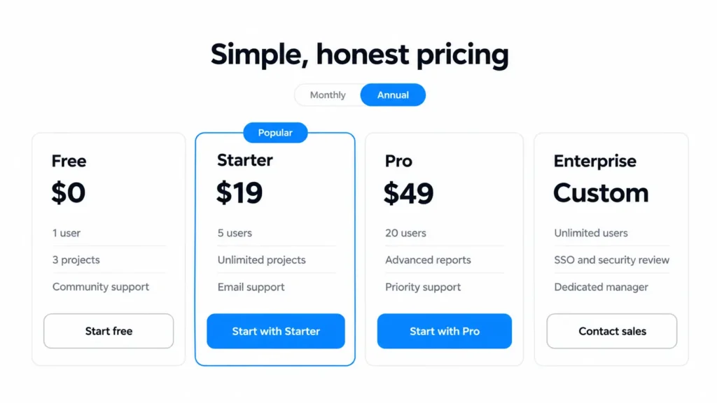
Every guide to SaaS pricing page design hands you the same rules. Three tiers. Highlight the middle one. Default to annual. Repeat a rule often enough and people stop checking it.
So we checked. We held six of the usual rules against two things. A study of 110 SaaS pricing pages from SaaS Research Lab, published 18 March 2026, and eight live pricing pages we opened ourselves on 5 October 2026.
Each rule gets a verdict. Keep, bend, or break, and one we could not settle. Then the parts those lists skip. The comparison table on a phone, usage pricing, and Contact sales.
We publish our own prices. We have designed this page for ourselves and for clients.
Key takeaways
- Count your buyer types first. The tier count follows.
- A highlighted plan works only while the label on it is true.
- The plan comparison table is the hardest part of the page to get right on a phone.
- Contact sales still owes the buyer an answer.
- If you hide the price, say why on the page.
What the pricing page is for
The pricing page is where a buyer checks if your homepage told the truth. The homepage makes the promise. This page puts a number on it.
When we reviewed 15 SaaS websites on 23 September 2026, twelve published their prices. The three that did not, Gong, Rippling, and Vanta, all sell through demos.
The usual rules for SaaS pricing pages, checked
Every product in the SaaS Research Lab sample has a public, self-serve pricing page, so the data leans self-serve. Our own eight pages are a small set of well-known products. Linear, Cal.com, Calendly, Loom, Framer, Attio, Plausible, and Tally. Treat our counts as a sanity check.
Use three pricing tiers
Bend. Four tiers edge out three in the data. Of 110 products, 44 used four tiers and 41 used three (SaaS Research Lab, March 2026). Seven of our eight pages showed four plans.
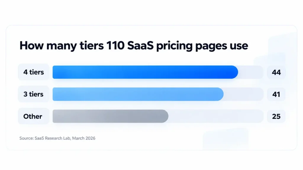
Count your buyer types first. Three kinds may need three paid tiers. One kind may need one plan.
Highlight one plan
Keep, if the label is true. Three of our eight pages badge a plan as popular. Calendly, Loom, and Attio. Five badge nothing, Linear and Framer among them.
In a second CXL study, a highlighted plan in a cheapest-first table drew the eye faster and was picked more often. Our view is that a recommended plan label such as “Most popular” does more, because buyers read it as a signal from other buyers. Put it on the plan you wish were popular and you spend that trust.
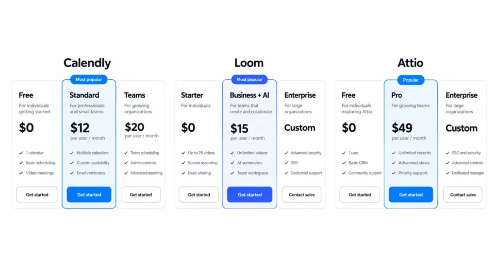
Check the label against your billing data. When it stops being true, take it down.
Default the annual toggle to annual
Bend. In the pricing study, 61% of products push annual billing first (SaaS Research Lab, March 2026). Of the seven pages where we could tell the default, five led with the annual price.
Hiding monthly is where it goes wrong. Show which option is selected, and show what monthly costs. A buyer who meets the real monthly price at checkout feels tricked.
Offer a free plan
Bend. Offer one only if a single person can get value alone. In the same study, just over half of products offered freemium and 38.2% offered a free trial (SaaS Research Lab, March 2026).
Tally gives away unlimited forms and submissions. Plausible offers a 30-day free trial and no free plan. If your product needs a team or a setup call before it pays off, a free trial fits better.
Put the most expensive plan first
Unproven. The rule traces to a 2016 CXL study that reordered the pricing table of one survey tool. Participants picked pricier plans more often when those plans came first, and the authors recommend that order. Their stated limit is that nobody in the study needed to buy a survey tool. Their closing line is that it is worth an A/B test.
None of our eight pages put the priciest plan first. If you have the traffic, test it. If you do not, keep cheapest first.
Make the button say “Get started”
Break. “Get Started” was the main button on 28.2% of the 110 pages, just behind “Start Free Trial” at 29.1% (SaaS Research Lab, March 2026). Common is a long way from clear. A button should name what happens next. Attio writes “Continue with Pro”. Framer writes “Start with Pro”. We covered button wording in our review of SaaS websites.
| Rule | What real pages do | Keep, bend, or break |
| Use three tiers | 44 of 110 use four, 41 use three | Bend. Count buyer types first |
| Highlight one plan | 3 of 8 badge a plan, 5 badge none | Keep, if the label is true |
| Default to annual | 61% push annual first | Bend. Keep monthly visible |
| Offer a free plan | Just over half freemium, 38.2% free trial | Bend. Only if one person gets value alone |
| Most expensive plan first | 0 of 8 do it | Unproven. Test it |
| Button says “Get started” | 28.2% of 110 use it | Break. Name the next step |
The comparison table, and what happens to it on a phone
Four plan columns do not fit a phone screen. You have five ways out. Show one plan at a time with a switcher, pin the plan names while the rows scroll, collapse the feature groups, show only the rows that differ, or remove the table.
Six of our eight pages had a full plan comparison table. We opened each one at 375 pixels wide.
One plan at a time, with a plan switcher. Linear and Calendly do this. The cost is comparison. The buyer holds one plan in memory while reading the next.
Plan names pinned while the rows scroll. Framer keeps the plan names fixed to the top of the screen. Attio does the same with its group headings. The cost is space on a small screen.
Feature groups that collapse. A long table becomes a short list of group names. We saw no clear example among the pages we opened. The cost is discovery. A row inside a closed group is a row few people read.
Only the rows that differ. Cut every row that reads the same across all plans. None of the pages we opened did this. The cost is doubt. A buyer hunting for one feature may think it is missing, so add one line that says what every plan includes.
No table at all. Loom and Cal.com drop the comparison table at phone width. That fails when the one row a buyer needs lives only in the table.
On any screen, cut tooltips that only work on hover. A phone has no hover.
The two hard cases
Usage-based pricing
A rate alone is not a price. A cost per event or per gigabyte tells a buyer nothing until they know how many they use in a month. Give them a way to find their own number.
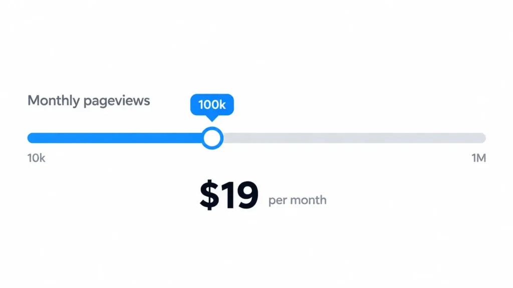
Plausible does it with a slider. You set your monthly pageviews and read your price. If a slider is too much to build, write one worked example with real numbers. The same goes for credits stacked on per seat pricing. Say what one credit buys.
The Contact sales tier
Where a price would be, the buyer still needs four answers. Who the tier is for. What puts a company in it. A starting figure, if you can give one. What happens after the click.
Seven of our eight pages had a custom tier. Six gave no figure. Calendly did. Its enterprise tier reads “Starts at $15k/yr” and says it starts at 50 seats. A buyer with 20 seats knows in one line that this tier is for someone else.
In our SaaS websites review, none of the demo pages we checked said how long the call takes. Our own page says who the custom tier is for and promises a reply within 24 hours. It gives no starting figure. That is the gap on our page.
When hiding the price is fair
Custom deals can justify hiding the price. If every contract differs in seats, security terms, and onboarding, a public number would mislead more than it helps. Even among products with a public pricing page, about 31% offered a Contact sales path (SaaS Research Lab, March 2026).
A low-cost tool cannot justify it. If the product costs less than the sales call costs you to run, publish the price.
If you do hide it, do two things. Put one sentence on the page that says why, and offer a lighter step than a sales call.
How we design pricing pages
In our experience, a client pricing page arrives with three problems. Too many plans, a comparison table that breaks on a phone, and a price that is hard to find. We start from two questions. How is the product sold. How many kinds of buyer are there. The tier count, the badge, and the table all follow from those answers.
Our own pricing page lists four options, three with a price.
This approach is wrong for you if the pricing itself is still unsettled. Settle the plans first. Then design the product and its pages around them.
Frequently asked questions
What should a SaaS pricing page include?
The plan names, what each costs, what each includes, and what happens after the click. Add a billing toggle that shows both prices, and a plan comparison table if the plans differ on more than a few features.
How many pricing tiers should a SaaS product have?
As many as you have buyer types. In a study of 110 SaaS pricing pages, 44 used four tiers and 41 used three (SaaS Research Lab, March 2026). Add a tier only when one kind of buyer needs something the others do not.
Should a SaaS pricing page show annual or monthly prices first?
Either works, and 61% of products in the SaaS Research Lab pricing study push annual first. Show which option is selected and what the other one costs. Annual first is fine while the monthly price stays one glance away.
Should enterprise pricing be public?
Publish a starting figure if you can. Calendly’s enterprise tier stated one when we checked on 5 October 2026. If every deal is custom, say who the tier is for and what happens after the click.
How do you design a pricing table for mobile?
Show one plan at a time with a switcher, pin the plan names, collapse the feature groups, show only the rows that differ, or drop the table. Then test it on a real phone, with one thumb.
The bottom line
Good SaaS pricing page design starts with checking the rules you were handed. A badge works only while it is true. The table that looks sharp on a laptop is the first thing to break on a phone.
Open your pricing page on your phone. If you cannot compare two plans with one thumb, start there. A UX audit covers the rest of the page.
Rebuilding your pricing page?
Send us your pricing page URL and we will name the one thing on it to change first. Use the contact form or email hello@pixelean.com. We design SaaS products and the pages that sell them.
Sources
- SaaS Research Lab, “Which CTA converts best? Analysis of 110 SaaS pricing pages”, 18 March 2026
- SaaS Research Lab, “Study of 110 SaaS pricing pages, 2026 benchmarks”, March 2026
- Ben Labay, CXL Institute, “Pricing Page Optimization. How to Order Pricing Plans [Original Research]”, 19 September 2016, hosted by Speero
- CXL Institute, “The Effects of Highlighting a Recommended Pricing Plan [Original Research]”, 2016, hosted by Speero
- Pricing pages opened 5 October 2026. Linear, Cal.com, Calendly, Loom, Framer, Attio, Plausible, Tally
- Pixelean, review of 15 SaaS websites, checked 23 September 2026