Almost every landing page roundup you will read was written by a company that sells landing page software. And most of the pages they show you were built in that software. That does not make the examples wrong. It does mean nobody is telling you which parts you can actually use.
We design landing pages for clients. So this list comes with the thing the software articles leave out: what each page is doing on purpose, what is safe to borrow, and which of these famous pages will quietly hurt you if you copy them.
Here is the part that trips people up. Every roundup includes Apple. Apple’s page converts beautifully, and copying it will hurt you, because the brand does the persuading before you read a word. Take the brand away and you have a big photo and almost no copy. That is not a landing page. That is a poster. These are the high converting landing page examples everyone links to, and almost nobody explains the catch.
Full disclosure. Pixelean designs landing pages, so read this as practitioners talking, not a neutral survey. One more thing before the list. A landing page is not a home page. It has one job, one audience, and one action. Keep that in your head as you scroll, because it explains almost everything below.
Consider this your shortlist of the best landing page examples worth copying, plus the four worth avoiding. If you came here from a search for landing page examples 2026, this is the current list, and almost every page here was opened and checked live in August 2026, because a page that no longer exists is the fastest way to lose your trust. Each example links to the page so you can see it for yourself.
Key takeaways
- The median landing page converts at about 6.6 percent across industries, and SaaS sits lower near 3.8 percent (Unbounce Conversion Benchmark Report, Q4 2024 data). Treat it as a yardstick, not a target.
- Removing the site navigation is one of the most reliable single fixes on a campaign page.
- One page, one goal. Two competing buttons beat each other up. One wins.
- Big brand pages work on recognition. Copy the structure, never the emptiness.
- Under 3 percent usually means your message does not match the ad that sent people, not that your design needs polish.
What to look for in these examples
Before the list, here are the five things that decide whether any page below actually works. Watch for them as you go.
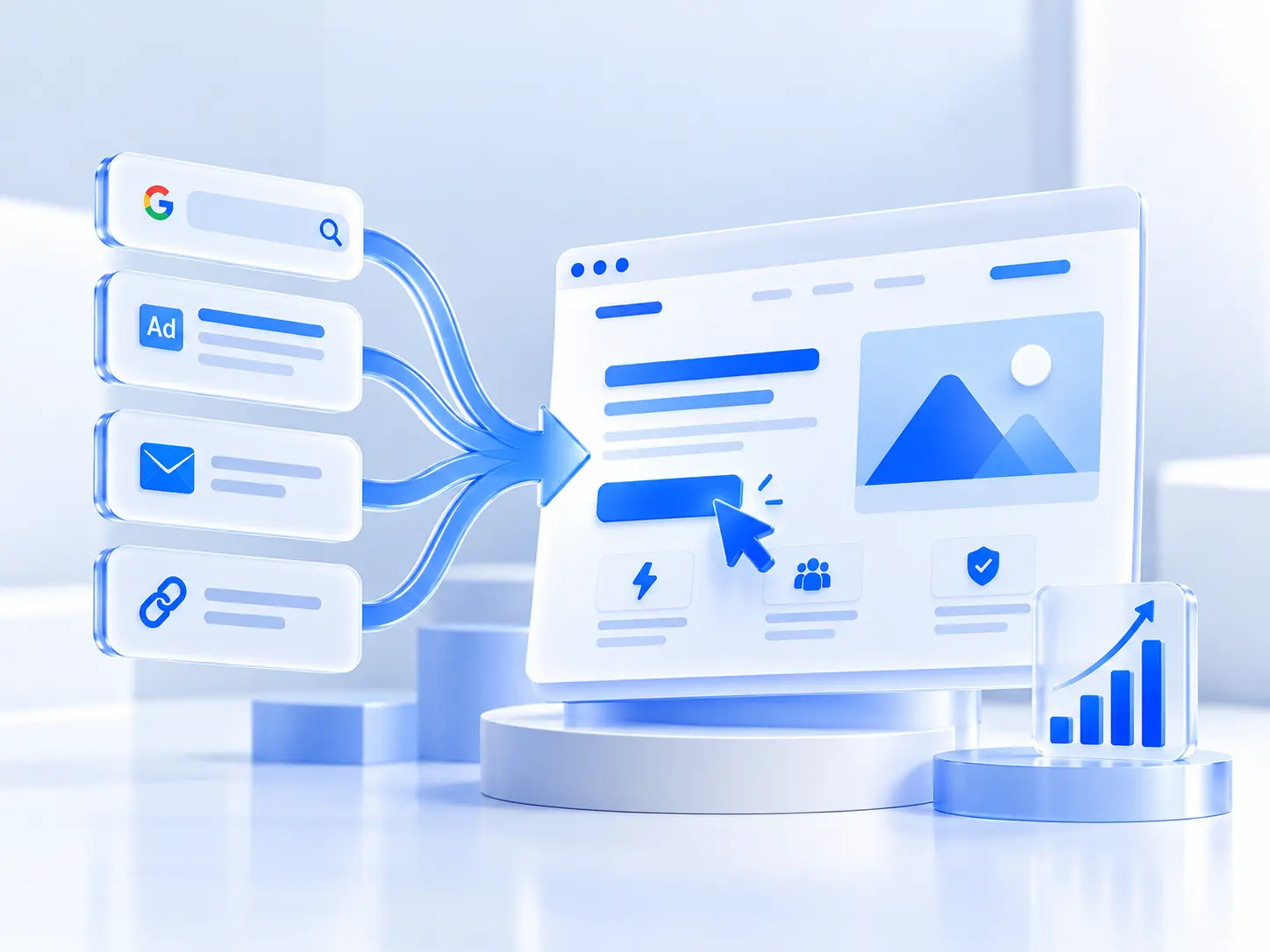
- Message match. Does the headline echo the ad, email, or search that brought the visitor? When it does not, the page feels like a wrong number, and people leave. In a public teardown of 50 pages, the most common failure was a hero that says what the product is instead of why anyone should care (dev.to, March 2026).
- One goal, one action. Two buttons split attention and both lose.
- Navigation removed. No header menu means no easy exit.
- Proof before you need it. Logos and a testimonial up top, so nobody has to go looking for a reason to believe you.
- Friction matched to the ask. A free download can ask for an email. A demo can ask for more. Ask for a phone number before a free trial and you will watch people leave.
That is the whole lens. For the long version, see our guide to the 10 essential elements of a high-converting landing page. This piece is about the examples, so I will keep the theory short.
Free trial and signup pages
Signup pages win by subtraction. Fewer fields, fewer decisions, and the product shown instead of described. These are the landing page design examples people copy most, so it is worth seeing what they leave out.
Netflix signup
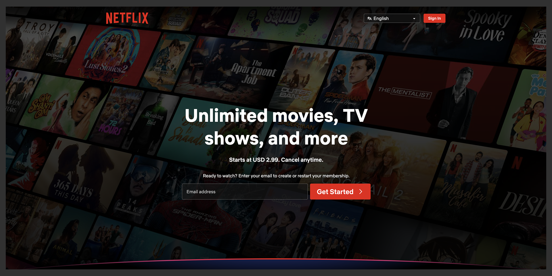
One email field, one button that says Get Started, and the objections parked in an FAQ accordion below the fold (What is Netflix, How much does it cost, How do I cancel).
Steal: The accordion. Answer the obvious worries in a spot that does not clutter the top.
Honest note: The emptiness works because everyone already knows what Netflix is. You probably do not have that yet.
Slack free signup
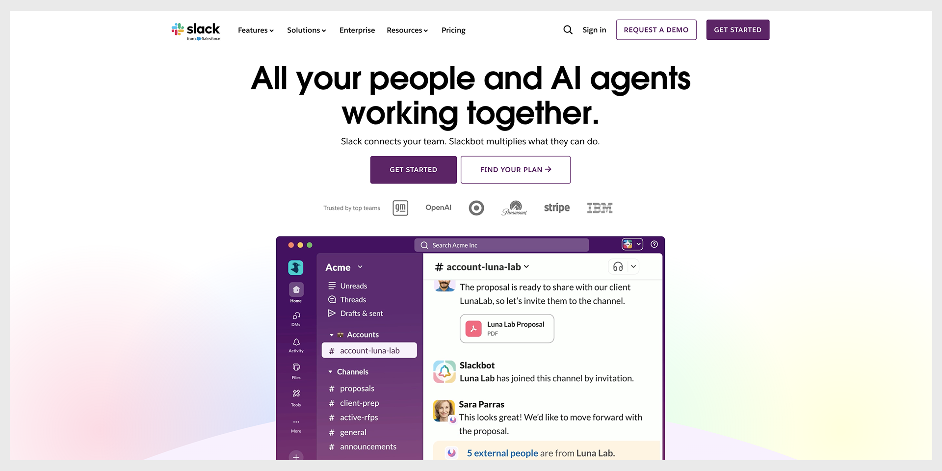
Product screenshots do the explaining, and a customer quote sits right after the value line (in 2026 that quote is from Anthropic).
Steal: Show the interface instead of describing it. A screenshot answers what is this faster than a paragraph can.
Notion free plan
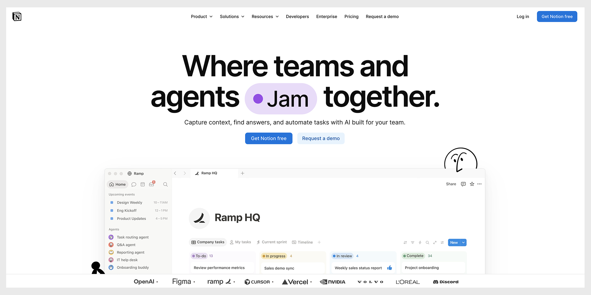
Notion used to slice its hero by use case so visitors picked their own version of the pitch. In 2026 it does not. It leads with one line about teams and agents working together, a Get Notion free button, and a wall of names it says covers 98 percent of the Forbes Cloud 100.
Steal: If big names use you, put them where the eye lands first. Logos are proof you do not have to write.
Trello signup
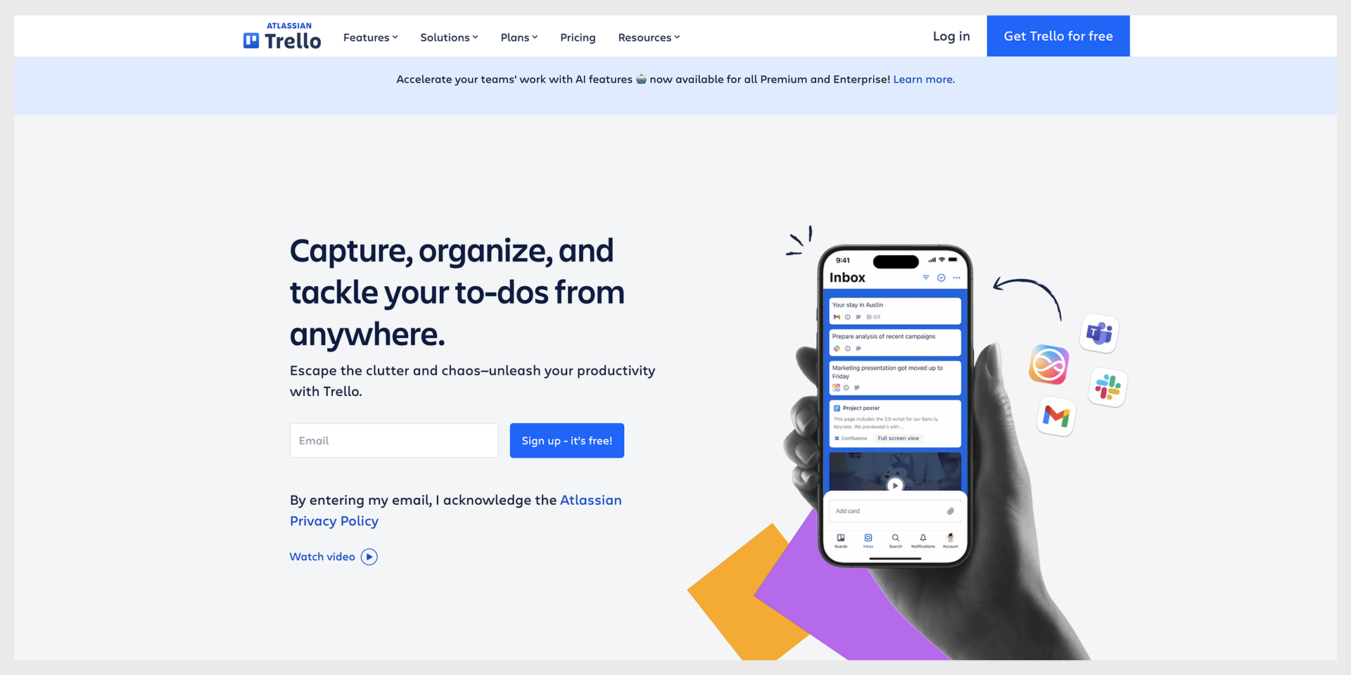
Trello communicates simple with pictures, though in 2026 those are friendly illustrations rather than product screenshots. Email field, Get Trello for free.
Steal: Let the visual carry the this is easy message, so your copy does not have to keep saying it.
Grammarly freemium
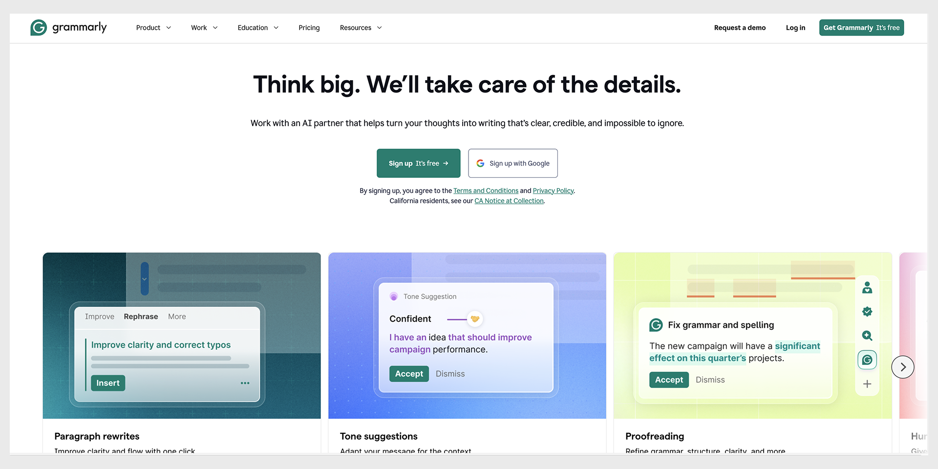
Short animations show the product fixing real writing before you sign up, including newer tricks like an AI humanizer.
Steal: Show the thing working before you ask for anything. A working demo beats an adjective every time.
The pattern we see in these is what they refuse to do. They do not explain everything. They remove decisions until one obvious action is left.
Demo request and B2B pages
A demo is a bigger ask than a free trial, so the b2b landing page examples here earn the click with proof, not brevity. Long is fine when every section removes a worry.
HubSpot demo request
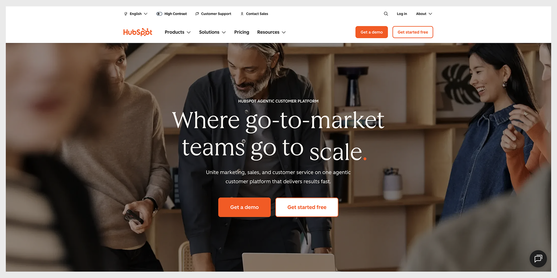
A long page that stacks proof before it asks (299,000 plus customers, logos like DoorDash and Reddit, a stack of category awards), with two clear paths: Get a demo and Get started free.
Steal: Put the proof before the form, not after it. People decide to trust you before they decide to fill anything in.
Salesforce enterprise demo
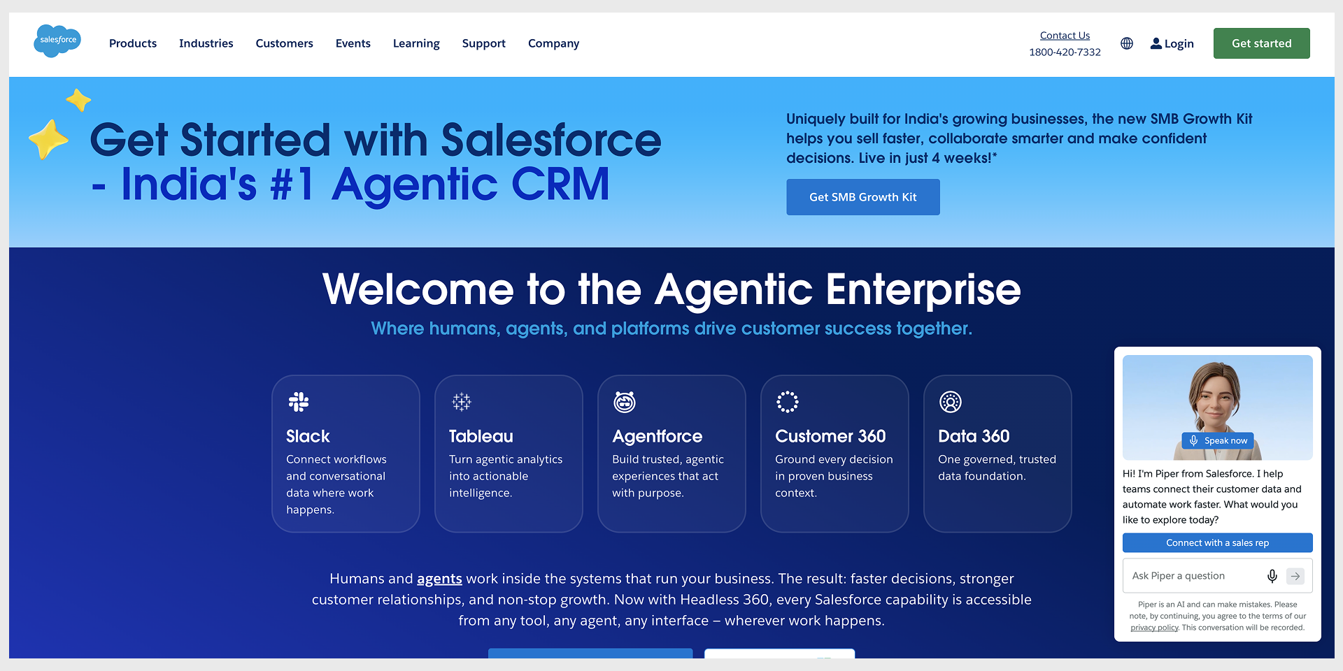
Salesforce sends different buyers down different paths (Slack, Tableau, Agentforce, Data 360) and lines up named executives to vouch for it.
Steal: Role or product paths, when you genuinely serve distinct buyers.
Honest note: This only helps if you have distinct buyers. Build it for one persona and you have added a maze for no reason.
Gong B2B demo
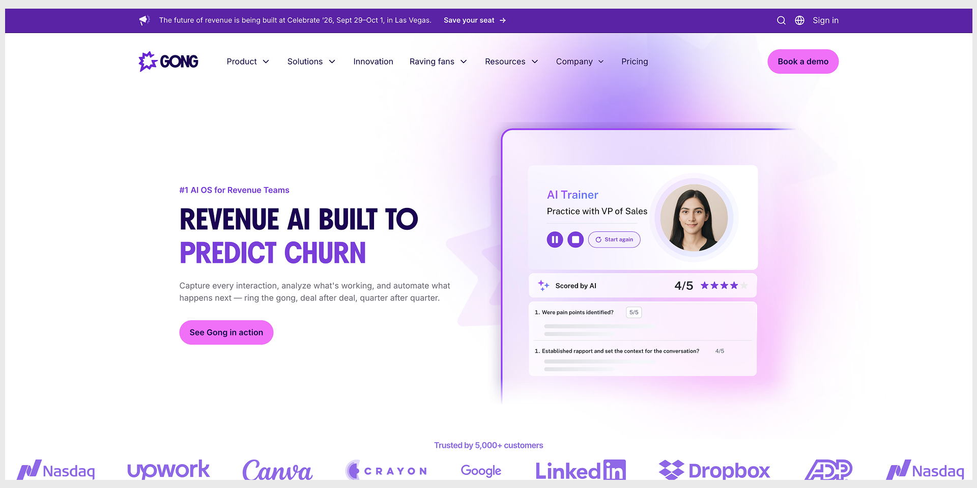
Gong’s page is dense with specific numbers (64 percent more productive, 46 percent faster ramp, hours saved per week), not adjectives.
Steal: Specific numbers. Save 10 hours a week lands harder than boost productivity. One caveat worth naming: Gong now speaks to several roles at once, which works because it has the customer base to back every claim. A smaller company should pick one number and one reader.
A conversational B2B page (Qualified)
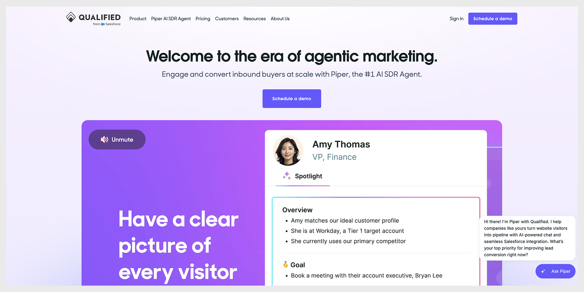
The chat-bubble approach that Drift made famous has grown up. Drift itself was folded into Salesloft and is being retired (Salesloft), and the idea moved to AI agents. Qualified now runs an AI rep called Piper next to a Schedule a demo button.
Steal: Lower the cost of the first step. A conversation, or an agent that answers on the spot, feels smaller than a form that vanishes into a queue.
Category takeaway: Heavier ask, heavier proof. If you want help reading your own demo page, that is what our landing page design work starts with.


Getting traffic and no conversions?
Send us the link. We will tell you which of these patterns your page is missing.
Ecommerce and product pages
Ecommerce converts on two feelings at once: I want this, and I will not regret buying it. The best pages handle both before you ask.
Tesla vehicle page
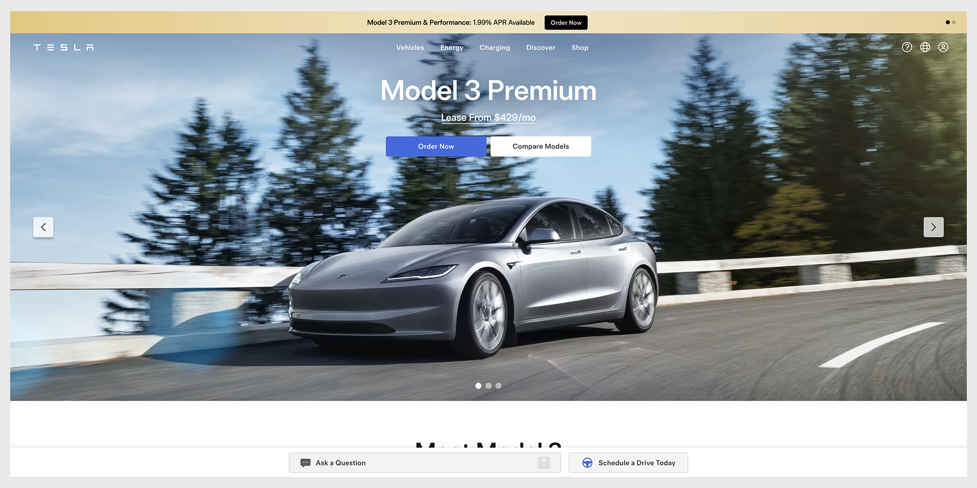
Big vehicle imagery, very little copy, one main action.
Honest note: This is the clearest case on the list of a page working because of the brand. Tesla can show a car and a price and trust you to fill in the rest. Copy that minimalism as an unknown brand and your page just looks empty. Steal the single-action focus. Leave the emptiness where you found it.
Allbirds
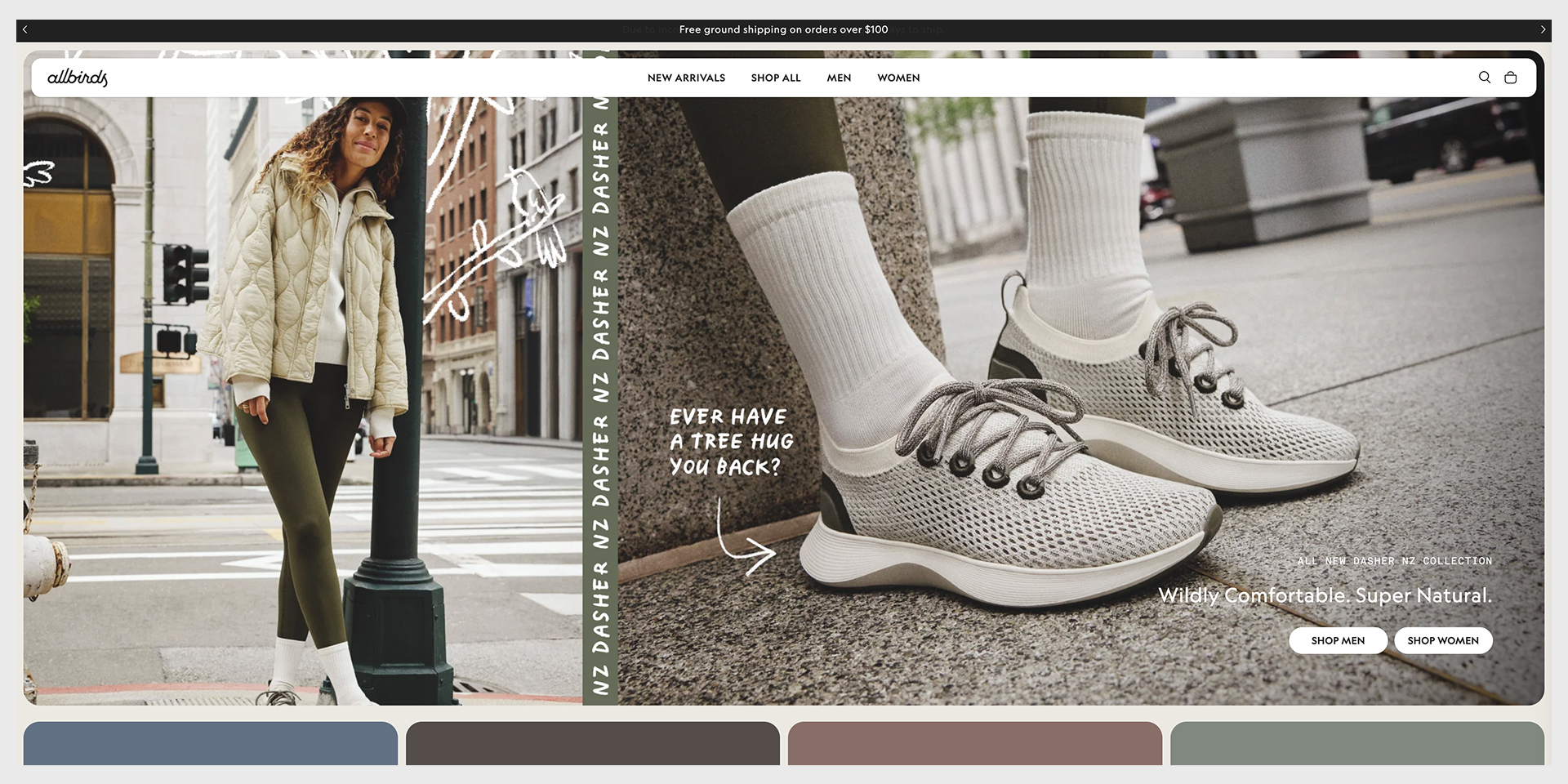
Allbirds ties the product to something the buyer already cares about. The 2026 hero reads Wildly Comfortable, Super Natural, and the materials story (wool, tree fiber, and sugarcane instead of petroleum-based synthetics) does the persuading.
Steal: Benefit framing over feature lists. Sell the comfort and the clean conscience, not the fiber content.
Glossier
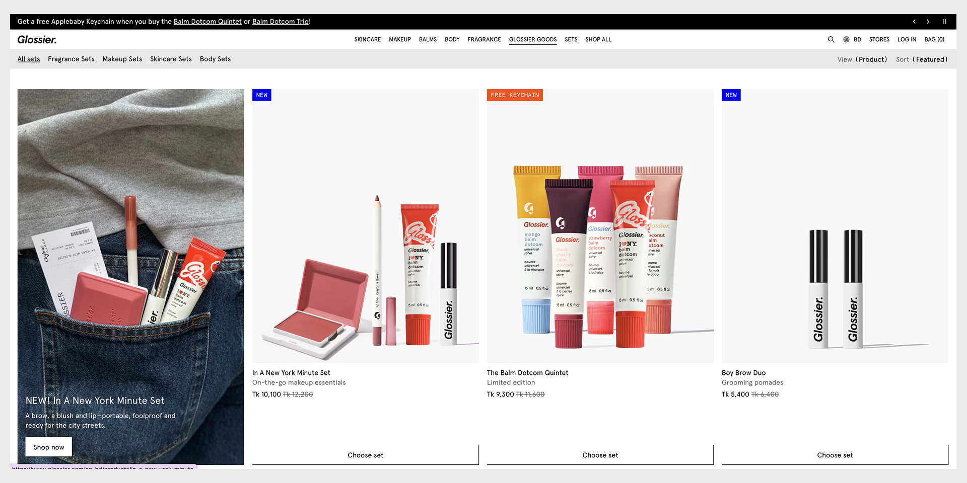
Glossier sells beauty the way it looks best, with campaign imagery and product sets doing the talking down a long scroll. The shop buttons (Shop now, Choose set, Get the look) repeat all the way down, so the button is never far from your thumb.
Steal: Repeat the call to action on a long page. People decide at different moments, and the button should be there whenever they do.
Dollar Shave Club
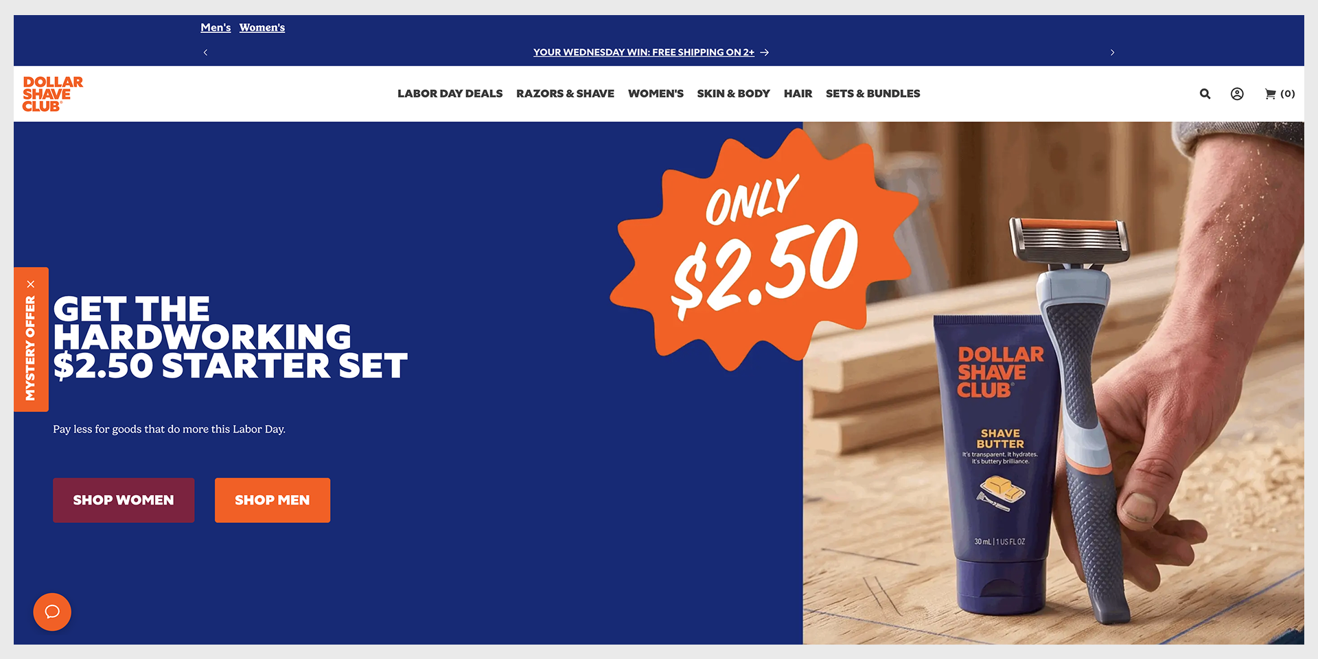
A subscription page lives or dies on the commitment worry, so Dollar Shave Club answers it up front: a 30-day money-back guarantee, a flexible schedule, and cancel in a click, all stated near the offer instead of buried in a footer.
Steal: Place the can I cancel answer at the moment of hesitation, not three scrolls past it.
Category takeaway: The best ecommerce pages answer can I cancel and when does it arrive before the visitor thinks to ask.
Lead magnet, waitlist, and event pages
A small ask still needs a reason to act now. The good pages give a real reason instead of a fake countdown clock.
Unbounce benchmark report download
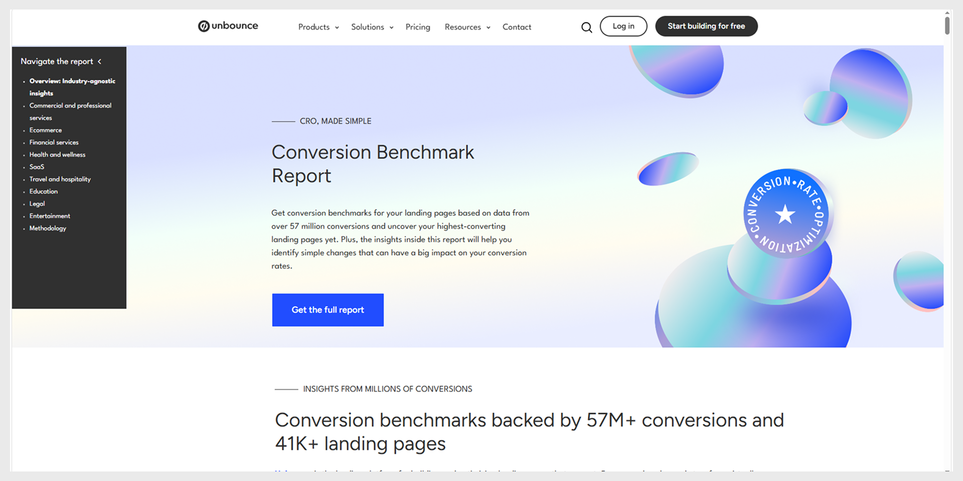
Show the reader what is inside before the form. The Unbounce Conversion Benchmark Report page previews the numbers and the industry breakdowns you will get, so the download feels like a known quantity rather than a gamble.
Steal: Preview the actual asset. A sample chart or a table of contents converts better than the word free, because the visitor can see the value before spending an email on it.
Dia waitlist
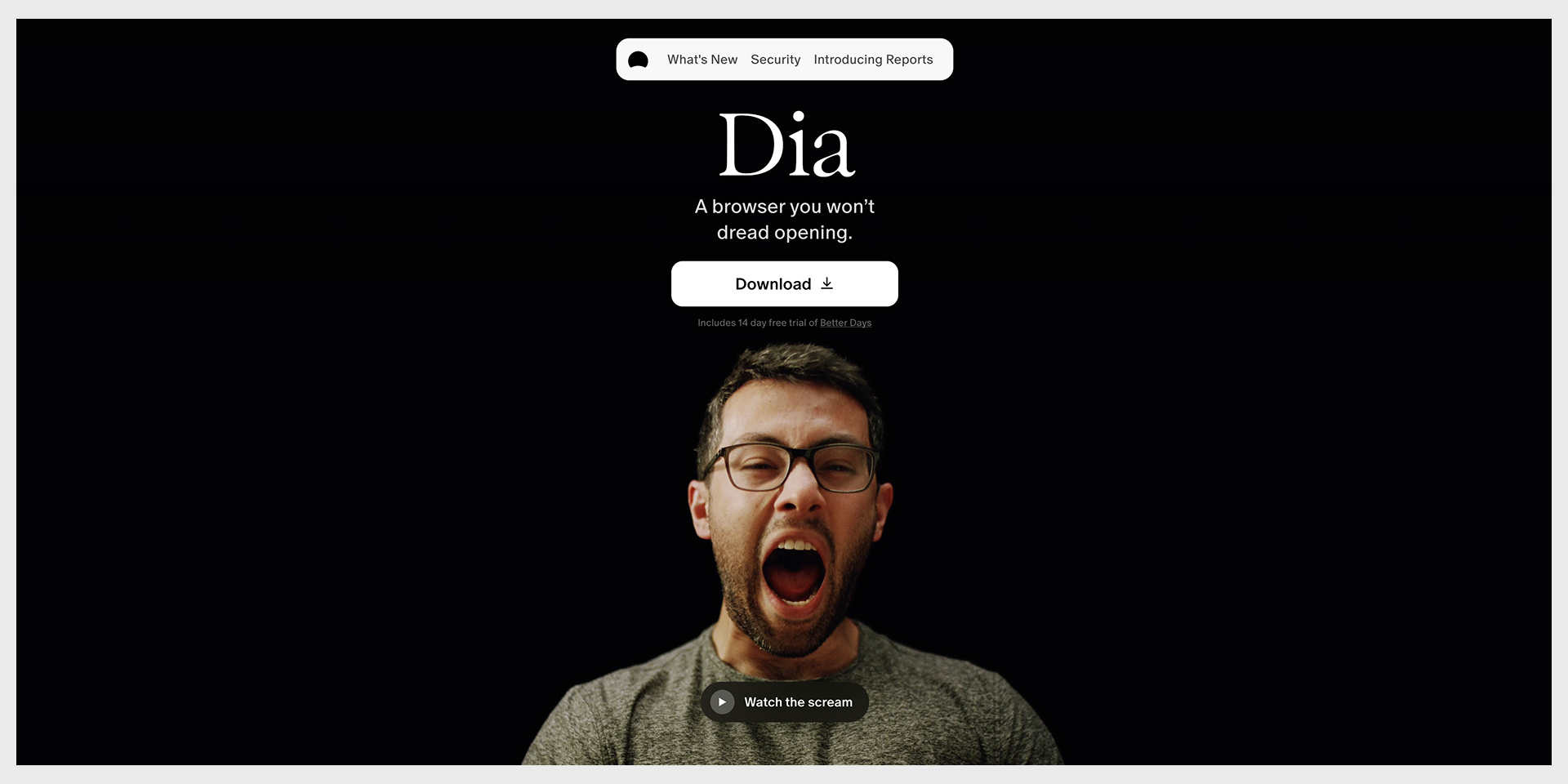
Dia, the AI browser from The Browser Company, leads with one honest CTA, Join the waitlist, next to a note about a free trial. It explains what you get for signing up, the daily brief and the cross-tool synthesis features, instead of manufacturing scarcity.
Steal: Explain the wait. Tell people what they get and why the line exists. A real reason beats a fake countdown.
Figma Config event page
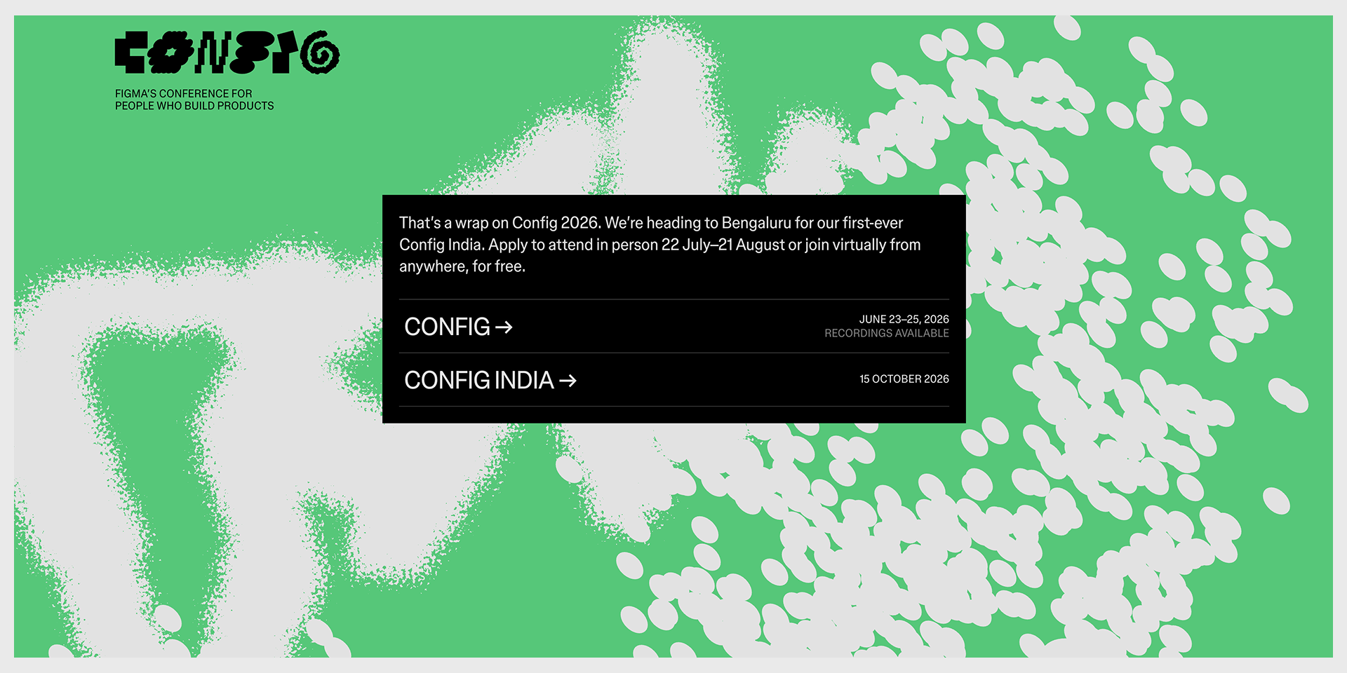
Config is Figma’s conference, and the page keeps converting after the dates pass. It offers an apply-to-attend option in person, a free way to join virtually, and recordings once the talks are done.
Steal: Give a low-friction option, a free virtual seat, and keep the recordings, so an event page earns registrations before and after the day.
Maven course and cohort pages
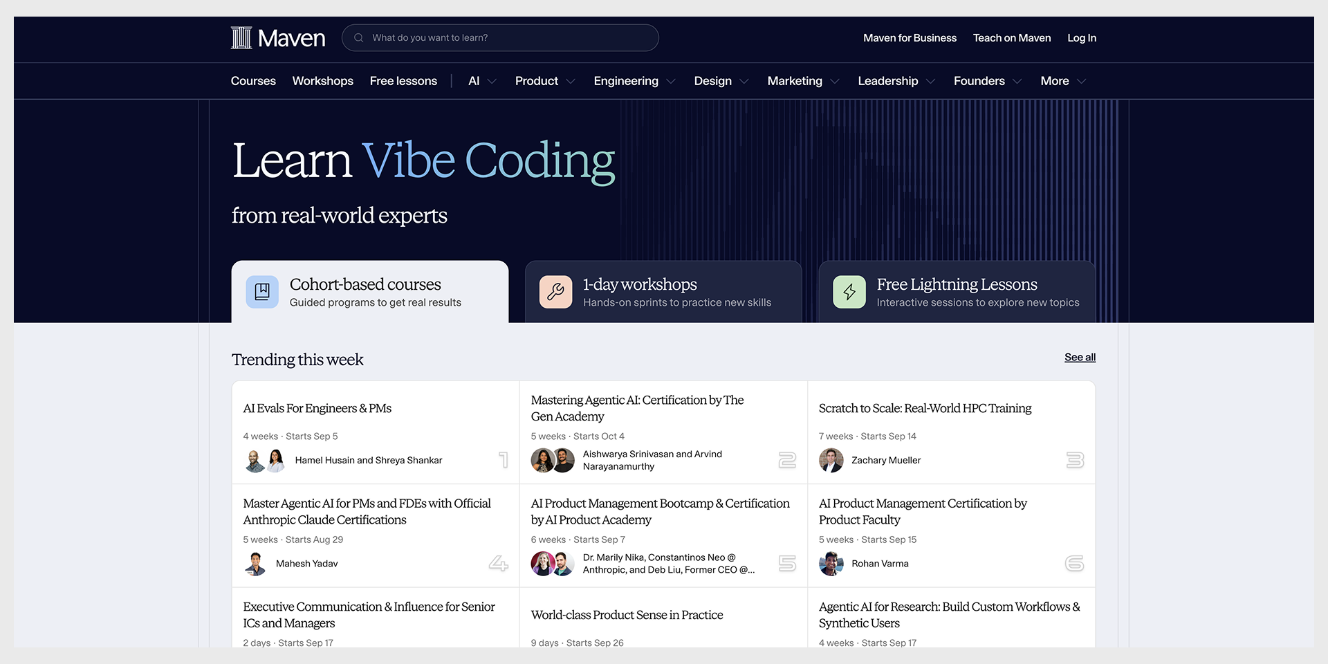
Maven runs cohort based courses, and the good listings frame the outcome and, oddly, say who the course is not for. They also lead with a real cohort start date, which is honest urgency rather than a countdown timer.
Steal: Name who should skip it. It sounds backwards, and it raises the quality of the people who do sign up.
Category takeaway: A low-commitment offer still earns the click with a real reason to act now. A genuine cohort date, a live event, or a preview of the asset beats a fake countdown every time.
SaaS and app landing pages
The SaaS landing page examples below sell a workflow, not a product. The ones that convert show the workflow happening, usually in a screenshot or a short loop.
Linear
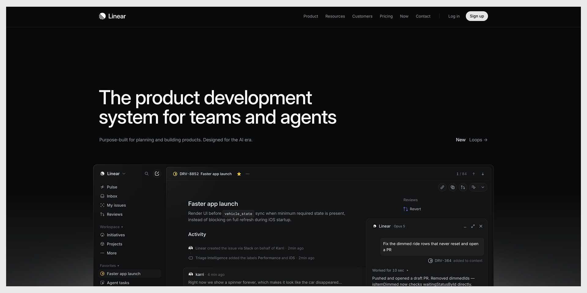
Restraint, speed, and interface screenshots do the talking. The copy is written for engineers and product teams, with language a general audience would not fully get. That is on purpose. The right people feel understood, and everyone else quietly self-selects out.
Steal: Specificity as a filter. Speak precisely to your person and let the wrong-fit visitors leave.
Stripe
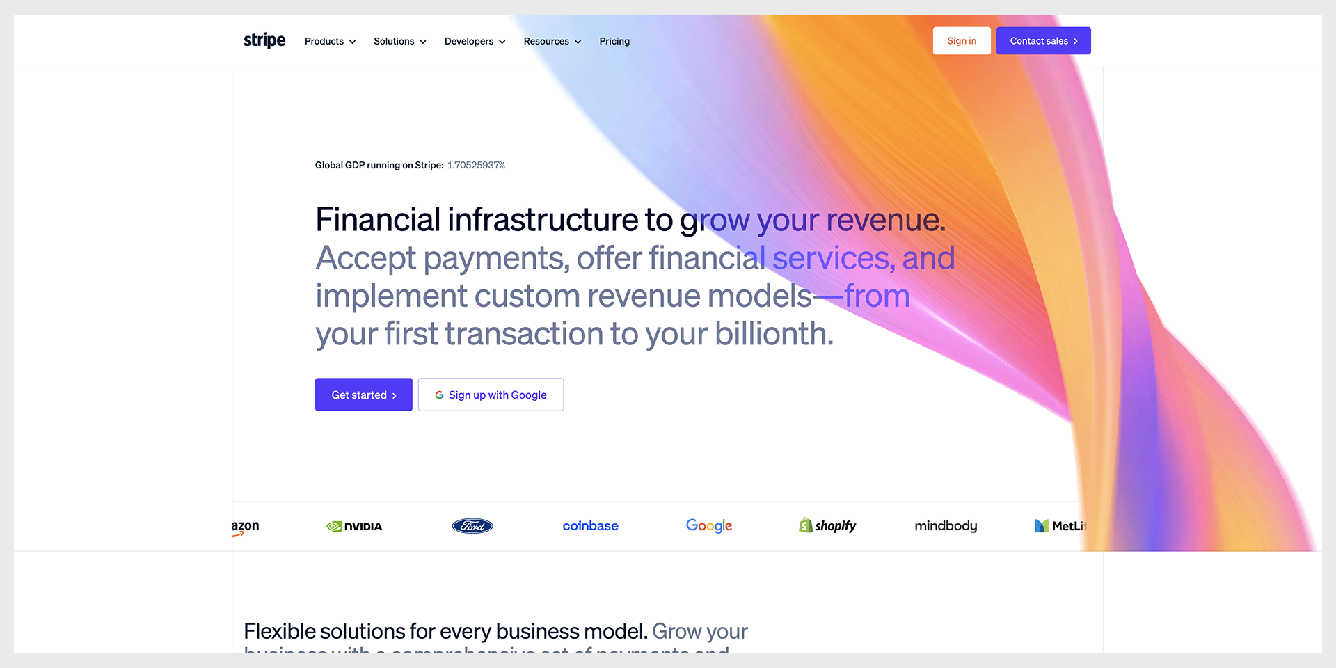
Stripe layers depth. A founder reads the top and gets the promise; a developer scrolls into API details and gets what they need too. Two buttons, Get started and Contact sales, have done the same job for years.
Steal: Progressive disclosure. Put the simple promise up top and the technical proof further down, so two very different readers both find their level.
Duolingo mobile app page
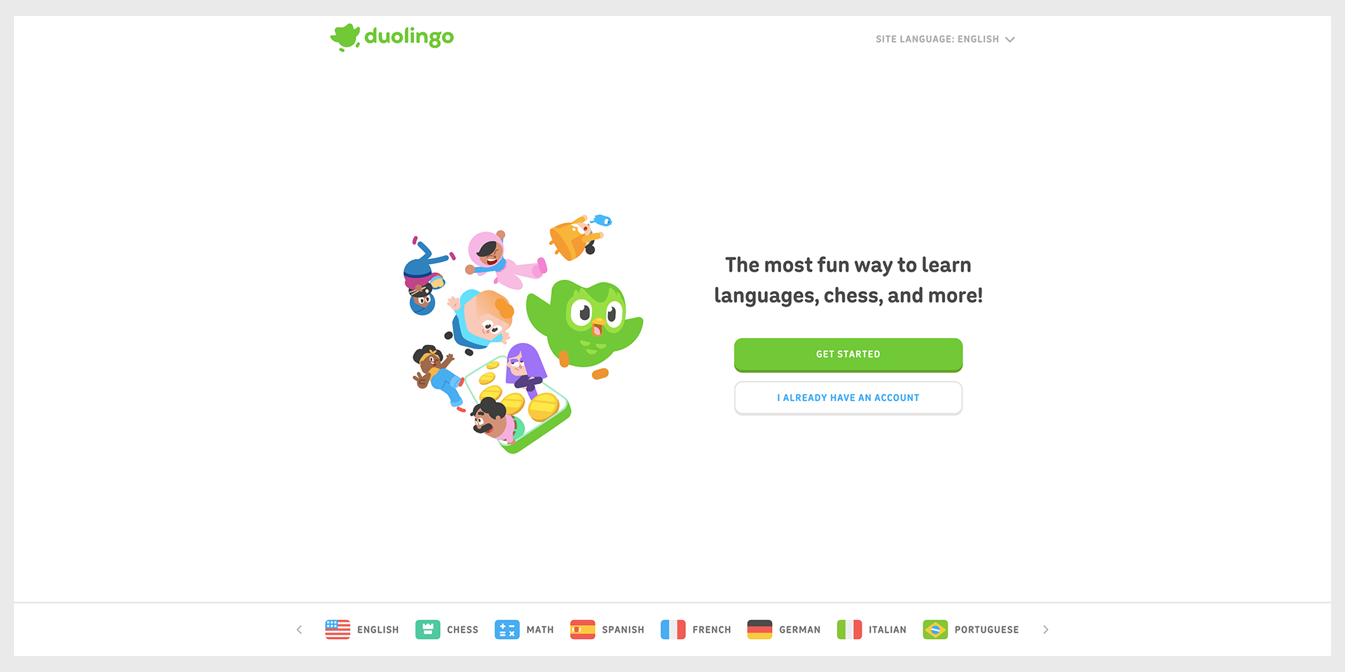
App Store and Google Play badges, a short sequence that shows the core loop, and one action that says Get Started.
Steal: Sequence a few screenshots that walk the main flow, so people feel the app before they install it.
Category takeaway: Show the workflow. If you want the longer version for products with dashboards, see our 20 SaaS dashboard design examples, and the SaaS application design work behind them.For whole sites rather than single pages, see the best SaaS websites, sorted by how they sell.
One current note worth flagging. In 2026 almost every SaaS page above leads with AI agents (Slack, Notion, Linear, Salesforce, HubSpot, and Gong all do it). It is the message-match move of the moment. If your ads sell AI, matching that language helps. If they do not, borrowing it just to sound current breaks the match and costs you.
The four you should not copy
Some of the most admired pages on this list are the most dangerous to imitate. Here is why, and what to do instead.
Trap 1: Apple, Tesla, Netflix, where the brand does the persuading
These pages are sparse because the brand already answered who are you and why should I trust you before the visitor arrived. Copy the sparseness as a new company and you answer neither question. Repeat after me: if nobody knows you, you need more copy, not less.
Trap 2: Salesforce, enterprise complexity on a startup page
Role paths and multi-product menus exist because those companies serve genuinely different buyers at scale. Build that machine for one persona and you have added friction and maintenance for nothing.
Trap 3: award-winning visual experiments
Heavy scroll animation, WebGL, and interactive storytelling win design awards and slow pages down. Most campaign traffic is on a phone, and a page that takes five seconds to become usable has already lost part of its audience. Practitioners keep saying the same thing out loud: pretty pages that load slowly convert badly (Medium, 2026). Fast and plain beats slow and gorgeous. This is where the page meets its web development, because the prettiest layout still loses if it loads slowly.
Trap 4: pages built inside a landing page builder
Here is the quiet one. A lot of roundup examples were built in the tool that published the roundup, which means the layout is shaped by what that builder does easily (one builder roundup is a fair case). Beautiful, and not always the layout your product needs. The tool’s convenience is not the same as your page’s job.
The rule, in a nutshell
Copy the structure, the ordering, and the way objections get handled. Do not copy the confidence that comes from being famous. Structure transfers. Reputation does not.
How does your page compare?
Find your conversion rate on this table, then look where it points. Most pages fail on one or two obvious things, and fixing those usually beats a redesign.
| Your conversion rate | What it means | Where to look first |
| Under 2% | Something structural is broken | Message match, page speed, CTA clarity |
| 2 to 5% | Below median, fixable | Proof placement, form friction |
| 5 to 8% | Around median | Copy specificity, objection handling |
| 8 to 12% | Doing well | Segmentation, testing variations |
| Over 12% | Top tier | Protect what works, test carefully |
A five-minute check
- Does your headline repeat the promise of the ad or email that sent people?
- Is there more than one call to action fighting for attention?
- Is your site navigation still sitting in the header?
- Is any proof visible before the first scroll?
- How many form fields are you asking for, and does each one earn its place?
If you failed one or two, good. That is the cheap stuff to fix.
How Pixelean designs landing pages
Since we build these for a living, here is how we work, offered as disclosure rather than a sales pitch.
- Full disclosure again: we design landing pages, so read this as our approach, not a verdict.
- Every page starts from the traffic source, because message match decides more than layout does.
- One goal per page. If a client wants two, we build two pages.
- Structure and copy get settled before anyone opens a design tool.
- We design the phone version first, since that is where most campaign traffic lands.
If budget is the next question on your mind, we wrote about web design agency pricing separately.
Frequently asked questions
What is a good landing page conversion rate?
Across industries the median is about 6.6 percent, with SaaS lower near 3.8 percent and the strongest industries reaching roughly 12 percent (Unbounce Conversion Benchmark Report, Q4 2024 data). Under 3 percent usually points to a structural problem, like a message mismatch or an unclear call to action, rather than a design-quality issue.
What makes a landing page convert?
Five things show up on almost every page that works. The headline matches the ad or email that sent the visitor, there is one call to action instead of several, the site navigation is removed so there is no easy exit, proof appears before the visitor goes looking for it, and the form asks for no more than the offer justifies.
Should a landing page have navigation?
Usually no. Removing the header menu keeps people on the one action the page was built for, and it is one of the more reliable improvements you can make. The exception is when visitors genuinely need to compare options before deciding.
How long should a landing page be?
As long as the ask requires. A free download or trial converts well on a short page. A demo, a high-priced product, or an enterprise deal needs more, because each section removes an objection. The real question is not length, it is whether every section earns its place.
Can I copy a landing page from a big brand?
Copy the structure, the ordering, and the way objections get handled. Do not copy the sparseness. Pages from Apple, Tesla, and Netflix work partly because the brand already built trust before the visitor read a word. A newer company has to do that work on the page, which usually means more copy and more proof, not less.