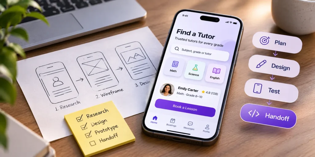
You have an idea for an app. You may even have a budget and a rough launch date. What is harder to picture is the stretch between the first call with a designer and the day developers start building, and what you will be asked to decide along the way.
That stretch is where first apps lose the most time. Decisions wait a week for a meeting. Screens get redesigned because nobody tested them. Developers stall on error messages and empty screens that nobody drew. Guides on how to design an app rarely cover this part, because they are written from the designer’s chair.
This one is written from yours. The mobile app design process below runs in ten steps, from one sentence about the problem to a file developers can build from. Each step says what you decide, what you get back, how you know it is finished and how long it usually takes. After the steps, you will find the platform rules, mobile details, tools and roles that most guides leave out.
One disclosure up front. We design and build mobile apps, so the handoff step below comes from projects we have shipped, and the time ranges are our own estimates.
To keep it concrete, we will follow one example through every step. A founder wants to build a tutoring app that matches parents with local tutors.
Key takeaways
- Write who the app is for and what it solves in one sentence before anyone draws a screen.
- Five user interviews and three competitor apps catch the wrong guesses early.
- Test a clickable prototype with five people before any code is written.
- Developers need every state of every screen, including empty, loading and error.
- A lean first app usually takes 4 to 7 weeks of design (our estimate) [CONFIRM].
The quick answer
The app design process at a glance. Times are for a lean first release and are our estimates.
| Step | What you decide | What you get | Typical time |
| 1. Write the problem in one sentence | Who the app is for and its one main task | A one-page brief | 1 to 3 days |
| 2. Talk to users and study competitors | Who to interview | A short research summary | 1 to 2 weeks |
| 3. Choose iOS, Android or both | The launch platform | Platform notes in the brief | 1 day |
| 4. Decide what the first release includes | What makes the cut | A ranked feature list | 2 to 4 days |
| 5. Map the screens and user flows | Approval of the main flows | Flow diagrams and a screen list | 3 to 5 days |
| 6. Sketch the wireframes | Layout and content, not looks | Low-fidelity screens | 1 week |
| 7. Test a clickable prototype | Who tests it | Findings and the fixes made | 3 to 5 days |
| 8. Design the visual layer | The look, on a few key screens first | Final screens and a component library | 1 to 2 weeks |
| 9. Hand off to developers | Who answers questions during the build | A build-ready Figma file | 2 to 4 days |
| 10. Check the build and plan the first update | What to fix before launch | A design review of the built app | Ongoing during the build |
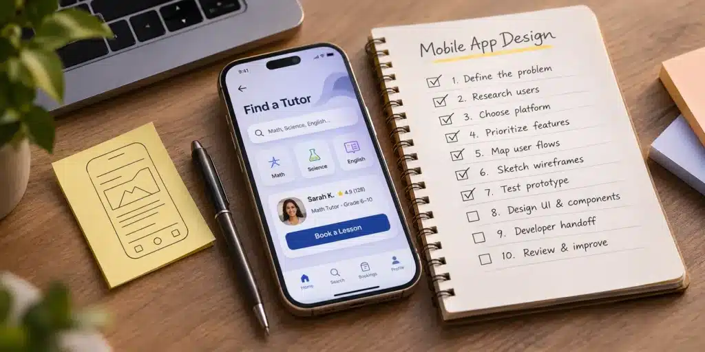
The mobile app design process in 10 steps
If you are working out how to design an app for the first time, start here. Every step uses the same four labels, so you can check where your own project stands. Steps overlap in real projects, and a good designer will start sketching flows while research is still coming in. The order still matters, because each step settles a question the next one depends on.
Step 1. Write the problem in one sentence
This step tests if the idea is clear enough to design. A sentence such as “Parents in one city find a vetted maths tutor and book a first lesson in under five minutes” does three jobs. It names the user, the task and what success looks like.
Everything later gets judged against that line. When someone asks for a chat feature in week four, the sentence answers whether it belongs in the first release. Our guide to writing a design brief shows how to turn the sentence into a one-page brief a designer can quote from.
You decide. The one user and the one main task.
You get. A one-page brief.
Done when. Everyone on the team says the sentence the same way.
Typical time. 1 to 3 days.
Where this goes wrong. The sentence names three user groups, and the app ends up serving none of them well.
Step 2. Talk to users and study competitors
This step tests if the problem is real, and how people solve it today. Five short interviews with likely users are enough to hear the same frustrations repeat. For the tutoring app, that means five parents who have hired a tutor in the past year, asked how they found one and what nearly made them give up.
Good interview questions ask about the past, because people predict their own behavior badly. A few that work for almost any app.
- Tell me about the last time you needed to find a tutor. What did you do first?
- What was the hardest part?
- What did you try that did not work?
- How did you decide who to trust?
- If you could change one thing about how that went, what would it be?
Avoid asking “Would you use an app that does this?” Almost everyone says yes to be polite, and the answer tells you nothing.
Then spend an afternoon with three competitor apps. Install them, sign up, try the main task, and read their one-star reviews in the App Store and Google Play. Those reviews are a free list of what users hate, written in their own words.
You decide. Who to interview, and you give the designer access to them.
You get. A short research summary with quotes and patterns.
Done when. The team can name the user’s biggest frustration in the user’s own words.
Typical time. 1 to 2 weeks, mostly spent booking calls.
Where this goes wrong. Friends and family stand in for users, and they are too kind to say the idea confuses them.
Step 3. Choose iOS, Android or both
This step tests where your users actually are. The choice changes the design work. Apple’s Human Interface Guidelines and Google’s Material Design set different patterns for navigation, back gestures, dates and system controls. An app that ignores them feels foreign to the people using it.
Building with a cross-platform framework such as React Native or Flutter saves development time, but it does not remove the platform checks. Someone still has to decide how the tutoring app’s back button and date picker behave on each phone. If your research shows parents in your city are mostly on one platform, launching there first keeps the first release smaller. The main differences are in the platform table further down.
You decide. The launch platform, and whether the second one follows later.
You get. Platform notes added to the brief.
Done when. The platform choice is written down with the reason.
Typical time. 1 day.
Where this goes wrong. One design is stretched across both platforms, and Android users get iPhone patterns they do not expect.
Step 4. Decide what the first release includes
This step tests if the scope fits the budget and the timeline. List every feature you can think of, then sort each one into must have, nice to have and later. For the tutoring app, search, tutor profiles and booking are must haves. Reviews are nice to have. In-app video lessons can wait.
The designer turns the must-have list into a rough screen count, which is the number that drives both time and cost. Our guide on how to build an MVP covers this cut in more depth.
You decide. What makes the cut.
You get. A ranked feature list with a screen estimate.
Done when. Every feature has a priority and someone who owns it.
Typical time. 2 to 4 days.
Where this goes wrong. Everything is a must have, and the first release grows until the budget runs out before launch.
Step 5. Map the screens and user flows
This step tests if a user can get from opening the app to finishing the main task. The designer maps the structure of the app, sometimes called information architecture, and draws the main flows as boxes and arrows. For the tutoring app, the flows to map first are sign-up, search to booking, and payment.
Flows are cheap to change. Moving an arrow takes a minute, while moving a finished screen can take a day.
You decide. Approval of the main flows.
You get. Flow diagrams and a full screen list.
Done when. You can trace the main task from the first screen to success without a dead end.
Typical time. 3 to 5 days.
Where this goes wrong. Only the happy path is mapped, and nobody asks what happens when a tutor declines a booking.
Step 6. Sketch the wireframes
This step tests the layout and the words before any color goes on. Wireframes are grey boxes with real text. Use real text from the start, because “Book a free first lesson” and “Request session” lead to different screens and different results.
Review wireframes for what is on each screen and in what order. Resist the urge to comment on fonts and colors. That comes in step 8.
You decide. Layout and content, screen by screen.
You get. Low-fidelity screens for the whole first release.
Done when. The main flow works on paper, with real words on every button.
Typical time. About 1 week.
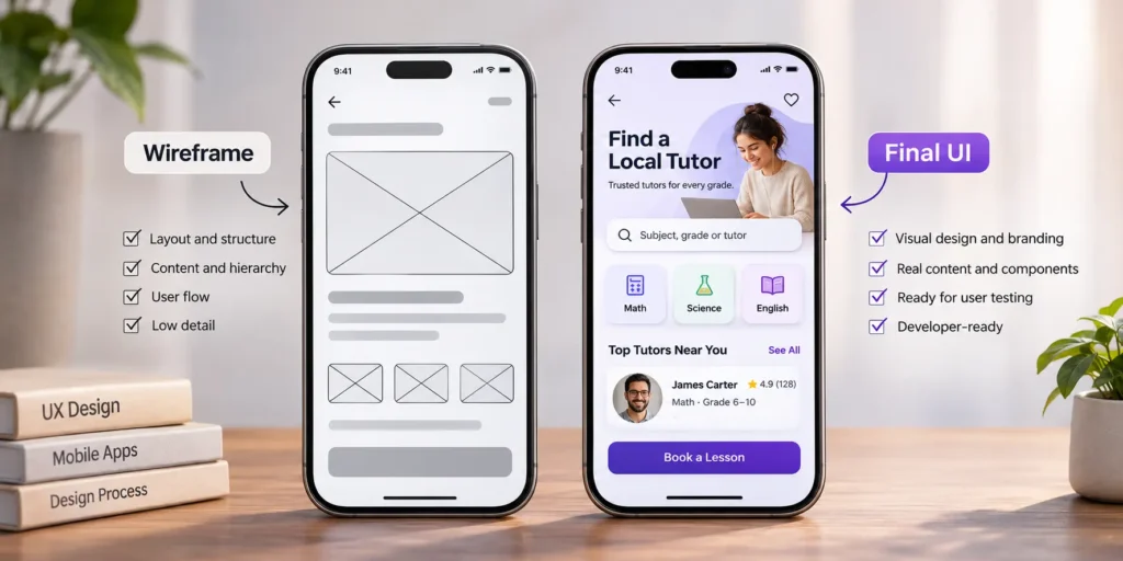
Where this goes wrong. Wireframes are skipped to save a week, and layout problems surface in final design, where they cost three times as long to fix.
Step 7. Test a clickable prototype with five users
This step tests the design with the people it is for, at the cheapest moment to be wrong. The designer links the wireframes into a clickable prototype in Figma, and you watch five people try to complete the main task. Nielsen Norman Group’s long-standing advice is that small tests with about five users find most usability problems, and that several small rounds beat one large one (Nielsen Norman Group).
A simple test script keeps the sessions comparable.
- Explain that you are testing the design, so nothing they do can be wrong.
- Ask them to think out loud as they go.
- Give one task at a time, such as “Book a maths tutor for Saturday morning.”
- Stay quiet. If they ask for help, ask what they would expect to happen.
- Write down where they hesitate, what they tap by mistake and anything they say twice.
After five sessions, list each problem with the number of testers who hit it. Fix the ones three or more people hit, then test again if the changes are large. Remote tools such as Maze or Lookback let testers join from their own phones. Our post on usability testing methods covers other ways to run the session.
You decide. Who tests it, and you help recruit them.
You get. A short findings list and the changes made.
Done when. No tester gets stuck on the main task.
Typical time. 3 to 5 days.
Where this goes wrong. The team explains the app to each tester before the test, and every flaw it hides ships to real users.
Step 8. Design the visual layer and components
This step tests if the app looks trustworthy and stays consistent. The designer applies color, type, icons and imagery, starting with three or four key screens. Approve those first. Approving the look on a few screens before the rest saves a round of changes on all of them.
Two small systems save a lot of rework. A type scale fixes five or six text sizes for the whole app, and a spacing scale, often in steps of 8, fixes the gaps between elements. With both in place, a new screen looks like it belongs from the first draft. The same applies to dark mode, which both iOS and Android offer system-wide. Deciding early whether the first release supports it is cheaper than retrofitting every screen later.
Reusable components, such as buttons, cards and form fields, are built at the same time. They keep the app consistent and speed up development, because developers build each component once.
Accessibility belongs here, and it is measurable. Body text needs a contrast ratio of at least 4.5 to 1 against its background under WCAG level AA (WebAIM). Touch targets need room for a thumb. Apple’s guidelines ask for at least 44 by 44 points (Apple), and Google recommends at least 48 by 48 dp (Google). A parent booking a tutor on a bus with one hand will thank you.
You decide. The look, on a few key screens first.
You get. High-fidelity screens and a small component library.
Done when. Every screen is built from the same set of components.
Typical time. 1 to 2 weeks.
Where this goes wrong. Each screen is designed on its own, and the app ends up with six slightly different buttons.
Step 9. Hand off to developers
This step tests if a developer can build from the file without guessing. Polished screens are only part of the job. Every screen also needs its other states.
- Empty, such as no tutors found in this area.
- Loading, while results come in.
- Error, such as a payment that failed.
- Success, once the booking is confirmed.
- Offline, for when the connection drops.
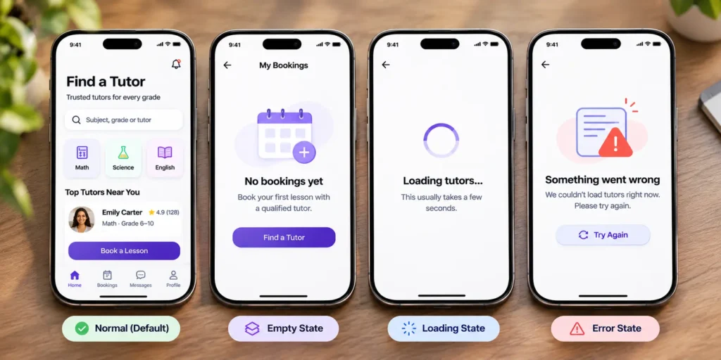
The handoff file also carries spacing and type specs, exported icons and images, and notes on any motion. Icons should be exported as vectors where the codebase supports them, and raster images in the sizes each platform expects, such as @2x and @3x for iPhone screens. Name layers and components the way developers will name them in code, so a “PrimaryButton” in Figma is a PrimaryButton in the app. When the same team handles mobile app design and development, many of these questions get answered in a quick call instead of a long ticket thread.
You decide. Who answers design questions during the build.
You get. A Figma file developers can build from.
Done when. A developer can build one full screen without asking a question.
Typical time. 2 to 4 days.
Where this goes wrong. Only the happy-path screens are handed over, and developers invent the error messages themselves.
Step 10. Check the build and plan the first update
This step tests if the built app matches what was approved. The designer reviews each screen on a real phone as development progresses, and flags spacing, text and state problems before launch. Apple’s TestFlight and Google Play’s internal testing track let the whole team install test builds, so these reviews happen on real devices instead of screenshots. This is also when the app store screenshots get designed.
After launch, watch where users drop off in the main task and collect the first reviews. Those become the brief for the first update. A UX audit a few months in is a structured way to find what to fix next.
You decide. What must be fixed before launch, and what waits for the first update.
You get. A design review of the built app and app store screenshots.
Done when. The built app matches the approved screens.
Typical time. Ongoing during development.
Where this goes wrong. Design ends at handoff, and small build differences add up to an app that feels unfinished.
iOS and Android differences to design for
You do not need two separate designs, but these details change between platforms, and users notice when an app gets them wrong.
| Detail | iOS | Android |
| Going back | Back button at the top left, plus a swipe from the left edge | The system back gesture or button, available on every screen |
| Main navigation | Tab bar at the bottom of the screen | Navigation bar at the bottom, or a navigation drawer in larger apps |
| System font | San Francisco | Roboto on most devices |
| Minimum touch target | 44 by 44 points | 48 by 48 dp |
| Dates and times | Wheel or compact pickers | Calendar and clock dialogs |
| Alerts and menus | Alerts and action sheets | Dialogs and bottom sheets |
A shared design system can cover both. The platform-specific parts are usually a small set of components, swapped in by the developers.
Mobile details most guides skip
These rarely get their own step, yet each one shapes how the app feels in someone’s hand.
Thumbs, one hand and reach
People often use their phone with one hand, on the move. Put the main action of each screen where a thumb can reach it, in the lower half, and keep destructive actions such as “Cancel booking” away from it.
Permission requests
Ask for access to location, camera or notifications at the moment the feature needs it, with a line explaining why. Apple’s guidelines advise asking only when the app clearly needs the access (Apple). A tutoring app that asks for location on the first screen, before showing a single tutor, gets far more refusals than one that asks when the parent taps “Tutors near me.”
Onboarding
Let people see value before you ask for an account where you can. Parents can browse tutors first and sign up when they book. Keep any intro screens to the few things a user must know, and make them skippable.
Larger text and screen readers
Both platforms let users increase text size, and many do. Check that key screens still work with larger text, without cut-off buttons or overlapping labels. Every button and icon also needs a text label for VoiceOver on iOS and TalkBack on Android.
Slow and missing connections
Phones lose signal in lifts, trains and basements. Decide what the app shows while data loads, what still works offline and how it recovers when the connection returns. These are the states developers need in step 9.
Notifications
Ask to send notifications after the user has a reason to want them, such as right after their first booking, and make each message useful on its own. Reminders about an upcoming lesson earn their place. Generic “We miss you” messages get the app muted.
Who does what during the mobile app design process
Clear roles keep the process moving. This is how the work usually splits on a first app.
| Stage | Founder | Designer | Developer |
| Brief and research | Owns the problem, recruits users | Runs interviews, studies competitors | Flags technical limits early |
| Scope and flows | Decides the cut | Maps screens and flows | Estimates effort per feature |
| Wireframes and testing | Reviews content, helps recruit testers | Builds and tests the prototype | Checks that flows are buildable |
| Visual design | Approves the look | Builds screens and components | Reviews components before build |
| Handoff and build | Answers business questions | Supplies states, specs and assets | Builds and raises questions early |
Bringing a developer in from step 4 costs a few hours and saves the most painful surprise in app projects, a design that cannot be built on time or on budget.
Tools for each step
The tools matter less than the order of the steps, but these are the ones you will most often see.
| Step | Common tools |
| Research and interviews | Google Meet or Zoom for calls, Notion or Google Docs for notes |
| Flows and structure | FigJam or Miro |
| Wireframes, UI and components | Figma |
| Prototype testing | Figma prototypes, Maze, Lookback |
| Handoff | Figma Dev Mode |
| Checking the build | TestFlight for iOS, Google Play internal testing for Android |
Where AI helps in the app design process
AI tools are now part of how many design teams work, and they speed up some steps more than others. We think they help most with the slow, text-heavy jobs. Summarizing interview notes, drafting first versions of microcopy, suggesting layout variations to react to and checking contrast across a whole file.
They help least with the steps that decide whether the app works. An AI tool can suggest a booking flow, but only five real parents trying to book a tutor will show you where it breaks. Treat AI output as a first draft for the team to judge, and keep step 7 exactly as it is.
How long does it take to design an app?
The mobile app design steps above add up differently for every product. The honest answer depends on the number of screens and how much research the product needs. These are our own delivery estimates for design only [CONFIRM].
| Project type | Typical design time (our estimate) |
| Lean first release, one main task | 4 to 7 weeks |
| Standard app with accounts, payments and several flows | 8 to 14 weeks |
| Complex product with several user roles | 14 to 20 weeks |
Three things stretch the timeline more than anything else. Feedback that arrives a week late, features added after the wireframes are approved, and content such as prices or legal text that nobody has written yet. Our breakdown of mobile app design cost shows how the same factors move the price.
What to prepare before you hire a designer
A designer can quote faster and more accurately when you arrive with five things.
- The one-sentence problem from step 1.
- Two or three apps you like, and what you like about each.
- Any brand assets you already have, such as a logo, colors or fonts.
- A rough budget range, even a wide one.
- The name of the person who signs off on design decisions.
Our guide to what mobile app design services include explains what a studio delivers at each stage, and the design brief guide shows how to put all five into one page.
Frequently asked questions
Can I skip wireframes and go straight to UI design?
You can, but it usually costs more time than it saves. Wireframes let you fix layout and content while changes are cheap. Skipping them moves those fixes into final design, where every change also touches colors, images and components.
Do I need separate designs for iOS and Android?
Not completely separate. One design system can serve both, with platform-specific versions of navigation, back behavior, date pickers and system dialogs. Budget a little extra time for the second platform rather than a full second design.
What is the difference between a prototype and an MVP?
A prototype is a clickable design with no real code behind it, used to test the idea with users. An MVP is a working first version people can actually use. You test the prototype in step 7 so the MVP gets built right the first time.
How many screens does a first app usually need?
A lean first release often lands between 10 and 25 screens (our estimate), counting sign-up and settings. Each extra user role or major feature adds more. The screen list from step 5 gives you the real number for your app.
Should I design for tablets in the first release?
Only if your users are on tablets. For most first apps, phones come first and tablets later. If a tablet version is planned, tell the designer early, so layouts can stretch without a redesign.
What tools do app designers use?
Figma is the standard for wireframes, final screens, prototypes and handoff. FigJam or Miro cover flows, and testing tools such as Maze run remote prototype tests. The tools table above lists one per step.
Can the same studio design and build the app?
Yes, and it removes a handoff between two companies. The designers stay available while developers build, so questions get answered in hours instead of days. If you already have developers, a studio can deliver design and a build-ready file only.
The bottom line
Decide the problem in one sentence. Test the prototype with five people before any code is written. Hand developers every state of every screen.
Each of those costs a few days. Skipping any of them usually costs weeks.
Get Help Designing Your Mobile App
Have an app idea and a launch date? Send us the idea. We will map the first release into screens, steps and a timeline you can plan around. [CONFIRM]